Designing with Restraint: The Power of a Controlled Palette
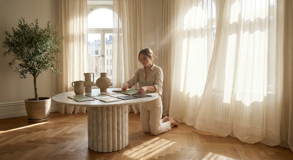
Sophisticated tile design begins with discipline, not abundance. A controlled palette—often two primary tones and a carefully considered accent—creates visual coherence from entry to ensuite. Rather than introducing a new color in every room, consider a continuous “ground” hue (such as a warm bone, nuanced greige, or soft limestone) that recurs across floors and key vertical surfaces.
This continuity allows you to layer interest through texture, pattern scale, and finish rather than color chaos. Matte and honed tiles in the same tone can differentiate functional zones without fracturing the eye, while a single deeper shade (charcoal, ink, or espresso) can be reserved for thresholds, niche backs, or stair risers. The outcome is a home that reads as a singular composition, not a sequence of competing ideas.
Exclusive Insight #1: Create a “House Color Spine”
Choose one foundational tile color that appears in at least three distinct locations—such as the entry floor, kitchen backsplash, and primary bath shower floor. Vary texture and format, but keep the hue consistent. This quiet repetition subconsciously signals luxury, much like a couture collection built around a signature tone.
Working with Light: Tiles as Luminous Architecture
Natural and artificial light transform tile more than almost any other material. Successful palettes consider not only the color you see on a sample board, but the shifting light that will wash over it at dawn, midday, and dusk. North-facing rooms often benefit from warmer neutrals that counteract gray light, while south-facing spaces can gracefully host cooler stone looks and nuanced blues without feeling chilly.
Finish is equally critical. Highly polished tiles amplify brightness but also highlight every reflection and water spot; honed and satin finishes soften glare and lend a gallery-like calm. In transitional spaces—hallways, powder rooms, stair landings—subtly reflective glazes or lightly textured porcelains can catch stray light and create moments of quiet shimmer without tipping into ostentation.
Exclusive Insight #2: Test Tiles Vertically in Real Light
Always view tile samples in their intended orientation at multiple times of day. A floor tile should be placed on the floor and a wall tile propped against the wall. Under-cabinet lighting, sconces, and window placement can dramatically alter perceived color; making decisions from flat sample boards alone is a shortcut to disappointment.
Quiet Pattern: Geometry That Serves the Architecture
For refined interiors, pattern should underscore structure, not shout over it. Large-format tiles can visually expand a room when laid to follow the longest dimension, guiding the eye and elongating perspective. Slim planks in porcelain or ceramic can suggest the rhythm of hardwood while offering the resilience of tile—particularly effective in kitchens and entries where durability is paramount.
On walls, classic geometries—chevrons, herringbones, and stacked rectangles—become elevated when they respect the proportions of the space. Extending a backsplash tile all the way to the ceiling behind a range hood or open shelving introduces a disciplined verticality. Conversely, running a subtle linear pattern around a room at a constant height can visually “tie” adjoining zones together, like a contemporary frieze.
Exclusive Insight #3: Align Pattern with Sightlines, Not Just Walls
Stand in the primary approach to each room and identify your main sightline. Orient directional tile patterns (planks, herringbone, elongated hexes) to flow with how you naturally move through the space. This simple shift often makes rooms feel more intentional, spacious, and calm—even before furniture is placed.
Elevated Neutrals: Nuance Over Novelty
Neutral does not mean featureless. Some of the most luxurious tile schemes rely on neutrals with character: a porcelain that hints at hand-troweled plaster, a limestone-look tile with soft fossil inclusions, a clay tile whose glaze pools slightly at the edges. These subtleties reward close inspection and age gracefully as trends evolve.
Instead of high-contrast combinations, consider “near neighbors”—colors that sit closely together in tone yet differ in undertone or texture. Pair a warm almond floor tile with an ivory wall tile that leans slightly cooler, then introduce a single element in a richer, related shade (such as mocha or tobacco) in a niche or shower curb. This creates depth and luxury through modulation rather than stark opposition.
Exclusive Insight #4: Layer Texture Within a Single Color Family
Select one hue—say, a warm porcelain “sand”—and specify it in three distinct surface qualities: a subtly textured floor tile, a smooth large-format wall tile, and a gently rippled or fluted accent. The color unity keeps the look calm, while the interplay of textures gives the room the dimensionality of a high-end boutique or gallery.
The Curated Accent: Using Bold Tile with Intention
Statement tiles have their place in a refined home, but their impact depends on editing. Instead of covering entire walls with bold pattern or color, treat these tiles like art—confined to areas where they can be appreciated up close and framed by quieter surrounds. Think shower niches lined in deep green zellige, a powder room vanity wall in a restrained graphic pattern, or a fireplace hearth in a richly veined marble-look porcelain.
Limit yourself to one truly assertive tile per visual field. If the main bathroom boasts a dramatic stone-look floor, keep the walls tonally calm. If a kitchen island is wrapped in a striking large-format slab, choose a backsplash that supports rather than competes. This hierarchy ensures your investment tiles feel curated, not chaotic.
Exclusive Insight #5: Anchor Every Bold Tile with a “Silence Partner”
For every expressive tile you select, assign a quieter companion that shares at least one attribute—color temperature, veining character, or finish. For example, a deep indigo glazed tile pairs elegantly with a soft gray porcelain that has a whisper of blue in its undertone. This “silence partner” gives the statement tile room to breathe and keeps the overall composition sophisticated.
Conclusion
Exceptional tile work is less about spectacle and more about orchestration—of color, light, texture, and proportion. By establishing a house-wide color spine, honoring the behavior of light, aligning pattern with movement, cultivating nuanced neutrals, and treating bold tiles as curated accents, homeowners can achieve spaces that feel both composed and deeply personal. In such interiors, tile ceases to be a mere finish and becomes the quiet architecture of everyday luxury.
Sources
- [U.S. Department of Energy – Daylighting and Energy Efficiency](https://www.energy.gov/energysaver/daylighting) – Insights on how natural light behaves in interiors, useful for understanding how tile color and finish will read throughout the day
- [Sherwin-Williams – The Impact of Light on Color](https://www.sherwin-williams.com/en-us/homeowners/color/lighting-and-color) – Explains how orientation and lighting conditions alter perceived color, relevant when selecting tile palettes
- [Ceramic Tile Education Foundation (CTEF)](https://www.ceramictilefoundation.org/blog) – Professional resources on tile selection, formats, and installation best practices
- [Tile Council of North America (TCNA)](https://www.tcnatile.com/) – Industry standards and technical insights on tile performance, finishes, and applications
- [Harvard Graduate School of Design – “The Architecture of Atmospheres” Lecture Note](https://www.gsd.harvard.edu) (navigate via site search) – Academic perspective on how material, light, and surface contribute to spatial mood and perception