Below, we explore five exclusive, design-forward insights that elevate tile from background material to composed, architectural presence—without ever tipping into visual noise.
Designing with Light, Not Just with Tile
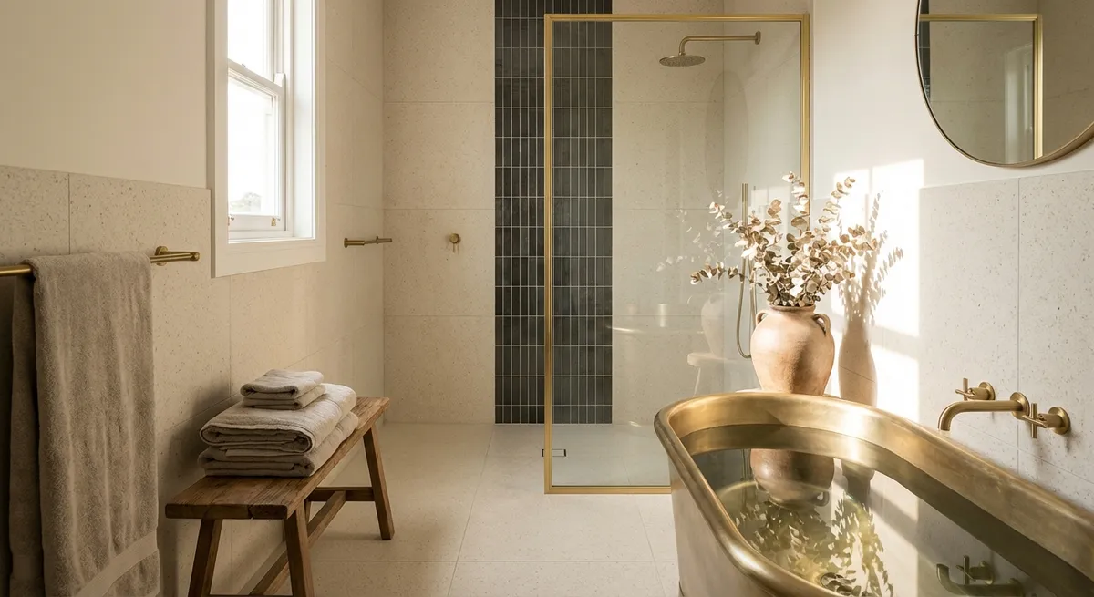
Most tile projects begin with color and pattern; the most refined begin with light. Daylight, artificial lighting, and reflection should guide your tile choices well before a single sample is ordered.
Glossy glazes can amplify natural light in darker rooms—but in excess, they can create glare and highlight every irregularity in a wall. A sophisticated approach balances reflective tiles at eye level with velvety, matte textures lower down, where touch and practicality dominate. In spaces with abundant sunlight, consider subtly variegated tiles: the tonal shifts read almost like fabric, catching light in a nuanced, non-flashy way.
In wet rooms and showers, think about how directional lighting will skim across the surface. Slightly structured or hand-pressed tiles become exquisite under grazing light, revealing gentle undulations that signal craftsmanship. Conversely, if you prefer a calm, planar visual, opt for rectified tiles with minimal lippage and pair them with diffuse lighting to maintain a serene, gallery-like effect.
Exclusive Insight #1: Treat your tile layout as a light map. Sketch where light falls throughout the day, then assign finishes—gloss, satin, or matte—according to whether you want reflection, diffusion, or absorption in each zone. This approach produces a space that feels deliberately “lit” even before you install fixtures.
Architectural Alignment: Grids, Sightlines, and Subtle Symmetry
Sophisticated tile work is rarely about the tile alone; it’s about how tile interacts with the architecture. The most elevated spaces are those where grout lines, fixtures, and structural lines quietly correspond, creating a sense of order that you feel even if you never consciously notice it.
Before choosing tile size, study your room’s key sightlines: the view from the entry, the axis of a hallway, the alignment with windows or door frames. Aim to center major tiles or grout joints on focal elements: a vanity, a range, a freestanding tub, or a fireplace opening. When possible, allow vertical grout lines to align from floor to wall behind cabinetry or tall built-ins, creating a continuous structural “grid” that visually stabilizes the space.
Larger format tiles can make a room feel expansive, but only if cuts are handled with intention. A premium detail: plan tile dimensions so that cut pieces at edges are symmetrical and generous, avoiding thin “slivers” that disrupt the rhythm of the grid. This level of planning often requires detailed drawings and scaled layouts—but the resulting serenity is unmistakable.
Exclusive Insight #2: Establish a “master axis” for your tile layout. Choose one dominant line—often the center of a key fixture or opening—and organize patterns, cuts, and transitions around it. This turns your tile field into quiet architecture rather than mere decoration.
Texture as a Quiet Luxury: Layering Understated Depth
In refined interiors, texture rivals color for impact. With tile, texture is often where luxury reveals itself: in how a finish feels underfoot, how a glaze breaks over an edge, or how a honed stone softens reflections into a gentle glow.
Rather than leaning on bold patterns, explore a single color family expressed in multiple textures. For example, a soft, honed limestone on the floor, a lightly tumbled mosaic in the shower niche, and a subtly ribbed ceramic on the wall can create a space that reads cohesive at a distance yet richly detailed up close. This layering is particularly effective in neutral palettes, where visual interest must be earned through subtlety, not contrast.
Think, too, about tactile experiences: the feeling of stepping from a warm, smooth tile floor onto a finely textured shower pan, or running your hand along a slightly raised relief tile near a vanity. These micro-moments of interaction are what give a room its sense of quiet indulgence.
Exclusive Insight #3: Restrict your palette, expand your textures. Limit the space to two or three core tones, but explore them across different finishes—honed, polished, brushed, ribbed, or handcrafted. The result feels curated rather than busy, and reads as bespoke rather than off-the-shelf.
Intelligent Transitions: Where Materials Meet with Grace
Refined tile design is as much about the “in-between” moments as the primary surfaces. Transitions—between tile and wood, tile and carpet, tile and painted walls—signal the quality of the entire installation. Harsh, abrupt changes can make even expensive materials feel disjointed, while thoughtful transitions create a sense of continuity and craftsmanship.
Consider using metal profiles or stone thresholds that echo the tone of nearby hardware, faucets, or door handles. A slim, brushed brass or stainless edge can transform an otherwise ordinary junction into a deliberate detail. In larger homes, repeating the same threshold material at every doorway creates a subtle visual rhythm that ties rooms together.
On walls, think beyond the classic bullnose. Mitered corners, pencil trims, or even a carefully aligned raw edge under a picture rail can feel more architectural than decorative. When tile meets painted plaster, set the tile a fraction proud or flush depending on the effect you want: proud for a framed, panel-like appearance, flush for seamless integration reminiscent of stone-clad walls.
Exclusive Insight #4: Design a “transition language” for the entire home. Decide on a consistent approach to edges and thresholds—materials, profiles, heights—then repeat it from room to room. The continuity quietly elevates the perceived quality of every surface.
Pattern with Restraint: Advanced Layouts without Visual Clutter
Pattern in tile is often misunderstood as loud or busy, but in skilled hands it can be almost meditative. The key is proportion, repetition, and restraint. Instead of scattering complex patterns throughout a space, anchor them in one or two highly intentional locations and support them with calm, solid fields.
Consider using patterned or mosaic tiles as architectural “inlays”: a rug-like composition under a dining table, a framed panel behind a vanity, or a border-carved pathway in a long corridor. Surround these with quieter tiles that share a common tone or undertone, allowing the patterned area to feel like a custom piece rather than an all-over print.
Even within simple formats, pattern emerges through layout: a classic herringbone on a small powder room floor, a stacked vertical layout to add height behind a tub, or a running bond that subtly references traditional masonry. The sophistication lies not in maximalism but in disciplined editing.
Exclusive Insight #5: Reserve complexity for framed zones. Treat pattern like art—locate it where your eye naturally rests and contain it within clear boundaries, keeping adjacent surfaces simple. This approach feels tailored, not theatrical, and keeps the room timeless even as tastes evolve.
Conclusion
Tile, when thoughtfully conceived, becomes more than a hard surface; it becomes a language of alignment, light, texture, and transition. By designing with illumination in mind, aligning grids to architecture, layering texture within a restrained palette, choreographing transitions, and curating pattern with intention, homeowners can achieve spaces that feel exquisitely composed rather than simply “finished.”
The most enduring tile interiors are not the loudest but the most considered. They reveal their richness slowly—through the softness of a honed edge, the precision of a joint, the logic of a line that continues just where you expect it to. In these details, refinement moves from idea to reality, and tile takes its place as a quietly confident foundation for the entire home.
Sources
- [American Institute of Architects – Residential Design Trends](https://www.aia.org/resources/6408311-aia-home-design-trends-survey) - Insights into how architects think about materials, light, and spatial composition
- [Ceramic Tile Education Foundation](https://www.ceramictilefoundation.org/blog) - Technical and design-focused articles on tile installation best practices
- [The National Kitchen & Bath Association (NKBA) Design Trends Report](https://nkba.org/insights/design-trends/) - Research on evolving kitchen and bath aesthetics, including tile, finishes, and layouts
- [The Getty – Surface & Depth in Architectural Materials](https://www.getty.edu/conservation/publications_resources/newsletters/20_1/) - Discussion of texture, light, and materiality in architectural surfaces
- [U.S. Department of Energy – Daylighting and Interior Surfaces](https://www.energy.gov/energysaver/daylighting) - Guidance on how surfaces interact with natural light, useful for planning reflective and matte tile finishes