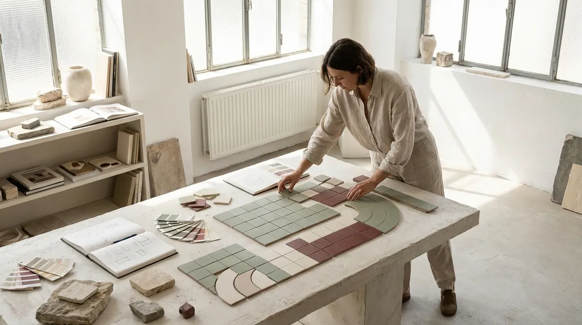
For homeowners pursuing a refined result, it pays to think like a curator rather than a shopper. This means editing, orchestrating, and anticipating how the tile will be lived with and lit over time—not just how it appears under showroom halogens. The following design insights move beyond obvious trends and into the realm of deliberate, enduring decisions that distinguish a truly bespoke installation.
Elevating Sightlines: Designing for the First Glance, Not Just the Floor Plan
Most tile decisions are made by staring down at a plan or a sample board on a table, but the eye experiences tile in motion, at human height, from the doorway first. Begin by identifying your primary sightlines: the view as you enter the room, the view seated at a dining table, the reflection caught in a mirror or glass door. These perspectives should dictate where patterns start and stop, where cuts fall, and where you allow a moment of visual calm.
In a bathroom, for example, consider centering a feature tile panel behind the vanity mirror so that it becomes the natural focal point from the hall, rather than scattering “interest” across all four walls. In a kitchen, align the most precise tile work with the hood and main prep zone—the area you face most—letting less visible corners absorb the unavoidable small cuts. Designing from the doorway inward produces a composition that feels intentional at first glance, and that sense of order reads as luxury even to an untrained eye.
By briefing your installer with clear “priority views,” you give them permission to spend more time aligning grout lines and pattern repeats where they matter most. The result is a space where movement through the room feels guided, and where the best craftsmanship sits exactly where it will be quietly admired every day.
Choreographed Transitions: Turning Thresholds Into Design Moments
Transitions between materials are often afterthoughts, yet they are where quality is most keenly felt. A jagged cut where tile meets wood, an awkward sliver at a doorway, or a bulky threshold strip can instantly diminish an otherwise elegant scheme. Instead, treat every junction—floor to floor, floor to wall, tile to plaster—as a deliberate design line.
Consider using stone or porcelain inlay strips to create a tailored “frame” at room thresholds, echoing the proportions of classic stonework in historic apartments and townhomes. These borders can visually reconcile slight level changes between rooms while also signaling a subtle shift in function or mood. In showers, a shadow reveal or slim metal profile at the niche or bench line can bring a contemporary, gallery-like precision to the composition.
It’s also worth aligning transitions with architectural elements: let the change in tile pattern occur under a door leaf, not mid-room; align vertical changes with window mullions, pilasters, or cabinetry divisions. When transitions feel choreographed rather than improvised, the entire space gains a sense of calm continuity, and the tile reads as integrated architecture rather than mere surface finish.
The Grout Palette: Treating Joints as Deliberate Design Lines
Grout is often treated as a technical afterthought—something to match “as closely as possible.” In a refined space, grout is not background; it is linework. Choosing the right tone and width can either reveal the geometry of the layout or intentionally soften it into a monolithic field. Both can be luxurious, but each requires conscious selection.
For graphic installations—herringbone, chevron, or contrasting shapes—slightly emphasizing the joint with a nuanced, tonal grout can add a tailored, suit-like sharpness. Think of it as stitching on fine clothing: visible enough to define structure, discreet enough not to shout. Conversely, where you want the surface to read like a single slab (for instance, large-format porcelain resembling stone), minimize joint width and choose a grout that disappears at a conversational distance.
Subtlety is the watchword. A half-shade difference in grout can be the distinction between chic and busy. Always review grout samples directly against the chosen tile, in both natural and artificial light, and from the distance at which you will most often view the surface. When grout is treated as a curated palette rather than a default, your tilework gains a level of refinement most projects never reach.
Light as a Material: Pairing Tile Texture With Daylight and After-Dark Glow
The most exquisite tile can appear flat if poorly lit, while a modest tile can look astonishing when its texture is allowed to interact with light. Before you finalize a selection, study how your space behaves throughout the day: the direction of sunlight, the presence of reflected light from adjacent buildings, and the type of evening illumination you prefer.
Matte and honed surfaces tend to absorb and diffuse light, lending depth and calm to bright rooms; they are particularly beautiful in spaces with large windows, where you want to temper glare. Subtle relief patterns or fluted tiles come alive with grazing light from wall washers or sconces, creating shadow play that feels more like architectural sculpture than mere cladding. In low-light rooms, consider a gentle satin or semi-polished finish, which can “hold” light and keep the space from feeling overly absorptive or dull.
Plan your lighting layout with the tile in mind, especially in showers and on feature walls. A simple row of downlights aligned with key tile seams can highlight the precision of the installation. By treating light as a companion material to tile rather than a separate consideration, you’ll unlock the full sophistication of both.
Edited Complexity: Balancing Statement Surfaces With Places to Rest the Eye
High-end spaces seldom rely on constant visual volume. Instead, they balance moments of intensity with expanses of quiet. Tile offers endless opportunity for pattern, color, and texture, but luxury often emerges from restraint—knowing where to place a statement and where to remain deliberately understated.
Rather than tiling “everything interesting,” identify a single hero area—the shower enclosure, the range backsplash, or an entry floor panel—and allow that surface to carry the strongest character. Surround it with more tonal, textural tiles that support rather than compete. A richly veined marble-effect tile may shine behind a vanity, while the floor beneath stays in a calm, honed porcelain of similar hue. The overall impression is layered, not loud.
Editing also means resisting the urge to introduce too many formats and finishes within a small footprint. A limited vocabulary—perhaps one stone look, one complementary field tile, and a single accent—can feel far more bespoke than a patchwork of trends. When each choice is purposeful and given room to breathe, the tilework begins to resemble a tailored interior rather than a sample catalogue.
Conclusion
Exceptional tile design is less about chasing the newest pattern and more about orchestrating a series of quiet, intelligent decisions. When you design from key sightlines, choreograph transitions, treat grout and light as integral materials, and edit complexity with care, your tilework evolves from “installed” to “composed.”
For homeowners who value refinement, these details are not indulgences; they are the invisible framework that makes a room feel intuitively right. With a curator’s eye and a craftsman’s respect for precision, each tiled surface becomes an enduring part of the home’s architecture—calm, confident, and unmistakably considered.