Below, you’ll find five exclusive, design‑driven insights that move beyond trend and into the realm of enduring, curated style—ideas that sophisticated homeowners and their design teams can actually use.
Designing with Proportion: When Tile Scale Mirrors the Room’s Architecture
Most tile decisions begin with color or pattern; refined rooms begin with proportion. The most elegant installations feel as if they were custom‑cut to the architecture, even when they use stock formats.
Consider the room’s dominant lines first: ceiling height, window placement, the width of door casings, and the rhythm of structural beams. A tall, narrow room rarely wants a small, fussy tile on the primary surface; instead, a larger format laid in a calm pattern can visually broaden the space, while a tall stack bond can emphasize the height. Conversely, compact powder rooms or vestibules can handle more intricate mosaics, which add richness without visually shrinking the footprint when used thoughtfully on the floor or a single accent wall.
The key is to let tile modules echo architectural dimensions. Aligning grout joints with window mullions or stone thresholds, or ensuring that a tub apron’s height corresponds to an exact multiple of tile modules, creates the sense that the room was drawn, not simply tiled. This is the kind of proportional harmony that subtly signals a high‑caliber project.
Choreographing Transitions: From Room to Room, Without Visual Noise
Luxury rarely announces itself at the center of a floor; it reveals itself in the way spaces connect. One of the most overlooked opportunities in tile design is the transition zone—the threshold, the cased opening, the shift from kitchen to living room.
Rather than abrupt changes, imagine each transition as a seam in a beautifully tailored garment. Using a slim stone or metal inlay at doorways can create a deliberate “frame” between two surfaces, while keeping the edge detail razor‑clean. When moving from tile to wood, consider matching grout color to the wood’s undertone, and align tile joints so that at least one axis relates to the direction of the planks; this continuity keeps the eye from stumbling.
In open‑plan spaces, restraint is often more luxurious than proliferation. Instead of three competing tile patterns—one for kitchen, one for dining, one for entry—let a single field tile run through, and subtly alter the pattern or scale within a defined zone (such as a framed herringbone inset under the dining table). The human eye reads this as a quiet shift rather than a clash, maintaining a composed atmosphere while still giving each area its own identity.
Light as a Material: Curating Sheen, Relief, and Shadow
The most sophisticated tile projects treat light as an additional building material. Choosing the right finish is less about “matte versus glossy” and more about how surfaces handle daylight, evening ambience, and artificial illumination.
Highly polished tiles can feel glamorous but will reveal every footprint and reflection; they’re best used on vertical surfaces or in controlled, formal spaces. Soft‑matte or satin finishes, especially on larger formats, lend a gallery‑like calm and photograph beautifully in both natural and artificial light. For walls, subtle relief tiles—fluted, ribbed, or softly beveled—can be extraordinary when paired with directional lighting that grazes the surface, turning shadows into a quiet pattern.
Think about how the space lives across a full day. In a north‑facing kitchen, a slightly reflective, hand‑glazed tile can add luminosity without glare, catching traces of ambient light and candle flame alike. In sun‑drenched bathrooms, a refined matte on the floor can temper reflections and improve both comfort and safety. When tile, finish, and lighting are chosen together, the room feels considered in every hour and season, rather than styled for a single photograph.
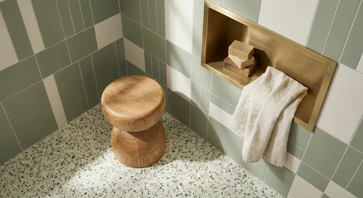
Curated Color Stories: Working with Undertones, Not Just Hues
Sophisticated tile palettes rarely depend on bold color alone; instead, they lean on undertones and nuance. Two “greige” tiles can clash dramatically if one leans green and the other violet. The difference is subtle in isolation, but unmistakable when surfaces meet at a corner or along a vanity edge.
Start by choosing a primary neutral with a clearly defined undertone—warm taupe, cool stone gray, or a warmer limestone beige. From there, build a limited family: floor tile, wall tile, and grout that share the same bias. Introduce contrast through depth rather than hue: a darker iteration of the same undertone on the floor, a lighter version on the walls, and perhaps a textured accent in the same color family for a niche or backsplash. This creates a layered, tonal effect that feels restrained yet rich.
If you want a statement color (an azure shower wall, a bottle‑green bar backsplash), let that note be singular and deliberate. Keep surrounding tiles either tonally aligned neutrals or very quiet complementary hues so that the feature reads as intentional architecture, not decorative noise. This kind of chromatic discipline is what separates “styled” from truly composed spaces.
Pattern with Intention: Using Layouts to Guide Movement and Emphasis
Pattern is often treated as decoration; in refined projects, it’s used as a tool to guide movement and subtly emphasize what matters. The same tile can feel entirely different when rotated, re‑scaled, or laid in an unexpected pattern.
In a long corridor, a classic herringbone or chevron can gently direct the gaze forward, elongating the space. In a square entry hall, a diagonal layout or centrally framed paneled “rug” can give the room a sense of geometry and arrival. Even straightforward layouts—running bond, stack bond, basketweave—take on a tailored feel when meticulously aligned to focal points: centered on a range hood, a freestanding tub, or a fireplace surround.
Refinement lies in restraint. One strong pattern per visual field is usually enough; adding more can feel frenetic rather than luxurious. The most exclusive spaces often combine a single expressive pattern with expanses of near‑patternless field tile, allowing the eye to rest. Think of pattern as punctuation: used sparingly and precisely, it gives the room rhythm, emphasis, and a memorable cadence.
Conclusion
Exceptional tile work is not about chasing the latest finish or layout; it’s about orchestrating proportion, transition, light, color, and pattern so that each surface feels inevitable rather than improvised. When these elements are curated with intention, tile stops functioning as mere cladding and becomes part of the home’s architectural language—quietly signaling quality, craft, and longevity.
For homeowners, the most valuable decision is to think beyond the individual tile and consider the composition as a whole: how it will feel underfoot, in candlelight, on a winter morning, and ten years from now. That is where truly premium tile design lives—at the intersection of visual poise and enduring comfort.
Sources
- [American Society of Interior Designers – Impact of Design](https://www.asid.org/resources/impact-of-design) – Research and insights on how design decisions, including surfaces and materials, influence experience and well‑being.
- [The National Kitchen & Bath Association (NKBA) – Design Trends Report](https://nkba.org/insights) – Industry data and expert commentary on evolving kitchen and bath design, including tile usage and finishes.
- [Ceramic Tile Education Foundation](https://www.ceramictilefoundation.org) – Technical resources on tile installation standards, patterns, and best practices that underpin premium‑quality work.
- [U.S. General Services Administration – Interior Design Guide](https://www.gsa.gov/real-estate/design-construction/design-excellence/interior-design) – Federal guidelines on interior materials, lighting, and finishes, offering a rigorous framework for durable, high‑performance spaces.
- [Harvard Graduate School of Design – “Spaces of Living” Lectures & Publications](https://www.gsd.harvard.edu/research-publications/) – Scholarly perspectives on spatial composition, proportion, and materiality that inform elevated residential design.