Below are five exclusive, design-focused insights for homeowners who treat tile not as a necessity, but as a crafted element of architectural couture.
1. Curating a Tile Palette Like Wardrobe Essentials
The most sophisticated interiors treat tile like a capsule wardrobe: fewer pieces, better quality, exquisitely coordinated.
Start with three “anchor” tones that can quietly travel through multiple rooms—a warm stone-inspired neutral, a deep grounding shade (ink, espresso, charcoal), and one delicate accent (celadon, muted terracotta, or smoked blue). Everything else should orbit these hues. This creates a visual continuity that feels expensive without shouting.
Think in terms of finish as much as color. A honed limestone-look porcelain on the floor, a soft satin ceramic on the walls, and a subtle gloss mosaic in select niches will catch the light differently while staying chromatically aligned. This layered approach avoids the “builder-basic” look without tipping into chaos.
When planning, lay tile samples together on a large tabletop: floor, wall, trim, and grout swatches all visible. View them morning, afternoon, and evening. The tiles that remain compelling in changing light are the ones that will feel timeless underfoot and overhead.
2. Using Scale and Proportion as a Design Language
Beyond color and pattern, tile size and proportion are where truly bespoke design emerges.
Large-format tiles (24" x 24" and beyond) create a sense of calm, especially in open-plan spaces. The reduced number of grout lines feels inherently more luxurious. Yet in refined homes, small-scale tiles are not banished; they’re strategically reserved for areas that reward close inspection: shower niches, vanity backsplashes, fireplace surrounds, or the interior of a bar cabinet.
The key is dialogue between scales. Think of a primary large format that establishes serenity, then pair it with a secondary tile that is either intentionally diminutive (a 1" x 4" stacked mosaic) or distinctly elongated (3" x 12" planks laid in a quiet stack bond). What you avoid is the muddled in-between: many medium sizes competing for attention.
Also consider the room’s architecture. In tall, narrow spaces—like a powder room—vertically oriented tiles or stacked planks can gently accentuate height. In expansive kitchens, a long, low backsplash tile can emphasize breadth and visually extend the counter line. These are subtle moves, but in aggregate, they create a space that feels tailored rather than merely tiled.
3. Mastering Grout as a Deliberate Design Element
Discerning homeowners know grout is not a technical afterthought—it is the frame that defines every tile edge.
In elevated interiors, grout is often tuned to one of two roles: seamless or structural. For a seamless, gallery-like feel, choose grout that closely matches the tile’s dominant tone, especially for floors. This reduces visual “noise” and allows furnishings, art, and fixtures to speak more clearly.
For a structural, architectural effect—particularly on walls or in feature moments—use a grout a shade or two deeper than the tile. This draws out the geometry without feeling graphic or trendy. For example, an off-white subway tile with a warm greige grout can look quietly continental rather than overtly industrial.
Equally important is grout joint width. Narrow joints (1/16"–1/8") tend to read more custom and precise, especially with rectified tiles. Wider joints can be beautiful in rustic or Mediterranean-inspired schemes but should be wielded intentionally, not by default. Specify your desired joint width in advance with your installer; it is as much a design decision as the tile itself.
4. Orchestrating Transitions Between Spaces
In homes with layered, sophisticated design, tile transitions are orchestrated, not improvised.
When moving from tile to wood, stone, or carpet, consider how the materials “speak” to each other at the threshold. A perfectly aligned transition—where a tile module meets a plank or stone in a considered, centered manner—feels far more bespoke than a last-minute reducer strip. Where possible, align transitions with architectural moments: doorways, cased openings, changes in ceiling height, or structural beams.
Thoughtful pattern transitions are equally impactful. A classic example is a master suite where a calm large-format tile in the bedroom leads into a bathroom where the same tile continues but shifts into a refined herringbone or stacked pattern in the shower. The material consistency calms the eye; the pattern shift gives the space its narrative.
For particularly refined homes, consider a “border conversation”: a subtle perimeter frame of a complementary tile around a main field in large rooms, echoing traditional stone inlay floors. Another approach is to carry one tile visually up the wall at key points—behind a tub, up a fireplace, or as a kitchen backsplash—so the floor and wall feel architecturally linked rather than separately designed.
5. Composing Light, Texture, and Reflection
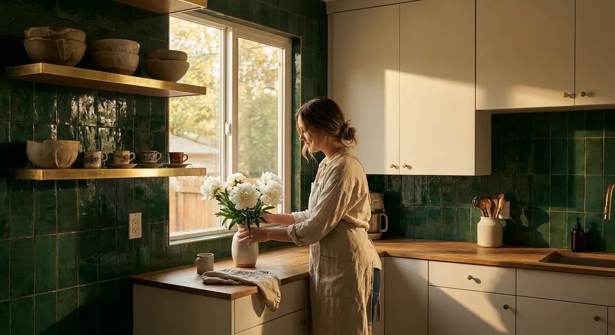
The finest tile interiors are less about “statement patterns” and more about the choreography of light across texture.
Begin with an honest reading of your light: Is it cool northern light, strong southern exposure, or primarily evening illumination? In softly lit rooms, a delicately reflective surface—a pearl-sheen ceramic, a glazed zellige-inspired tile, or even a finely textured porcelain—can bring life where heavy matte finishes might fall flat. In highly sunlit rooms, a velvety matte or honed finish can prevent glare and lend a gallery-like calm.
Texture should be perceptible but not busy. Think of tiles with micro-relief, linear striations, or a gently hand-wrought surface. These capture shadows and highlights in a way that feels artisanal without becoming visually restless. Reserve bolder textures for focused zones: a shower feature wall, a bar backsplash, or a fireplace column.
Finally, treat reflective tiles strategically. A band of subtly glossy tiles above a vanity can bounce light back into the face, enhancing both function and atmosphere. A slightly iridescent mosaic in a bar niche or behind open shelving can catch candlelight or pendants in the evening, creating a sense of depth and quiet opulence.
Conclusion
Exquisite tile design is never accidental. It is the accumulation of hundreds of small, precise decisions: a disciplined palette, calibrated scale, intentional grout, composed transitions, and a sophisticated understanding of light and texture. When these elements are curated with care, tile moves beyond utility and becomes part of the home’s architectural narrative—enduring, composed, and quietly unforgettable.
For homeowners who appreciate the nuance of a well-tailored space, tile is not simply a surface. It is a medium through which restraint, refinement, and longevity can quietly express themselves every day.
Sources
- [American Society of Interior Designers (ASID) – Design Trends](https://www.asid.org/resources/resources/view/resource-center/108) – Insights on current and emerging interior design directions that inform sophisticated material choices.
- [Ceramic Tile Education Foundation](https://www.ceramictilefoundation.org/blog) – Technical articles on grout joints, tile sizing, and installation standards that underpin premium design decisions.
- [Tile Council of North America (TCNA) – Handbook Overview](https://www.tcnatile.com/faqs/72-handbook-faqs.html) – Authoritative guidance on best practices for tile layouts, transitions, and performance considerations.
- [Porcelanosa – Tile Collections](https://www.porcelanosa.com/en/tiles/) – High-end examples of finishes, formats, and textures that illustrate many of the design principles discussed.
- [Architectural Digest – Tile Design Features](https://www.architecturaldigest.com/search?q=tile) – Curated editorial examples of sophisticated tile use in luxury residential projects.