This guide explores a series of refined design ideas, each built around an exclusive insight that goes beyond basic pattern or color selection. Consider it a framework for composing surfaces that feel tailored, enduring, and unmistakably yours.
Curated Transitions: Using Tile to Choreograph Movement
A sophisticated home rarely announces its transitions with bold lines; it suggests them. Tile can gently choreograph how a person moves through space, especially between rooms with different functions or moods.
Instead of a hard, straight threshold between, for example, a tiled entry and a wood-lined living area, consider a graduated transition: a “feathered” edge where select tiles extend into the adjacent flooring in a measured, staggered pattern. This softens the boundary and reads as architectural rather than purely functional.
Play with format to articulate hierarchy. Larger format tiles can define principal circulation paths, while smaller mosaics signal “pause points” like a reading nook, powder room, or window seat. Think of it as wayfinding through material rather than signage.
For open-plan spaces, a subtle change in grout tone (not tile color) can differentiate a dining zone from a lounge area without visually slicing the room. The tile remains consistent, but the shift in grout acts like a nuanced underline.
Exclusive Insight #1: Design thresholds as moments, not lines. Consider transitions as compositions in their own right—where a handful of tiles break pattern, soften edges, or guide the eye—so movement through the home feels orchestrated rather than accidental.
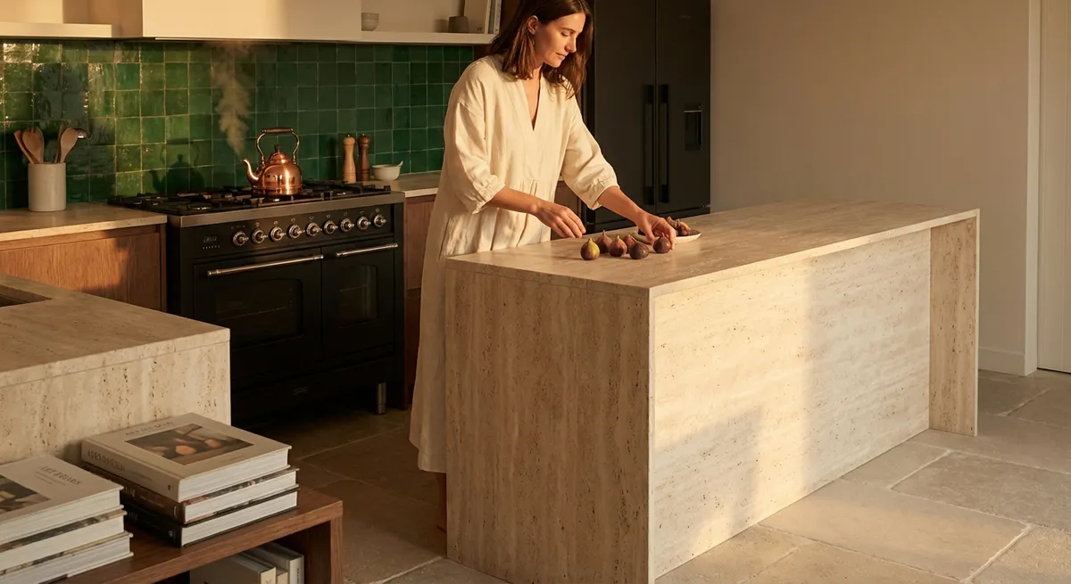
Light as a Material: Shaping Atmosphere with Tile Surface
Truly elevated tile design accounts not only for color and pattern, but also for how surfaces receive and release light throughout the day. The same tile can appear dramatically different at dawn, midday, and evening if its finish and relief are carefully chosen.
In rooms with strong natural light, a high-gloss tile with gentle surface variation can scatter reflections in a way that feels almost liquid, especially behind a kitchen range or in a shower niche. Conversely, in more controlled, moody spaces—a library-style bathroom, a small powder room off a corridor—a soft matte or satin finish absorbs light and creates depth without glare.
Consider directional glazing or subtle ribbed textures on wall tiles. When paired with thoughtfully placed sconces or concealed LED strips, the ridges catch light, creating a play of shadow that makes even a monochrome palette feel layered and dynamic.
Don’t overlook ceiling height and window orientation. A north-facing room with cooler light might benefit from warmer-toned tiles with a softly reflective finish to compensate; a south-facing bath flooded with sun can be calmed by velvety, low-sheen tiles that quiet the brightness.
Exclusive Insight #2: Treat incident light as part of your material palette. Before committing, view tile samples vertically and horizontally in your actual space at different times of day—the most refined schemes are chosen not just by color card, but by how they perform in real light.
Proportioned Patterns: Tailoring Scale to Architecture
An elegant tile installation feels proportionate to the room’s architecture—never too busy, never too sparse. Mastering scale is one of the most underestimated aspects of tile design and one of the clearest markers of a carefully considered home.
In grand spaces or long corridors, overly small patterns can quickly become visual noise. Larger format tiles, elongated rectangles, or broad, understated terrazzo can maintain calm while still adding interest. In compact spaces, such as powder rooms or entry vestibules, a finer pattern can bring intimacy and a jewel-box quality.
Think beyond the individual tile and focus on the repeat. A bold veined marble-effect porcelain, for example, demands attention to how veining lines flow from one tile to the next—whether they bookmatch, run diagonally, or create a gentle, organic rhythm. Improperly aligned patterns can undermine an otherwise premium specification.
Balance pattern intensity across the home. If a kitchen floor uses an expressive pattern, consider quieter, larger-format tiles for the adjacent hallway. This maintains an overall sense of cohesion and restraint, while allowing each space its own character.
Exclusive Insight #3: Design pattern at the room scale, not sample scale. Lay out full repeats (physically or digitally) and study how the pattern reads from the main viewpoint of entry; the most elevated spaces feel composed when the eye encounters intentional alignments rather than accidental ones.
Architectural Framing: Tiles as Quiet Millwork
Tile can do more than cover planes; it can frame, outline, and emphasize the architecture in ways that recall classic millwork or stone detailing. This approach elevates everyday zones—showers, backsplashes, fireplaces—into architectural features.
Consider “framing” a shower wall with a border of contrasting tile format or finish, much like a picture frame. The interior field can be quieter, while the border adds definition without feeling decorative for its own sake. Similarly, a fireplace surround can be refined by using slim, elongated tiles mitred at the edges to create clean, stone-like profiles.
In kitchens, tile can replace or complement traditional wood trims. A subtle border of slim mosaic or narrow pencil tiles can delineate the edges of a backsplash, align with the underside of cabinetry, or trace the line of a floating shelf. These details create a sense of tailored completion similar to fine joinery.
For window reveals in bathrooms or kitchens, continuing the tile into the recess (rather than stopping at the face of the wall) adds depth and integrates the opening as part of the overall composition. With careful edge details—bullnose, mitred corners, or dedicated trim profiles—the window becomes a considered element, not a disruption.
Exclusive Insight #4: Think of tile as architectural trim. Use it to outline, frame, and complete junctions—at windows, recesses, fireplaces, and built-ins—so surfaces read as part of the architecture, not an afterthought.
Harmonized Grout: The Invisible Design Lever
Grout is often treated as a purely technical decision, but in a refined scheme it functions as an essential design tool. Its color, joint width, and consistency can either amplify or quiet a tile pattern, impacting how polished or relaxed a space feels.
For a seamless, monolithic effect—especially with stone-look or large-format porcelain—select a grout tone that closely matches the tile body. This minimizes visual fragmentation and reads as a continuous surface. In contrast, slightly contrasting grout can celebrate the geometry of smaller subway tiles or mosaics, if done with restraint.
Joint width should be proportional to tile size and aesthetic intent. Narrow joints feel precise and contemporary; slightly wider ones can introduce a subtle artisanal softness, especially with handmade or zellige-style tiles where variation is part of the appeal. The key is consistency: irregular joints distract from even the most beautiful tile.
Consider maintenance alongside appearance. In high-use areas like kitchen floors or family baths, mid-tone grout colors can gracefully conceal daily wear better than pure white or very dark shades, all while maintaining a refined look.
Exclusive Insight #5: Decide what you want the eye to register first: form or field. If you want the pattern to recede and the surface to feel calm, align grout closely to tile and tighten joints. If you want to celebrate the layout rhythm, introduce gentle contrast—but never so much that the grout becomes the focal point.
Conclusion
A truly elevated tile scheme is less about spectacle and more about precision—of scale, light, transitions, framing, and the often-overlooked details like grout. When each of these elements is treated as part of a single composition, the result is not just a beautifully tiled room, but a home whose surfaces feel quietly bespoke.
Approach your tile decisions as an architect might: how will people move, where will light fall, what should feel emphasized or softened? In doing so, you transform tile from background material into a finely tuned instrument—one that plays in harmony with the rest of your home.
Sources
- [Tile Council of North America (TCNA) – Handbook & Technical Resources](https://www.tcnatile.com/technical-main.html) - Authoritative guidelines on tile installation, grout joints, and best practices for long-lasting, high-quality work
- [Ceramic Tile Education Foundation (CTEF)](https://www.ceramictilefoundation.org/blog) - In-depth articles on professional tile setting standards, layout considerations, and detailing
- [American Society of Interior Designers (ASID) – Design Trends & Resources](https://www.asid.org/resources) - Insights on how materials, including tile, influence spatial experience, light, and movement
- [University of Massachusetts Amherst – Daylighting & Design](https://www.umass.edu/sustcomm/daylighting) - Background on how natural light behaves in interior spaces, informing decisions about tile sheen and texture
- [U.S. General Services Administration – PBS Tile and Stone Design Guide](https://www.gsa.gov/technical-procedures/tilestone-interior-design-guide) - Government design guidance on stone and tile applications, proportion, and performance in architectural settings