Below are five exclusive, design-forward insights for homeowners who expect more from their tile work than simple durability. Each idea is crafted for those who appreciate subtle luxury, precision detail, and spaces that reveal themselves slowly rather than all at once.
1. Treat the Floor as a “Field” and the Walls as “Frames”
In sophisticated spaces, tile is not chosen in isolation; it’s curated as part of an architectural composition. One of the most powerful moves is to think of the floor as a continuous “field” and the surrounding walls, millwork, and thresholds as “frames” that define and elevate that field.
A restrained, continuous floor tile—especially in large format or elegantly proportioned rectangles—creates visual calm. Then, rather than competing with it, the walls and built-ins become quiet frames: painted plaster, rich wood, or stone details that respect the floor’s geometry. This approach is particularly effective in open-plan spaces where tile transitions seamlessly from a kitchen into a scullery, or from an entry hall into a powder room.
The key is continuity. Keep floor grout lines aligned from room to room wherever possible, and resist unnecessary pattern changes at every doorway. You might subtly shift tone or finish in secondary spaces—say, from a honed to a lightly textured variant of the same tile—to give each area a distinct character while preserving the architectural “field” beneath it.
Exclusive insight: Ask your installer to lay out the entire floor plan to scale on paper (or in CAD) with tile joints mapped before any tile is ordered. This ensures transitions, thresholds, and room centers align gracefully rather than by chance.
2. Use Light First, Color Second
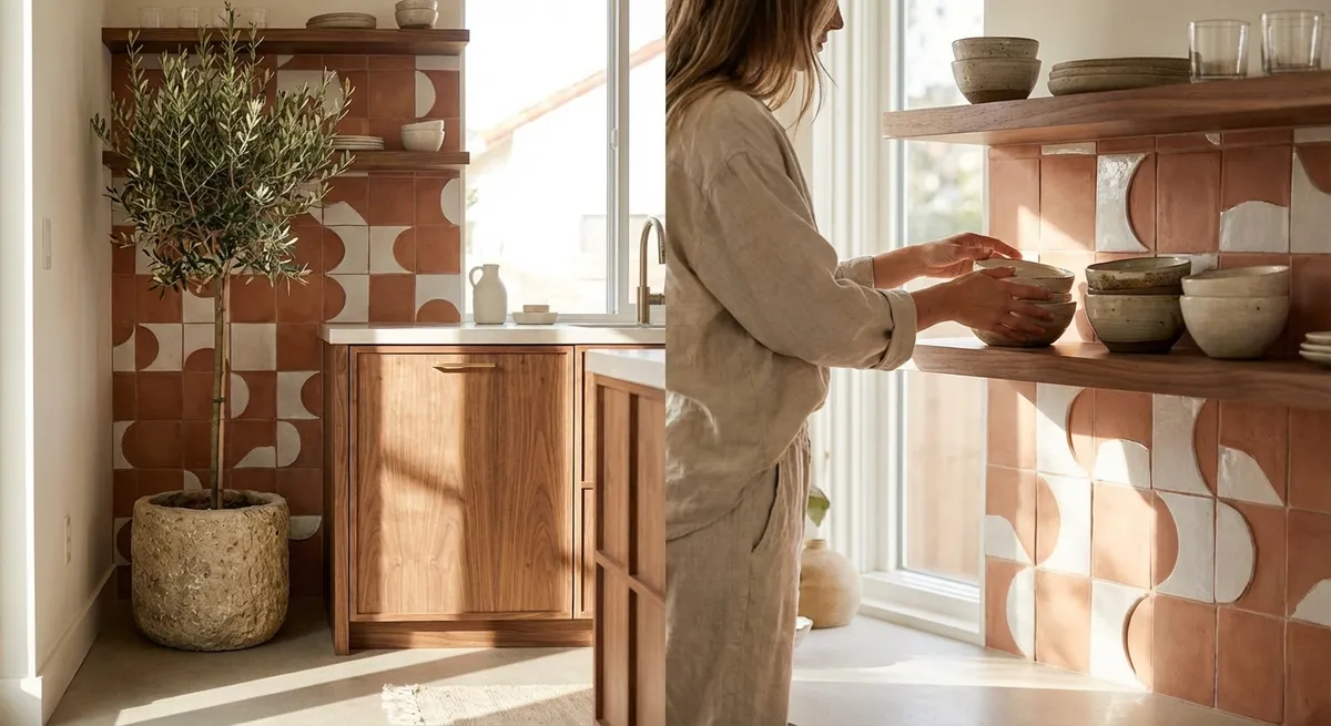
Most tile selections start with color; refined tile design starts with light. How a tile receives natural and artificial light throughout the day is more important than its color chip under showroom LEDs.
In a room with abundant daylight, a softly honed, pale stone or porcelain with subtle movement can act as a light box, amplifying the brightness without glare. In more intimate spaces—like a windowless powder room—matte or satin-finished tiles in deeper tones absorb and soften light, making the space feel intentional rather than simply small.
It’s also useful to consider directional light. Linear wall sconces will read differently on deeply textured tiles than on smooth, large-format panels. A sculpted or fluted tile can create shifting shadow lines that add quiet drama, while a high-gloss ceramic can mirror points of light and lend a jewelry-like quality to a backsplash or niche.
Exclusive insight: Before committing, tape tile samples vertically and horizontally in the actual space and view them at three times of day—early morning, midday, and evening with all artificial lights on. Choose based on how the tile behaves with light rather than how it looks under a single condition.
3. Let Grout Become a Deliberate Design Element
In premium projects, grout is never an afterthought—it is a design instrument. The ratio between tile and joint, and the degree of contrast between them, can shift a space from quiet to graphic.
A tone-on-tone grout (matched carefully to the tile) creates a monolithic, almost seamless plane—ideal for minimalist interiors and large-format installations. Slightly contrasting grout, perhaps one or two shades darker or lighter, can gently articulate the pattern without overwhelming it. High contrast grout, on the other hand, emphasizes geometry and rhythm, and is best reserved for spaces where a strong graphic statement is intentionally desired.
Joint width is equally critical. A slim, consistent joint conveys precision and luxury. Wider joints can suit rustic or handmade tiles, where the irregularity of the edge is part of the charm. In either case, the grout color should be tested on a small mock-up; a half-shade difference can transform the personality of the tile.
Exclusive insight: Request a sample board from your installer using your actual tile with two or three grout colors and joint widths. Photograph the board in your space and place it against adjacent finishes (cabinetry, wood, paint) to ensure the grout supports the full palette, not just the tile.
4. Design Transitions as Moments, Not Afterthoughts
Elegant tile work is often defined less by the tile itself and more by how it starts, stops, and transitions. Door thresholds, stair nosings, shower entries, and the meeting points between tile and other materials are where a project either feels bespoke or merely “finished.”
Instead of using generic metal trims everywhere, consider custom stone thresholds, flush transitions, or a carefully aligned border tile that visually “stitches” two materials together. For example, a stone or porcelain slab cut as a monolithic stair tread can make a staircase feel sculptural, while a slim inlay strip at the edge of a tiled entry hall can provide a natural visual boundary without the cliché of a busy medallion.
For wet areas, recessing floor drains into linear slots along the perimeter, or using tileable drains that accept a full tile piece, preserves the continuity of the floor and avoids visual disruption. Similarly, stopping a shower wall tile at a carefully determined vertical line that aligns with a window jamb or vanity edge brings a sense of architectural intention.
Exclusive insight: During planning, ask your designer or installer to create a “transition schedule” that lists every point where tile meets another material (wood, carpet, stone, glass). Each line on that schedule should have a deliberate detail (flush, overlap, reveal, or trim type) rather than a default solution chosen onsite.
5. Compose Depth with Mixed Finishes, Not Just Mixed Materials
A refined interior doesn’t necessarily require a multitude of different tiles; it often relies on a restrained palette used intelligently. One sophisticated approach is to work with a single tile collection in multiple finishes and scales, rather than introducing many unrelated materials.
For example, a limestone-look porcelain might appear in a large-format matte tile on the floor, a smaller honed version in the shower floor, and a structured or textured version on a single feature wall. The eye reads the continuity of material, while the subtle changes in scale and sheen create depth and hierarchy.
This strategy works beautifully in kitchens, baths, and entries. You might run a large-format tile on the floor, a thin stacked mosaic of the same material as a backsplash, and a polished slab version on the countertop. The space feels layered yet coherent, and maintenance remains simpler because surfaces behave similarly in terms of cleaning and durability.
Exclusive insight: When selecting tile, ask whether the line includes coordinating mosaics, trims, and slabs in multiple finishes. Build your design around one or two core materials and let the variation in size, finish, and application define the architecture of the space rather than constantly introducing new looks.
Conclusion
Exceptional tile design is rarely about spectacle. It’s about measured decisions: how planes connect, how light moves across surfaces, how each detail contributes to a sense of composure and quiet luxury. By treating floors as fields and walls as frames, prioritizing light over color, elevating grout to a design element, choreographing transitions, and working intelligently with a restrained material palette, you transform tile from backdrop to architecture.
For homeowners who value refinement, these insights are less about trends and more about longevity—spaces that feel considered today and enduring tomorrow. With thoughtful planning and meticulous execution, your tiled surfaces can become the calm, curated foundation of a truly distinguished home.
Sources
- [Porcelain Tile Selection Guide – The Tile Council of North America](https://www.tcnatile.com/faqs/37-porcelain-tile.html) – Technical background on porcelain tile characteristics, performance, and appropriate applications
- [Flooring, Finishes, and Interior Design – National Institute of Building Sciences](https://www.wbdg.org/design-disciplines/interior-design) – Guidance on how finishes, including tile, impact interior design, light, and spatial perception
- [American Society of Interior Designers (ASID) – Design Impacts Lives](https://www.asid.org/resources/impact-of-design) – Research and insight into how well-considered design and material choices influence the experience of interior spaces
- [Ceramic Tile, Stone, and Grout Design Considerations – Schluter Systems](https://www.schluter.com/schluter-us/en_US/education/architects) – Technical resources on transitions, movement joints, and detailing that support elevated tile installations
- [International Masonry Institute – Tile and Stone Technical Resources](https://masonryinstitute.org/tile-and-stone/) – Best practices for tile layout, substrates, and detailing used in high-quality installations