Composed Fields: Treating Tile as Architectural Mass, Not Decoration
In refined homes, tile rarely appears as a decorative afterthought. Instead, it behaves like an architectural mass—continuous, intentional, and proportioned as carefully as millwork or stonework.
Begin by thinking in “fields” rather than “areas.” A shower isn’t simply tiled; it’s conceived as a single, continuous tiled volume that may wrap the ceiling or return onto an adjacent wall. A kitchen backsplash doesn’t stop where the upper cabinets end; it may extend to the ceiling, or terminate at a deliberate vertical line aligned with a window or doorway.
Pay particular attention to terminations. Edge profiles (miters, bullnoses, or metal trims) should feel invisible, serving to complete the field rather than announce the transition. When possible, turn corners with full tiles rather than slivers—this preserves a sense of solidity and craftsmanship.
Consider continuity across spaces as well. Running the same floor tile from a kitchen into a mudroom, or extending a bathroom floor into the shower with a subtle shift in scale, can create a calm, architectural rhythm. The goal is for tile to read as part of the structure of the home, not as an applied graphic.
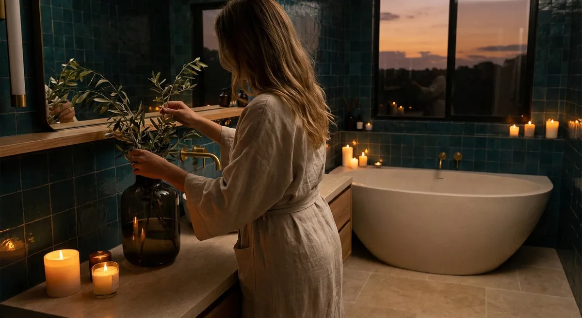
Intelligent Light Play: Using Finish and Format to Sculpt Atmosphere
Light will reveal more about your tile choices than any showroom vignette. The most sophisticated interiors use tile not just for durability, but as a surface that manages reflection, shadow, and depth.
In spaces that receive strong natural light, slightly textured or matte tiles can diffuse glare and create a gentle, tactile glow. Handmade or hand-look tiles, with their minor irregularities, can catch light in a way that feels almost luminous, especially when installed with tight, carefully aligned joints. In darker rooms, a satin or semi-polished finish can help bounce available light without producing harsh reflections.
Format also affects perception of light. Larger tiles reduce grout lines, which can make a room feel quieter and more expansive, but they can also flatten light. Introduce movement through subtly varied tones or a faint veining pattern to keep large expanses from feeling lifeless. In contrast, smaller formats—mosaics, herringbone, or slim planks—break up light into finer highlights and shadows, adding visual intimacy.
Think about directional light: wall tiles with linear textures or ribbing are especially effective when installed perpendicular to a window, so daylight grazes across the surface and emphasizes the relief. In evening settings, under-cabinet or cove lighting can be positioned to skim tiled walls, turning an everyday backsplash or shower wall into a softly illuminated backdrop.
Grout as a Design Instrument, Not a Necessary Compromise
In elevated projects, grout is never an afterthought. It’s one of the most powerful—and most underused—tools for controlling how tile reads in a room.
When tile and grout are closely matched, the surface becomes more monolithic and serene. This is ideal for spaces where tile is meant to recede and allow other elements—art, furniture, landscape views—to take the lead. Conversely, a slightly contrasting grout can articulate the module of each tile, emphasizing patterns like chevron, basketweave, or classic running bond.
The key is restraint. Extreme contrast (for example, bright white tile with stark black grout) quickly feels graphic and trendy. For a more enduring aesthetic, select grout that is one to two tones away from the tile—just enough contrast to reveal the pattern without shouting. In natural stone or stone-look installations, pull a grout tone from the stone’s secondary hues rather than its dominant field color.
Joint width and layout also convey intent. Narrow joints (1/16"–1/8") read as tailored and precise, particularly with rectified porcelain, whereas wider joints can feel more relaxed and traditional. Align grout joints with architectural axes—window mullions, door casings, countertop edges—so that the geometry of the tile quietly supports the geometry of the room.
Layered Luxuries: Combining Tile Types Without Visual Noise
A refined tile scheme doesn’t rely on a single “hero” material; it balances several, orchestrated in a way that feels layered rather than busy. The difference lies in hierarchy, scale, and repetition.
Start by defining a dominant surface. This is usually the flooring or the primary wall area—something calm, often in a neutral tone with a subtle texture or veining. Then, introduce a secondary tile that either shifts in scale (larger or smaller), sheen (matte vs. honed or polished), or format (plank vs. square), but remains within the same tonal family. This relationship creates visual depth without fragmentation.
Reserve a third, more expressive tile for a very targeted application: the back panel of a niche, the interior of a shower bench, the wall behind a vanity mirror, or the hearth surround. Limiting this more characterful tile (bolder pattern, richer color, or stronger veining) to smaller, strategic areas turns it into a quiet moment of focus rather than visual clutter.
The most successful layered schemes also repeat elements. If a marble mosaic appears on a powder room floor, echo that stone on the primary bathroom vanity top or in a kitchen detail. If a subtle green wall tile appears in a laundry room, allow that same green to appear in textiles or cabinetry hardware elsewhere. Cohesion comes from repetition and restraint, not from matching every surface.
Future-Proof Elegance: Designing Tile Choices for the Next Decade
True luxury often reveals itself in how gracefully a space ages. Tile is among the most enduring materials in a home; designing with longevity in mind is as much a stylistic decision as it is a practical one.
Instead of chasing fleeting tile trends, focus on timeless structures: elongated rectangles, squares, understated chevrons, and classic mosaics such as hexagon or basketweave. These formats have existed for decades (often longer) and can adapt to evolving decor around them. Color can absolutely play a role, but anchor major surfaces in tones drawn from nature—stone grays, soft whites, clays, greens, and warm neutrals tend to age more gracefully than saturated novelty hues.
Think beyond current ownership. A thoughtfully tiled shower with impeccable waterproofing, aligned grout, and durable porcelain in a classic format is a feature that will still feel considered to a future buyer. So will heated tile floors with programmable thermostats, especially in primary suites and entryways. These are not just stylistic flourishes; they’re functional luxuries that extend your home’s appeal and comfort.
Finally, respect the technical side of tile as deeply as the aesthetic. Ask for proper substrate preparation, appropriate setting materials, and movement joints where required. Specify slip resistance for floors, especially in wet areas. Elegant tile work is not only about what you can see; it’s about the quiet assurance that the installation behind the surface is as disciplined as the design in front of it.
Conclusion
When approached with intention, tile becomes more than a finish—it becomes a framework for how your home feels, functions, and endures. By treating tile as architectural mass, harnessing light with considered finishes, using grout as a deliberate design tool, layering materials with hierarchy, and planning for longevity, you create interiors that feel both quietly luxurious and deeply resolved. These are spaces that don’t shout for attention, yet remain compelling long after the latest trend has passed.
Sources
- [American Society of Interior Designers (ASID) – Trends Report](https://www.asid.org/resources/resources/view/resource-center/2024-trends-outlook) – Professional insight into long-term interior design directions and client preferences
- [Tile Council of North America (TCNA) – Handbook for Ceramic, Glass, and Stone Tile Installation](https://www.tcnatile.com/handbook.html) – Technical standards and best practices for high-quality, durable tile installations
- [Ceramic Tile Education Foundation (CTEF)](https://www.ceramictilefoundation.org/blog) – Articles on craftsmanship, installation details, and why technical precision matters in premium tile work
- [National Kitchen & Bath Association (NKBA) – Design Resources](https://nkba.org/resources) – Guidance on kitchen and bath planning, including surfaces, lighting, and long-term usability
- [University of Minnesota Extension – Durable and Sustainable Flooring Choices](https://extension.umn.edu/materials-design/durable-and-sustainable-flooring-choices) – Research-based overview of flooring materials, including tile, with attention to longevity and performance