For homeowners who expect more than “nice tile,” these five insights move beyond trends and into the realm of composition, craftsmanship, and enduring elegance.
1. Treat the Floor Plan as a Canvas, Not a Grid
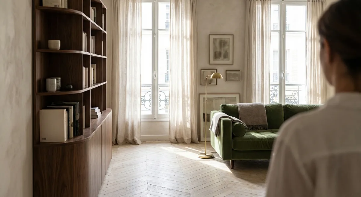
Sophisticated tile design begins long before the first box is opened. Instead of defaulting to a standard grid, consider how tile can choreograph movement and define zones within an open plan.
Think of the floor as a single composition. Allow tile patterns to align with architectural axes: sightlines from entry to windows, central circulation paths, or key focal points like a fireplace or range hood. You might rotate a herringbone pattern to direct the eye toward a garden view, or center large-format slabs on a room’s main axis so grout lines feel intentional rather than arbitrary.
Subtle shifts between tile formats—say, a large-format porcelain in the living area and a smaller, textured tile in the adjacent dining space—can delineate zones without adding walls or thresholds. The result is a plan that feels artfully layered rather than visually busy.
When planning, ask your installer to overlay tile joints on scaled floor plans and elevations. This level of precision ensures that lines meet at doorway transitions, island bases, and tub fronts, creating a continuous, composed visual flow throughout the home.
2. Elevate Grout from Afterthought to Design Element
In luxury projects, grout selection can be almost as consequential as the tile itself. A half-shade difference can shift a room from serene to fragmented.
For a monolithic, gallery-like effect, specify grout that closely matches the tile body. This allows the surface to read as a single plane, especially important for large-format tiles or stone-look porcelains. In contrast, a slightly deeper or lighter grout can outline each tile just enough to emphasize pattern—beautiful for chevron, basketweave, or classic subway layouts.
Joint width is equally critical. Narrow, well-executed joints (often 1/16" to 1/8", where the tile allows) suggest precision and tailor-made quality. Wider joints can feel rustic by design—but when they’re unintentional, they read as compromise rather than character.
Consider grout performance as well as appearance. Epoxy and high-performance cementitious grouts resist staining in kitchens and baths, protecting both aesthetics and hygiene. A premium interior should look composed not only on installation day, but years later, under real use and scrutiny.
3. Compose Surfaces with Subtle Material Contrast
Refined tile design rarely relies on a single “wow” moment. Instead, it layers subtle contrasts in sheen, texture, and tone to create depth that feels effortless.
Think in terms of “quiet contrast.” Matte porcelain on the floor paired with a soft-sheen glaze on the walls allows light to play gently across surfaces without becoming reflective or harsh. A honed stone-look tile beside a delicately striated porcelain creates interest through texture rather than color alone.
Monochromatic palettes can be elevated by varying finish and scale: oversized tiles on the main floor, a slightly smaller format on the shower walls, and a structured (textured) tile at the niche or feature wall—all within the same color family. This approach avoids the patchwork effect that often comes from too many competing tiles.
For transitional spaces—entries, mudrooms, powder rooms—consider one “statement” tile balanced by restrained companions. A geometric mosaic on a small floor can be grounded by large-format, low-contrast wall tiles, so the room feels curated rather than themed. The most successful schemes feel like a collection, not a catalog.
4. Align Transitions with Architecture, Not Just Walls
The true test of high-level tile work is often found at the edges: where tile meets other materials, and where different tiles meet each other. These transitions are where many interiors lose their sense of refinement.
Base your transitions on architectural logic rather than arbitrary wall breaks. For example, shift from tile to wood at the centerline of a doorway or aligned with a ceiling beam, not randomly under a door leaf. Allow shower tile to stop in line with a window jamb or built-in edge, creating a satisfying visual rhythm.
Metal trims, when used thoughtfully, can be a subtle jewelry-like detail rather than a distraction. Choose finishes that coordinate with hardware and plumbing—brushed nickel, warm bronze, or blackened metal—and specify minimal, squared-edge profiles for a contemporary, tailored look.
In wet areas, niche placement and tile continuation are key. Align niches with grout joints; run wall tile cleanly into window reveals instead of stopping short with exposed edges. These decisions signal a deliberate, custom approach where every junction has been considered.
5. Use Light and Reflection as Silent Collaborators
The most sophisticated tile schemes are composed with light in mind—both natural and artificial. Instead of simply choosing a tile you like under showroom fluorescents, consider how it will perform in your specific light conditions throughout the day.
Gloss and semi-gloss tiles can amplify limited natural light, especially in compact powder rooms and internal bathrooms. Installed on a feature wall opposite a window, a subtly reflective tile can bounce light into the space, making it feel more generous. However, on floors or in very bright rooms, high gloss may introduce glare and visible footprints; a low-sheen, honed, or satin finish often reads more luxurious.
Directional lighting can enhance texture. Washing a sculpted or ribbed wall tile with a linear wall washer will accentuate its relief and create gentle shadows—ideal behind a freestanding tub or along a corridor. Conversely, strong spotlights can emphasize lippage or uneven joints; for large-format compositions, specify exceptionally flat substrates and qualified installers to maintain visual calm.
When evaluating samples, place them in the intended room, at scale if possible, and view them under day and evening lighting. The most enduring choices feel tranquil and balanced across all conditions, not just in an idealized showroom snapshot.
Conclusion
Exceptional tile work is less about dramatic gestures and more about the discipline of quiet decisions—alignment, proportion, grout tone, transitions, and the choreography of light. When these elements are composed with intention, the result is a surface that feels inevitable, as though it belongs to the architecture rather than merely decorating it.
For homeowners, engaging with tile at this level turns a renovation into a design collaboration. You’re not simply choosing “pretty tile”; you’re authoring a refined, cohesive experience underfoot and at eye level—one that will feel considered and current not just this season, but for years to come.
Sources
- [Ceramic Tile Education Foundation (CTEF) – Technical Resources](https://www.ceramictilefoundation.org/blog) - Offers professional guidance on tile installation standards, grout joints, and substrate preparation, underpinning many of the technical considerations discussed.
- [Tile Council of North America (TCNA) Handbook](https://www.tcnatile.com/technical-services/publications/handbook.html) - Industry reference for layout planning, transitions, and performance standards that support high-end tile design.
- [American Society of Interior Designers (ASID) – Design Trends and Insights](https://www.asid.org/resources/resources) - Provides context on how contemporary luxury interiors use materials, light, and proportion, relevant to the design principles in this article.
- [Porcelanosa – Tile Collections & Technical Information](https://www.porcelanosa.com/uk/tiles/) - Showcases real-world examples of finish, format, and texture combinations used in sophisticated tile compositions.
- [University of Nebraska–Lincoln, Lighting Design Basics](https://extensionpublications.unl.edu/assets/pdf/g1962.pdf) - Explains how light interacts with surfaces and finishes, supporting the discussion of sheen, reflection, and tile under different lighting conditions.