At Tile Pro Tips, we see the same principles at work every day in high‑end tile installations. The rooms where a dog can disappear into the background are often the rooms where design has been handled with the most intention. The alignment of grout lines, the subtle shift in tone, the way light moves across a matte surface—these are the quiet decisions that give a home its character.
Below are five exclusive, timely insights inspired by the #HiddenDog trend that you can apply directly to your next tile project—whether you want your floors to frame a photogenic pup or simply elevate the everyday.
1. Camouflage as a Design Strategy, Not a Gimmick
What the #HiddenDogChallenge demonstrates, over and over, is how well-composed pattern can visually “swallow” an object without feeling chaotic. The most shared images aren’t messy—they’re meticulous. Rugs echo wall tones, throws mirror sofa hues, and the dog becomes a charming detail rather than visual noise.
Translate that to tile by thinking of camouflage as serenity, not clutter. For pet‑friendly or family‑heavy spaces, select tiles whose color and pattern quietly absorb minor imperfections: pawprints, crumbs, or the inevitable scuff. A terrazzo-look porcelain or a finely speckled stone-effect tile, for example, softens visual contrast so the eye reads the whole surface, not every footprint. This is the same principle that helps those hidden dogs disappear into rich textures: variation without harsh contrast.
For homeowners, the luxury isn’t only look—it’s forgiveness. A refined, softly variegated floor allows life to happen without your space looking perpetually “in progress.” In photos, these surfaces read as high-end; in daily life, they read as calm.
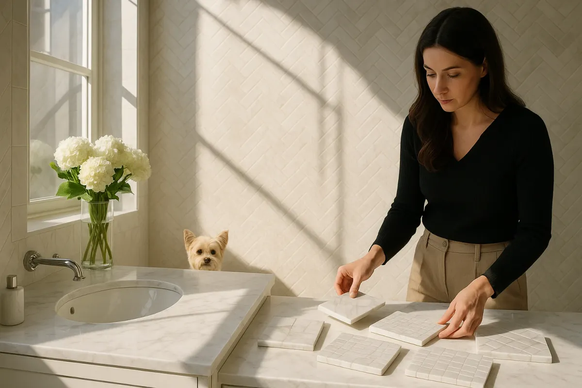
2. Pattern Scale: The Secret Behind “Where Did The Dog Go?”
In many of the viral photos, the dogs vanish because the scale of their markings matches the scale of the surrounding patterns. A spotted dog on a small-scale dotted rug becomes visual static; a dark dog on a broad, sweeping shadow of a wall nearly disappears.
When planning tile, this balance of scale is one of the most powerful tools you have—and it is frequently overlooked in residential projects. For a premium, designer-level result:
- In small powder rooms, consider larger-format tiles with broad veining or wide, soft patterning. They visually expand the envelope and prevent the room from feeling noisy.
- In expansive kitchens or great rooms, introduce mid- to small-scale pattern—such as subtle chevrons, parquet‑style layouts, or understated mosaics—to keep the space from feeling flat on camera and in person.
Think of it as calibrating your backdrop. Just as a medium‑pattern rug is ideal for making a mid‑sized dog “disappear” in a photograph, a carefully chosen tile scale ensures your cabinetry, art, and furnishings are hero elements—not lost, not shouting, but effortlessly framed.
3. Layered Neutrals: Why Viral Interiors Feel So Photogenic
Scroll through the Dogspotting Society posts and you’ll notice a recurring palette: layered neutrals with one or two deliberate accents. Cream walls, taupe throws, warm oak, sand-colored tiles—and then a collar, a toy, or a set of brass fixtures that quietly spark.
In high-end tile work, this “layered neutral” approach is a hallmark of quiet luxury. The nuance is in the undertones:
- Pair warm-beige limestone looks with honeyed wood and soft white walls for a sunlit, European feel.
- Use cooler greige or stone-gray porcelain with black steel and crisp white grout for a more architectural, gallery-like composition.
- Mix matte and honed finishes within the same color family—matte wall tile against honed floors—to build depth without adding more color.
The camera loves this. So does the human eye. Dogs, with their natural coats, simply become another warm element in the palette rather than high-contrast distractions. For homeowners, this means that your tile choices won’t fight with future furniture swaps, seasonal décor, or an ever-changing roster of pet accessories.
4. Zoning With Tile: Creating “Dens” Your Pets Naturally Choose
If the #HiddenDogChallenge has proven anything, it’s that animals instinctively seek textural safety—corners with softness, warmth, and a clearly defined edge. They curl up where surfaces change, where a rug meets a floor or a pillow meets a sofa.
You can design this instinct directly into your home with strategic tile zoning:
- Define a pet-friendly “den” area in an open-plan living room with a slightly deeper-toned tile inset bordered by a slim metal or stone trim. It reads as custom millwork for the floor, yet functions as your dog’s preferred zone.
- In an entry, frame a mudroom-style landing pad with more textured, slip-resistant porcelain for wet paws, then transition to a smoother main-floor tile. The change underfoot—both for you and your pets—signals function without visual clutter from rugs.
- On a patio, shift from a large-format stone-look tile to a subtly patterned or fluted outdoor tile under a bench or daybed. Pets will gravitate there, and your eye reads the area as a curated outdoor “room,” perfect for photographs.
These are not gimmicks; they’re architectural signals that make your home feel intentional and grounded. And in photos—the language of social media—they create layered compositions where every element, even the dog on his favorite tile patch, feels thoughtfully placed.
5. Designing for the Lens: Tile That Elevates Everyday Photos
The #HiddenDogChallenge reminds us that homes are now lived in and documented. Friends might never visit your mudroom, but thousands can see it in a single Instagram Story. The most shared hidden-dog images have three things in common: controlled light, coherent surfaces, and one fascinating detail.
Apply that discipline when you’re choosing and placing tile:
- Consider where natural light lands at different times of day and choose finishes accordingly. A heavily polished marble effect under direct afternoon sun can glare on camera; a fine-matte or silky honed surface translates with depth and softness.
- Use grout as a design tool, not an afterthought. High-contrast grout emphasizes geometry (perfect for a statement backsplash), while low-contrast grout creates a continuous field that makes rooms feel calm and expensive.
- Introduce one “hidden surprise” in tile—a border that only reveals itself close up, a subtly textured niche in a shower, or a quiet herringbone inlay under a dining table. These are the moments that feel discoverable in photos, the spatial equivalent of spotting the well-camouflaged dog.
By designing with the lens in mind, you don’t create a show home; you create a home that records beautifully—birthdays, quiet mornings, and yes, those perfectly timed #HiddenDog photos where everything, including the background, looks impeccably considered.
Conclusion
The global affection for the #HiddenDogChallenge isn’t just about cute animals; it’s about the delight of discovering something cleverly integrated into its surroundings. In the world of tile, that same delight comes from a floor that calms rather than shouts, a backsplash that frames rather than competes, and a bathroom where light, texture, and pattern feel quietly choreographed.
When you plan your next tile project, borrow from the spaces where dogs disappear: embrace subtle pattern for forgiveness, tune the scale to your room, layer neutrals with intent, carve out zones that feel like dens, and remember that your surfaces are now part of your home’s visual story online. The result is not just pet-friendly or photo-ready—it’s deeply, durably luxurious.