Below are five exclusive, deeply considered design insights that elevate tile from “nice” to quietly unforgettable.
1. Curated Continuity: Using Tile to Guide the Eye, Not Dominate It
One of the most powerful ways to use tile in a refined home is not as a focal point, but as a thread that quietly links adjacent spaces. Continuity does not mean repetition; it means controlled variation around a clear idea.
Consider establishing a single “hero” material—perhaps a honed limestone-look porcelain in a restrained tone—and allowing that tile to appear in different scales, finishes, or layouts throughout the home. In an entry, it may be laid in a classic grid. In a powder room, cut to smaller rectangles in a herringbone. In a primary bath, used as large-format wall panels with minimal joints. The eye registers a sense of belonging without consciously decoding why.
The key is to limit the palette and expand the expression. Two or three related tiles, used with discipline, almost always feel more luxurious than seven or eight competing choices. This approach also makes architectural transitions—hall to bath, kitchen to scullery—feel intentional, not improvised. Continuity, handled with restraint, turns tile into a narrative rather than a collage.
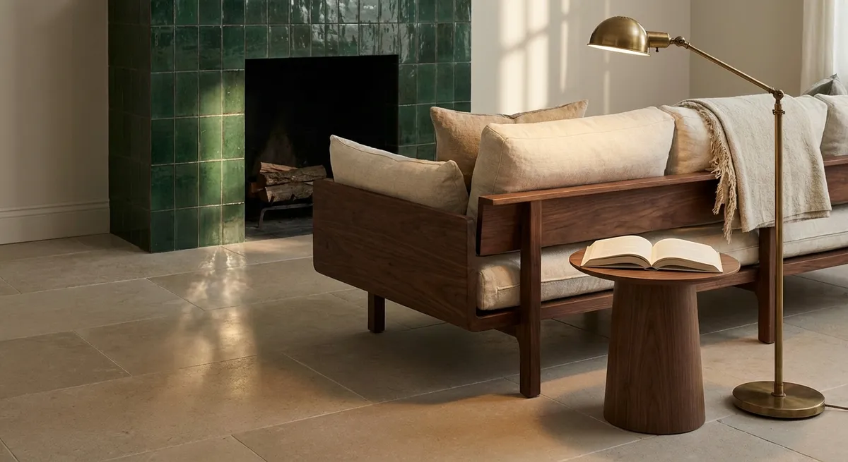
2. The Choreography of Light: Designing for Shadow, Not Just Color
Most homeowners select tile by color first, rarely considering how light will articulate its surface throughout the day. Sophisticated schemes begin with the opposite question: How will this tile behave under morning, midday, and evening light?
Matte and honed surfaces tend to create soft, velvety shadows—excellent for spaces meant to feel calm and cocooned, such as ensuites or spa-inspired showers. A gently textured matte tile will catch light in micro-relief, giving depth without glare. Conversely, high-polish finishes and mirrored mosaics can be extraordinary in small doses, but they demand carefully planned lighting to avoid harsh hotspots and visual fatigue.
Orientation matters as much as finish. A vertically ribbed or fluted wall tile in a shower niche, lit from above or the side, creates a refined play of shadow lines, instantly heightening the sense of detail. Large-format tiles on a sunlit floor will read as nearly monolithic planes of color—a serene counterpoint to more articulated walls. When you evaluate samples, move them under different light sources (daylight, warm LED, cool LED) and view them both flat and vertically. Luxury is often the result of having answered light before committing to color.
3. Micro-Patterning: Subtle Layouts That Whisper, Not Shout
Layout is where exceptional tile work quietly distinguishes itself. While bold patterns have their place, high-end rooms often rely on micro-patterning—layouts that are perceptible on a second or third glance rather than at first shock.
For instance, a floor in uniformly colored rectangular tiles might be laid in a stacked pattern in the main area, then quietly shift into a herringbone or basketweave as you approach a specific architectural moment—a fireplace, a soaking tub, a large window. The pattern becomes a spatial cue, guiding movement and anchoring focal points without relying on contrast or color changes.
Similarly, consider “ghost borders” created purely through layout: a subtly rotated band of tiles around a kitchen island, or a frame in front of a vanity where the pattern turns 90 degrees. These techniques evoke the tailored detailing of fine textiles and millwork. They also demand high-quality installation, precise cuts, and clear planning—exactly the kind of craftsmanship that distinguishes a premium home.
4. Tonal Pairing: The Discipline of Near-Match, Not High Contrast
Elevated tile design often resists sharp contrast in favor of finely tuned tone-on-tone palettes. This is less about playing it safe and more about giving the room longevity and a sense of calm authority.
Instead of pairing a white tile with a stark black grout, imagine an off-white tile with a warm greige grout just one or two steps darker. The joints remain legible, but they do not slice the surface into a grid. In a bath, a pale stone-look floor tile might be paired with wall tiles in the same undertone family but a half-step lighter, so the transition from vertical to horizontal feels naturally graded.
Where contrast is used, it should feel purposeful and concentrated. A strongly veined marble mosaic, for example, can be extraordinary when confined to a single, architecturally meaningful area—a shower floor, a backsplash niche, the risers on a single flight of stairs—while the surrounding surfaces remain quietly tonal. This restraint prevents the eye from fragmenting across the room and allows the home’s best details—views, art, bespoke cabinetry—to remain protagonists rather than competing with the tile.
5. Framed Moments: Architectural Jewelry in Tile Form
The most memorable tile interiors rarely rely on blanket application. Instead, they create a series of “framed moments” where tile acts like jewelry for the architecture—concentrated, precise, and flawlessly finished.
Think of a tall shower wall clad in large-format porcelain, with a single vertical inlay of mosaic running offset from center, echoing the line of the shower fittings. Or a kitchen backsplash where a slab-format tile extends behind the range to the ceiling, framed left and right by understated field tile. In an entry, a tiled “inset rug” defined by a slim border of contrasting trim can signal arrival while keeping the surrounding floor serene.
Framed moments depend on sharp detailing: mitred corners where appropriate, perfectly aligned grout joints, and carefully chosen edge treatments (bullnose, metal profiles, or stone pencil trims) that feel intentional rather than improvised. When these elements are resolved with precision, they communicate something quietly powerful—that the home has been considered not only at the scale of rooms, but at the level of millimeters.
Conclusion
Tile, when handled with this degree of thoughtfulness, becomes the quiet architecture of a room’s character. It guides movement, receives light, and signals care in ways that are immediately felt, even if not immediately analyzed. By seeking continuity instead of repetition, designing for light before color, adopting subtle patterning, embracing tonal discipline, and reserving strong statements for framed moments, homeowners can ensure their tiled spaces age with grace rather than date with fashion.
In the end, true luxury is not about having more tile or louder tile. It is about every piece, every joint, every transition feeling inevitable—because it has been chosen, and installed, with intention.
Sources
- [Ceramic Tile Trends – Tile Council of North America](https://www.tcnatile.com/industry-issues/trends-in-tile.html) - Industry overview of tile trends, materials, and performance considerations
- [Porcelain Tile Selection and Design – Crossville Inc.](https://www.crossvilleinc.com/Porcelain-Tile) - Technical and design insights on porcelain tile formats, finishes, and applications
- [Lighting for Residential Interiors – U.S. Department of Energy](https://www.energy.gov/eere/buildings/lighting) - Guidance on how different light sources affect surfaces and finishes in the home
- [Resilient and Hard Surface Flooring – U.S. EPA](https://www.epa.gov/indoor-air-quality-iaq/resilient-flooring-and-hard-surface-flooring) - Information on indoor air quality, materials, and health-related considerations for hard surfaces
- [Historic Tile and Stone Detailing – National Park Service](https://www.nps.gov/tps/how-to-preserve/briefs/40-ceramic-tile-floors.htm) - Preservation-focused discussion of tile layouts, borders, and detailing that inform timeless design