Designing with Light, Not Just Color
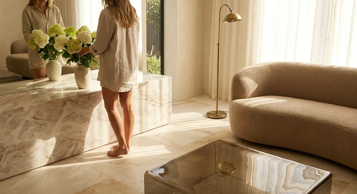
Most tile decisions begin with color charts. In truly elevated spaces, however, the starting point is light. How a tile receives, diffuses, or reflects light determines whether a room feels tranquil, expansive, or quietly dramatic.
Instead of asking “What color?” begin with “What kind of light will live here?” North-facing rooms often benefit from warmer-toned stone or matte porcelain that softens cool daylight. South-facing spaces can handle more contrast and even higher-gloss finishes, as the intense light is broken up across the reflective surface. In windowless corridors or powder rooms, a softly lustrous glaze can introduce an almost candlelit warmth, while honed finishes in naturally bright spaces keep glare in check.
Consider running sample tiles vertically and horizontally on-site for a full day to observe how morning, midday, and evening light shift the surface. The most expensive tile choice can fall flat if it fights the room’s light; a modest selection can look bespoke if it’s in quiet harmony with it. Professionals often talk about “light behavior” as much as pattern—and once you see it, you can’t unsee it.
The Power of Proportion: Scaling Tile to the Architecture
Sophisticated tile design feels inevitable, as if it could never have been done another way. That effect is rarely about cost; it’s about proportion. The relationship between tile size, grout line, and architectural scale is what makes a bathroom feel like a boutique spa or a foyer feel like a gallery.
In tall, narrow bathrooms, running rectangular tiles vertically can visually lift the ceiling while minimizing the sense of a “corridor.” In wide, low-ceiling rooms, generous-format tiles laid horizontally can stretch the perimeter and calm visual noise. Subtle shifts—like using a slightly slimmer grout joint in a modest kitchen—can suddenly make a standard subway tile feel impeccably tailored.
Pay particular attention to transition points: door thresholds, stair edges, window lines, and vanity bases. Aligning tile joints with these architectural elements creates a visual grid that reads as intentional and serene. The difference between “nicely tiled” and “architecturally resolved” often lies in these alignments—details that never announce themselves, but deeply influence how refined a room feels.
Texture as a Design Language, Not an Afterthought
Texture is often reduced to a choice between matte and glossy. In premium tile work, it becomes a design language in its own right—capable of shaping how a room feels underfoot, to the touch, and in one’s peripheral vision.
Very smooth, polished stone or porcelain communicates formality and lightness but can feel severe if used wall-to-wall. Introducing a honed or subtly textured tile in adjacent zones—a shower floor, mudroom entry, or hearth surround—adds tactile relief and improves slip resistance without interrupting the overall palette. This quiet interplay of finishes keeps a monochromatic or tone-on-tone scheme from feeling flat.
Ribbed, fluted, or softly dimensional wall tiles can introduce shadow and depth, especially when paired with carefully positioned lighting. In small spaces, a single textured feature panel—behind a vanity or framing a fireplace—can provide presence without pattern overload. The key is restraint: one or two deliberate textural statements, supported by calm, complementary surfaces, create a layered, collected atmosphere that never feels busy.
Five Exclusive Insights Discerning Homeowners Learn to Value
Beyond color and pattern, there are subtler, insider considerations that dramatically influence how tile performs and ages in a well-kept home. These five insights rarely make it into standard showrooms conversations but are consistently appreciated by homeowners who insist on elevated results.
1. The Joint Is a Design Element, Not Just a Gap
Grout color and joint width can sharpen, soften, or completely reframe a tile layout. A tone-on-tone grout dissolves grid lines and lets the tile read as a single field—ideal for serene, spa-like rooms. A slightly darker grout emphasizes geometry and craftsmanship, particularly with meticulous alignment. Choosing an epoxy or high-performance grout in visually quiet tones can also keep joints looking pristine for years, preserving the room’s composed appearance.
2. Edge Profiles Quietly Signal Quality
Cut edges, factory edges, and trim pieces behave differently in light and over time. Bullnose, mitred corners, and metal profiles all send different visual messages. Mitered stone or porcelain at niches and external corners reads as seamless and architectural but requires expert installation. Elegantly chosen trims—especially in showers and around windows—create a frame that finishes the room like custom millwork would.
3. Tile Layout Should Echo the Room’s Primary Axis
Before committing to a pattern, stand in each main entry point to the room and note where your eye naturally travels. Aligning a prominent tile direction—such as a plank tile or elongated rectangle—with this sightline makes the room feel composed and intentional. In long spaces, consider whether you want to emphasize length (by running tiles parallel) or visually widen the room (by running them perpendicular). This psychological effect of directionality is subtle but powerful.
4. Transitions Between Materials Are As Important As the Materials Themselves
Where tile meets wood, carpet, or stone is where many otherwise luxurious designs break down. A clean, flush transition with precisely planned heights, thoughtfully chosen thresholds, and aligned joints preserves the flow between rooms. Using a consistent stone saddle or low-profile metal transition throughout a floorplan can unify disparate tiles and finishes, creating a cohesive narrative instead of a patchwork of surfaces.
5. Future Access and Maintenance Should Shape Current Design
Hidden access panels in tiled tub surrounds, shower valves that can be serviced without breaking a feature wall, and drain locations that align with tile grids are the marks of intelligent design. Planning for eventual maintenance—while preserving visual purity—ensures that the space ages gracefully. Large-format tiles near plumbing elements may be swapped for a discrete pattern zone that allows repairs without disturbing the entire composition.
These insights operate in the background, but they profoundly influence whether a space continues to feel precise, calm, and “finished” many years after installation.
Curated Color Stories Instead of Trend Cycles
Color in tile has entered an era of extremes—either aggressively on-trend or timidly neutral. A more enduring approach is to think in curated color stories: palettes that feel personal, controlled, and deeply compatible with the architecture.
Rather than anchoring a room in a single “accent color,” develop a range: one foundational neutral, one supporting tone, and one restrained accent. For instance, a warm limestone-look porcelain as the base, a greige or mushroom wall tile as support, and a very limited application of deep ink or forest green in a niche or border. The effect is nuanced and layered rather than themed.
Consider the long view. Bathroom and kitchen tiles typically live in place for a decade or more. Selecting colors that echo the home’s fixed elements—window frames, stone thresholds, existing hardwood tones—creates cohesion that outlasts trend cycles. Strategic saturation in smaller, easily replaced zones (backsplashes, powder rooms) allows for personality without compromising the home’s overall timelessness.
Elevating Everyday Rituals Through Zoning and Detail
The most memorable tile designs don’t just look refined; they make daily routines feel considered. Thoughtful zoning—subtly differentiating areas of use with changes in tile size, layout, or finish—introduces a sense of rhythm without shouting for attention.
In a primary bathroom, for example, the bathing area might feature vertically oriented tiles that draw the eye upward, while the vanity wall uses the same tile horizontally to widen the room. A shower floor in a smaller mosaic from the same collection adds safety and a gentle shift underfoot, reinforcing the idea of entering a distinct, more intimate zone. In kitchens, a quietly patterned backsplash behind the cooktop paired with calmer surrounding fields can define the culinary “stage” without overwhelming the space.
Recessed niches, ledges, and plinths clad in carefully detailed tile transform storage into architecture. A shower ledge wrapped in a single, continuous stone-look tile slab, with mitred corners and minimal grout, feels like part of the building rather than an add-on. These moments of precision create the subtle sense that everything has been thought through—even if guests cannot immediately explain why the room feels so composed.
Conclusion
Tile, chosen and detailed with intention, becomes the quiet backbone of a sophisticated interior. It shapes light, defines proportion, and supports daily life with a sense of ease that belies its complexity. By thinking beyond color and pattern—considering light behavior, proportion, texture, joints, edges, transitions, and future access—you move from simply installing tile to composing environments.
For homeowners who value refinement, the most luxurious tile work is rarely the loudest or the most obviously expensive. It’s the surface that looks as though it has always belonged to the architecture, performs impeccably, and continues to reveal its intelligence over time. When every decision, from grout tone to layout axis, is treated as part of a larger design language, tile stops being background and becomes the quiet signature of a well-conceived home.
Sources
- [Ceramic Tile Selection & Installation – U.S. Department of Housing and Urban Development](https://www.huduser.gov/portal/publications/ceramic-tile.html) – Technical guidance on tile performance, installation, and detailing in residential settings
- [The Tile Council of North America (TCNA) Handbook](https://www.tcnatile.com/handbook.html) – Industry standards and best practices for tile design, installation, and maintenance
- [Porcelain Tile: Design and Performance – MAPEI Technical Resources](https://www.mapei.com/us/en-us/tech-documents/tech-library) – In-depth discussions of grout selection, transitions, and substrate considerations
- [Lighting and Interior Surfaces – Illuminating Engineering Society (IES)](https://www.ies.org/definitions/interior-lighting/) – Explores how surface finishes and light interact in interior environments
- [National Kitchen & Bath Association (NKBA) Design Resources](https://nkba.org/resource-category/design) – Professional insights into bathroom and kitchen planning, zoning, and materials coordination