Below are five exclusive, design-forward insights that homeowners and designers can use to shape tile schemes with a distinctly refined character.
Insight 1: Design the Room as a Sequence, Not a Snapshot
Most tile decisions are made from a single angle—the view standing in the doorway, or the hero shot imagined for a photo. Elegant spaces, however, are composed as a sequence of views: the approach from the hallway, the glance from the dining room, the view while seated at the island, the reflection in a mirror.
Begin with a simple exercise: walk the path a guest would take through your home and note every first sightline of the tiled area. Instead of one “feature wall,” consider a hierarchy of subtle moments—a perfectly aligned edge at the corridor threshold, a gentle shift in tile size where the room widens, or a band of tiles that catches the light at eye level when seated.
This sequential thinking often leads to more restrained, architectural choices: extending floor tile slightly beyond the room’s “obvious” boundary to visually elongate a space, or wrapping a shower tile around a corner so the room reads as a continuous shell rather than a set of planes. The result is a room that feels resolved from every angle, not just styled for a single photograph.
Insight 2: Let Grout Lines Behave Like Tailoring, Not Grid Paper
In sophisticated tile work, grout lines are not merely gaps; they are seams, more akin to tailoring than drafting paper. They can lengthen a wall, calm a busy pattern, or articulate the bones of the room.
Start by deciding what you want the grout to do: disappear, frame, or rhythmically emphasize. For a serene, gallery-like mood, choose a grout that is close in tone to the tile, especially on large surfaces. This keeps the eye on the silhouette of the room rather than on the geometry of each piece. For spaces where you want a sense of crafted structure—an entry, a bar area, a powder room—a slightly contrasting grout can act like fine topstitching on a suit: visible, deliberate, and precise.
Pay particular attention to alignment. When grout joints line up with architectural elements—the edge of a vanity, the centerline of a window, the sightline from a doorway—the space feels custom-fitted. Misaligned joints, on the other hand, make even expensive tile read as generic. Working with your installer to plan joint layout before any tile is ordered is a hallmark of truly elevated work.
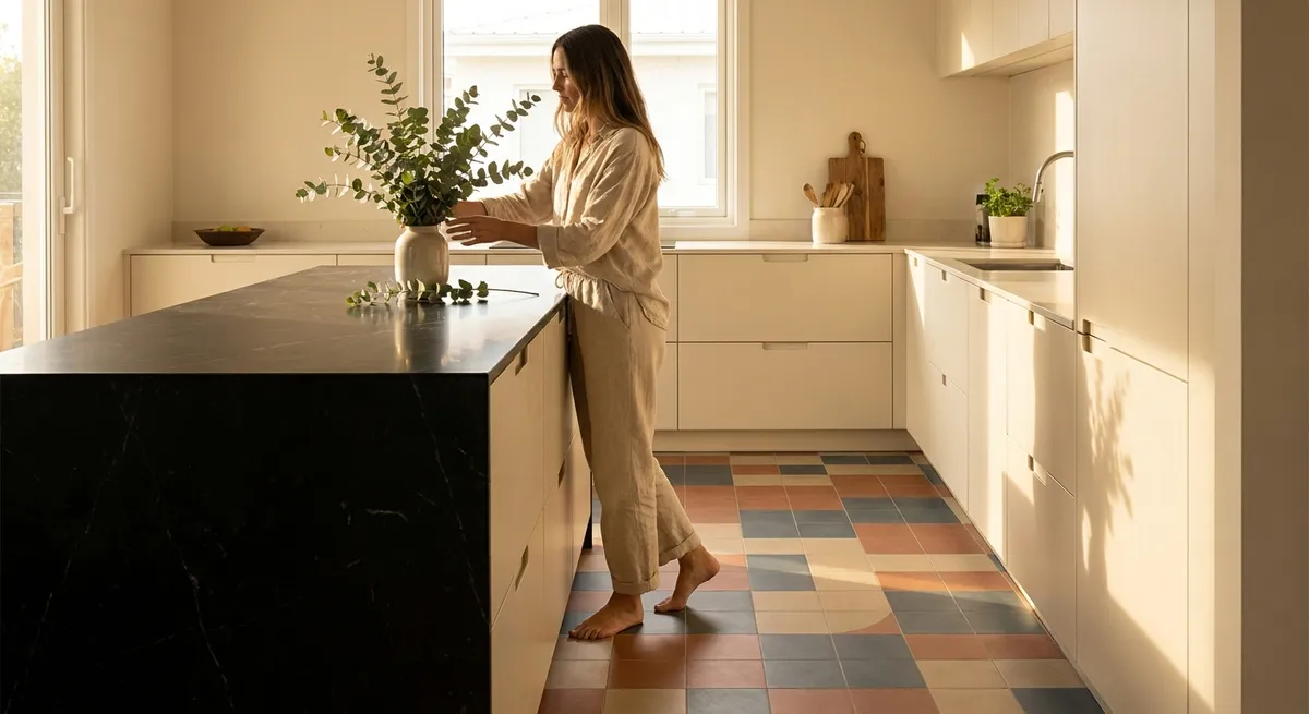
Insight 3: Curate a Limited Palette but Varied Texture
Luxury in tile design rarely comes from an explosion of color or pattern; it comes from restraint and depth. One of the most effective strategies is to commit to a limited palette—often two or three tones at most—and then introduce subtle variation through finish and texture.
Imagine a bathroom composed almost entirely of soft, stone-toned porcelain: a matte floor tile with just enough texture for underfoot security, a honed wall tile with a velvety, light-absorbing finish, and a glossy, slender mosaic lining a niche to create a quiet shimmer. All three might be within a narrow color range, but each catches light differently, creating a layered, gallery-like environment.
This approach also supports longevity. A considered neutral palette becomes a calm backdrop for evolving furnishings and art, rather than locking you into a bolder statement you may tire of. The sophistication comes not from shouting a color story, but from the unexpected richness that reveals itself as the day’s light changes across different textures.
Insight 4: Use Scale and Proportion to Quietly Edit the Architecture
Tile scale is a powerful tool for editing how a room is perceived—heightening ceilings, widening narrow rooms, or grounding airy spaces. Instead of selecting size purely by trend (large-format here, small mosaic there), use scale strategically to correct or celebrate the architecture.
In a low-ceilinged bathroom, consider vertically oriented tiles or planks with minimal horizontal breaks; running them floor to ceiling visually stretches the walls. In a narrow galley kitchen, a slightly wider rectangular floor tile laid across the short dimension can subtly widen the room. Conversely, in a very large, open-plan space, extra-large floor tiles with tight joints can lend a sense of calm continuity, like a single stone slab extending beneath multiple zones.
Proportion is equally crucial. Transitioning from one tile size to another—say, large format on the floor, smaller modules on the walls—should feel intentional, often occurring at a logical architectural breakpoint: a change in ceiling height, a shift in function, or a natural line where the eye already expects something to change. These calibrated shifts in scale feel like architectural decisions rather than decorative ones.
Insight 5: Compose Lighting and Tile as a Single Design Element
Tile is only as beautiful as the light it receives. The most exquisite glaze, veining, or relief can appear flat under inadequate lighting, while the right approach can make a modest tile feel luminous. Treat lighting and tile as a single, intertwined design problem from the very beginning.
For subtly reflective tiles—glossy subway, glazed zellige, or polished porcelain—side lighting is transformative. A linear wall washer grazing the surface will reveal the gentle undulation of handmade edges or the soft sheen of a glazing variation. In showers, a recessed downlight placed too close to the wall can create harsh scallops; moving the light slightly outward and adding an indirect source (such as an LED in a niche) often creates a more flattering, spa-like effect.
Matte or honed tiles, beloved for their understated luxury, benefit from layered lighting rather than a single, strong source. Combining ambient ceiling light with softer, directional task lighting at mirrors or work surfaces allows the texture of the tile to read clearly without glare. When you imagine the finished room, imagine not only the tile pattern, but also how it will look at dawn, midday, and evening—because that is where true refinement lives.
Conclusion
Exceptional tile design is less about spectacle and more about discipline: editing, aligning, and refining until the room feels inevitable—like it could not have been done any other way. By thinking in sequences rather than snapshots, treating grout as a tailoring element, curating texture within a restrained palette, deploying scale as an architectural tool, and choreographing light with as much care as layout, you elevate tile from background material to quiet protagonist.
For homeowners, these principles become a filter: a way to move past fleeting trends and toward rooms that feel composed, enduring, and unmistakably considered.
Sources
- [American Society of Interior Designers (ASID): The Impact of Design](https://www.asid.org/resources/press-media/impact-of-design) – Discusses how design decisions, including finishes, shape user experience and perception of space.
- [Tile Council of North America (TCNA)](https://www.tcnatile.com/) – Industry standards and technical guidance on tile installation, grout joints, and layout considerations.
- [National Kitchen & Bath Association (NKBA) Design Trends](https://nkba.org/insights/design-trends/) – Professional insights into current and emerging approaches in kitchen and bath design, including surfaces and lighting.
- [Architectural Digest – Tile Ideas & Trends](https://www.architecturaldigest.com/story/tile-ideas) – Editorial examples of sophisticated tile applications and design-forward uses of scale, grout, and texture.
- [U.S. Department of Energy – Lighting Design Basics](https://www.energy.gov/energysaver/lighting-design) – Guidance on layering light and positioning fixtures, relevant to how tile surfaces are perceived in finished spaces.