Below are five exclusive, design‑driven insights for homeowners who expect their tile work to feel bespoke rather than simply “finished.”
1. Composed Color: Treat Tile as a Tailored Wardrobe, Not a Paint Swatch
The most refined tile schemes aren’t built from a single standout color; they’re curated the way one assembles a wardrobe—anchored by timeless neutrals, elevated by one or two intentional statements.
Begin with a “foundation” tone that can comfortably coexist with changing furniture, art, and textiles over the next decade. Think warm stone greiges, nuanced bone whites, or deep ink tones that read sophisticated rather than stark. From there, introduce a secondary hue that exists in the same temperature family, but slightly shifted in value—a softer version for walls if floors are dark, or a moodier tone in a niche if the primary field is pale.
Resist the temptation to match every surface perfectly. Slight, deliberate mismatches in undertone create a layered, couture effect—similar to pairing a cashmere camel coat with tobacco leather shoes. The harmony is felt more than seen, and it grants your spaces an enduring, quietly luxurious quality that survives trends and repaintings alike.
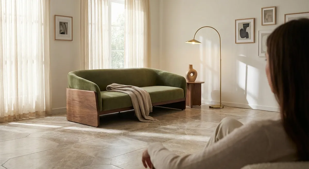
2. Light as a Material: Specifying Finish for Morning, Afternoon, and Evening
Most tile selections fixate on color and shape; very few consider how finish will choreograph light throughout the day. Yet this is where a space can transition from “nicely done” to convincingly architectural.
In rooms with abundant natural light, a very high-gloss wall tile can create distracting glare and chaotic reflections. Instead, specify a soft satin or semi‑polished finish with subtle movement—this will gently refract daylight, lending softness rather than shine. In lower‑light environments, conversely, a carefully chosen glossy tile behind a vanity or kitchen sink can amplify ambient light, acting almost like a restrained mirror.
For floors, prioritize refined mattes or honed finishes with just enough reflectivity to keep the space from feeling flat. The objective isn’t to make tile “disappear,” but to ensure that light grazes across surfaces in long, elegant strokes rather than sharp flashes. During specification, bring samples into the actual room at different times of day; watch how they behave under morning cool light, late‑afternoon warmth, and evening artificial illumination. Your final choice should feel composed across all three.
3. Precision in Transitions: Turning Thresholds into Deliberate Moments
Sophisticated tile design is often revealed not in the center of the room, but at its edges—where tile meets wood, carpet, glass, or itself at a change in pattern. These transitions, when left to default trims and standard thresholds, can betray an otherwise elevated design.
Consider transforming each junction into a discreet architectural gesture. A slim metal profile in brushed brass or blackened steel can create a couture “hem” between stone‑look tile and hardwood, cleanly articulating the shift in material. At doorways, instead of generic saddles, explore a single, precisely cut piece of stone or large‑format porcelain bridging both spaces, aligned perfectly to the door leaf. The effect is minimal yet unmistakably intentional.
Where tile changes direction—such as a herringbone floor that meets a straight‑laid bath zone—plan the intersection as though it were a piece of marquetry. Align central patterns to architectural axes (door centers, window mullions, or key sightlines), and let the transition land on those lines. The sensation of walking through spaces where every seam feels deliberate is one of quiet luxury that guests register, even if they can’t articulate why.
4. Scaled Drama: Using Format and Layout to Shape the Room’s Proportions
Format—tile size and proportion—is one of the most powerful, and underused, design tools in a home. It can visually heighten ceilings, elongate narrow rooms, and rebalance awkward proportions without moving a single wall.
In elongated spaces, such as galley kitchens or long baths, running rectangular tiles parallel to the longer wall can accentuate the tunnel effect. Instead, rotate the planks or large rectangles across the narrow dimension: the eye will read the space as broader and more grounded. For rooms with modest ceiling heights, consider full‑height vertical stacks or slender vertical planks; they coax the eye upward and create an impression of a taller volume.
Large‑format tiles (24"x24", 24"x48", and beyond) introduce a sense of seamlessness, especially in main floors and shower walls. But the refinement comes from how the grid is located. Avoid centering cuts on whatever is easiest for the installer; instead, center full tiles on focal elements—an island, a freestanding tub, a fireplace—and allow the unavoidable cuts to fall in less visible perimeters. The result feels architectural rather than merely decorative, as though the room were designed and built around the tile, not the other way around.
5. Quiet Pattern: Embedding Personal Narrative Without Visual Noise
Personal expression in tile does not need to shout. In truly considered homes, it tends to whisper—embedded in subtle pattern work, custom insets, or quiet references to places the homeowner loves.
One approach is to work within a restrained palette and introduce variation through layout alone. A single, noble material—say, a limestone‑look porcelain—can appear in a straight stack in the entry, a refined herringbone in the dining area, and a gentle chevron in a corridor, all within the same tone. The continuity of color keeps the home cohesive, while the shifting pattern adds a sense of journey and discovery as one moves through the space.
For more intimate gestures, integrate a bespoke “signature” detail in a location encountered daily: a narrow border of contrasting mosaic framing the shower niche, a small inset at the kitchen floor where one naturally stands to prep, or a miniature rug‑effect inlaid beneath a powder room pedestal. These details are not meant for social media first; they are designed for the homeowner’s quiet delight. Over time, they become a form of architectural jewelry—subtle, deeply personal, and irreplaceable.
Conclusion
Elevated tile design is not about spectacle; it is about control—over color, light, proportion, and detail. When each decision is made with this level of intention, tile stops functioning as mere finish and begins to read as part of the home’s architecture and identity.
For homeowners, these five insights—composed color, considered finishes, deliberate transitions, scaled drama, and quiet pattern—offer a framework for conversations with designers and installers that goes far beyond “which tile looks nice.” The result is a home where every surface feels measured, calm, and unmistakably tailored to the life lived within it.
Sources
- [Ceramic Tile Institute of America – Architectural Tile Design Considerations](https://ctioa.org/wp-content/uploads/2019/01/tn-005_0.pdf) - Technical note discussing layout, joints, and aesthetic considerations for tile design
- [Tile Council of North America (TCNA) – Handbook for Ceramic, Glass, and Stone Tile Installation](https://www.tcnatile.com/products-and-services/publications/handbook.html) - Industry reference outlining best practices that underpin precise, durable tile work
- [American Society of Interior Designers (ASID) – Color, Light, and Human Response](https://www.asid.org/resources/glossary/color-light-and-human-response) - Explores how color and light interact in interiors, informing sophisticated finish selection
- [Porcelanosa – Large Format Tiles Design Guide](https://www.porcelanosa.com/uk/tile/large-format-tiles/) - Manufacturer overview on using large‑format tiles to influence spatial perception and continuity
- [Mosa – Designing with Ceramic Tiles (Architectural Guide)](https://www.mosa.com/en-gb/inspiration/stories/designing-with-ceramic-tiles) - Architectural insights into format, pattern, and transitions in high‑end tile applications