1. Orchestrating Scale: Large Format Meets Delicate Geometry
Sophisticated tile design rarely relies on a single scale. Instead, it composes a restrained interplay between generous surfaces and finely calibrated details. Large-format tiles—think 24"x24", 24"x48", or even larger porcelain slabs—can lend a space an almost monolithic calm, especially when paired with minimal grout lines and carefully aligned sightlines. The effect is particularly compelling in open-plan kitchens, gallery-like hallways, or serene primary baths, where expanses of tile visually elongate the room and create a sense of tailored stillness.
The counterpoint comes in the form of smaller-scale geometry: a subtle mosaic niche, a delicately patterned border, or a thoughtfully scaled herringbone on a single feature wall. Rather than competing, these refined gestures prevent the large format from feeling too austere, introducing intimacy where the eye naturally rests—at a vanity, near a shower control, or at the threshold between spaces. The most elevated designs avoid abrupt shifts; transitions are positioned at architectural breaks (corners, recessed panels, beam lines) so the conversation between scales feels intentional, not improvised. The result is a space that feels composed and calm from a distance, yet rewards close inspection with quiet intricacy.
2. Depth Without Noise: Layering Texture, Sheen, and Shadow
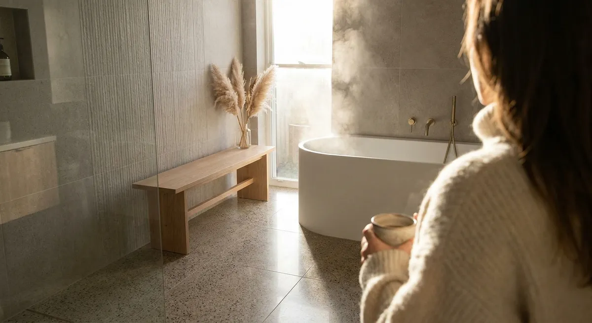
Luxury in tile surfaces is often less about color and more about depth. While bold patterns can be tempting, truly enduring spaces rely on a layered subtlety: texture that catches morning light, a soft variation in glaze, or a honed surface that diffuses reflections. Matte and honed finishes are particularly effective in cultivating an understated ambiance; they soften glare, hide minor smudges, and lend stone and porcelain an almost velvety character. In contrast, selectively placed gloss—perhaps in a shower niche, a backsplash band, or a decorative insert—can create a restrained interplay of sheen without overwhelming the eye.
Texture also operates at different intensities. A barely perceptible linear striation on a porcelain floor can elongate a room, while a more pronounced ribbed or fluted tile on a feature wall adds architectural shadow play. For homeowners attuned to detail, the key is to keep the palette tight while varying surface qualities. A bathroom, for instance, might use a single stone-look porcelain across floor and walls, but shift from honed on the floor to lightly textured on the shower wall, and subtly polished on an integrated bench. This layered approach produces a sense of depth and richness that feels composed rather than decorated—luxury expressed as atmosphere, not spectacle.
3. Intelligent Color: Neutrals with Architectural Intent
Neutrals are often misunderstood as the “safe” option, when in a refined scheme they become the most exacting choice. The sophistication lies in the undertone and context. Warm grays and soft taupes complement natural woods and brushed brass, while cooler stone hues pair effortlessly with black metals, glass, and concrete. Before committing, it is essential to view tile samples vertically and horizontally in your actual lighting conditions: daylight, evening, and artificial light can shift undertones from serene to slightly off-key.
An elevated tile palette also considers adjacency. Floor, wall, and counter surfaces should not merely match—they should converse. For example, a warm limestone-look porcelain with subtle veining can ground a space, while a coordinating but slightly lighter wall tile keeps the room from feeling compressed. A single, strategically chosen accent—perhaps a deep tobacco, charcoal, or mineral green mosaic in a restrained field—can anchor the composition without tipping into trendiness. The most refined schemes often use no more than three tonal steps from lightest to darkest, producing a visual gradient that feels architectural rather than decorative. This is color not as statement, but as structure: a controlled spectrum that frames furniture, art, and natural light.
4. Spatial Choreography: Using Tile to Guide Movement and Mood
Exceptional tile work does more than protect surfaces; it subtly directs how you move through and experience a space. In hallways and entry sequences, the direction of a plank-format tile or linear pattern can elongate or visually widen the path, inviting a graceful flow rather than a rushed passage. In open-plan living areas, a refined shift in tile pattern—say, from a straight lay in the main area to a herringbone in the dining zone—can define functional “rooms” without the need for walls or level changes.
Bathrooms and kitchens, in particular, benefit from deliberate zoning in tile. A more tactile finish in wet zones, a slightly darker floor hue in circulation paths, or a different orientation behind a cooktop or vanity can lend each zone its own quiet identity while maintaining overall harmony. Transitions between materials (for example, tile to wood) should align with architectural logic: door thresholds, window walls, or structural elements. Slim metal profiles, carefully color-matched to adjoining surfaces, can make these transitions read as precise design moments rather than practical compromises. When thoughtfully executed, tile becomes a subtle form of wayfinding—inviting, calming, and deeply intuitive.
5. Detailing for Longevity: Grout, Edges, and the Art of Restraint
For the discerning homeowner, the true luxury of a tiled space reveals itself in its detailing. Grout, often treated as an afterthought, is in fact a primary design material. A nearly tone-on-tone grout can create an expansive, monolithic effect, especially with larger format tiles; a slightly contrasting grout can articulate a pattern just enough to give it rhythm without veering into busyness. The grout joint width matters equally: slimmer joints (appropriately sized for tile tolerances) instantly elevate a surface, lending it a tailored, bespoke quality reminiscent of fine millwork.
Edge treatments are another mark of sophistication. Bullnoses and factory-finished trims can be effective, but slim metal or color-matched porcelain profiles, precisely aligned with adjacent planes, often achieve a more contemporary and architectural result. In niches, window returns, and bench fronts, wrapping tile seamlessly around edges or mitering corners where appropriate creates a sense of crafted continuity. Behind the aesthetics, performance details such as slip-resistance ratings for floors, properly sloped shower pans, and high-quality, stain-resistant grouts ensure that beauty endures daily use. The most exclusive insight of all is this: a genuinely luxurious tile installation is not defined by how much is on display, but by how little is visually disturbed by function. Every flange, drain, and transition is integrated so gracefully that the surface reads as inevitable.
Conclusion
Elevated tile design is a study in discernment: choosing scale with intent, layering finishes with restraint, tuning color to architecture, and choreographing surfaces to shape how a room is lived in, not just looked at. When these elements align, tile ceases to be a mere finish and becomes part of the home’s identity—quietly resilient, tactile, and enduringly relevant. For homeowners who see their spaces as long-term companions rather than fleeting statements, these refined strategies transform tile from a practical necessity into a defining expression of modern sanctuary living.
Sources
- [American Society of Interior Designers (ASID) – 2024 Trends Report](https://www.asid.org/resources/2024-trends-outlook) - Insight into current and emerging design directions, including surfaces and materials
- [Ceramic Tile Education Foundation – Technical Resources](https://www.ceramictilefoundation.org/blog) - Professional guidance on tile selection, installation standards, and detailing considerations
- [Tile Council of North America (TCNA) – Handbook & Guidelines](https://www.tcnatile.com/technical-library.html) - Authoritative reference for best practices in tile design, performance, and installation
- [University of Minnesota Extension – Choosing Flooring Materials](https://extension.umn.edu/materials-building-and-repairs/choosing-floor-covering-materials) - Educational overview of flooring characteristics, durability, and maintenance factors
- [Porcelanosa – Large Format & Architectural Tile Collections](https://www.porcelanosa.com/en/tile/) - Real-world examples of large-format, textured, and architectural tiles used in contemporary luxury interiors