Below, discover five exclusive, under-discussed design insights that can elevate tile from expected to exceptional—each one crafted for those who prefer nuance over novelty.
1. Curated Transitions: Treat Thresholds as Design Statements
Most homes treat transitions between materials as afterthoughts: a metal strip here, a jarring grout line there. In a refined interior, these thresholds become deliberate, almost ceremonial.
Consider designing “micro-scenes” at transitions. Where marble meets oak, instead of a simple butt joint, introduce a slim border tile—perhaps a honed limestone pencil or a narrow band of darker stone—that reads like a tailored hem on a couture garment. For open-plan spaces, you can use subtle tile inlays to define zones without ever resorting to walls or rugs.
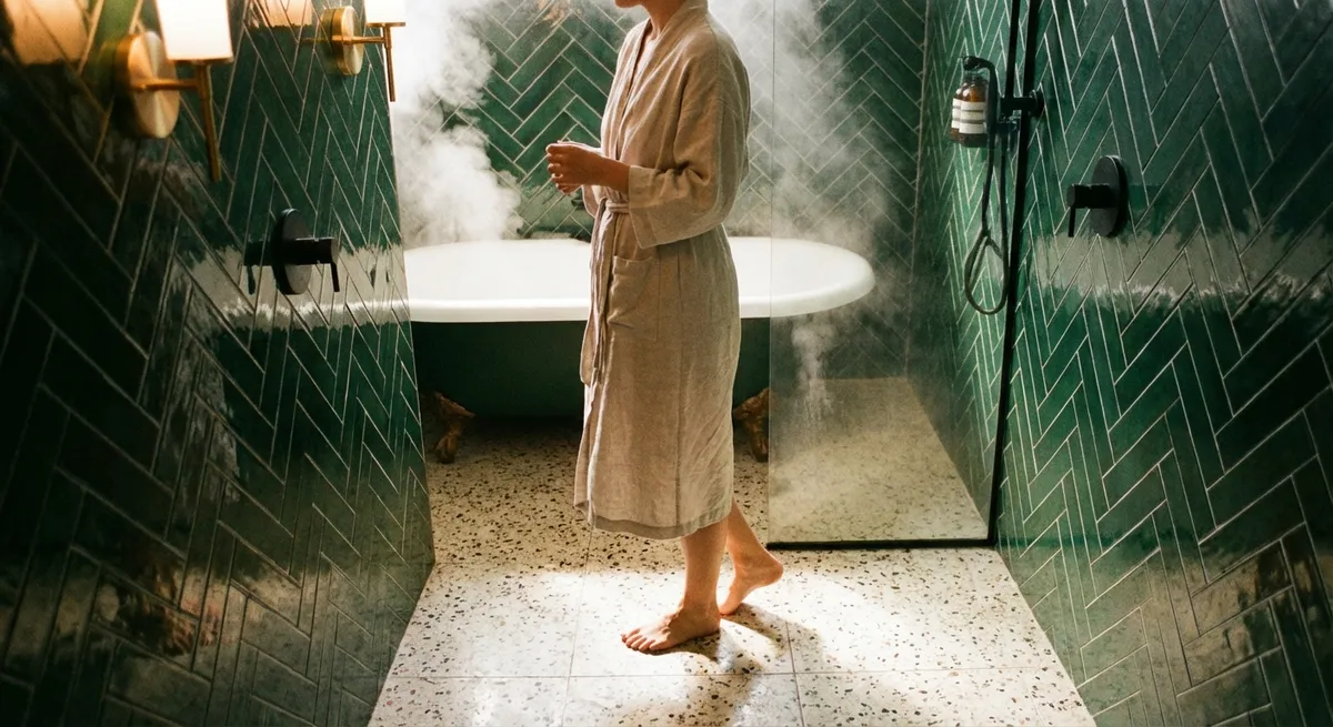
In corridors or entries, a patterned tile field can dissolve into a calmer border tile before meeting adjacent flooring, softening the visual shift. Likewise, in bathrooms where a shower floor meets a main floor, align tile formats so grout lines continue through the threshold, visually elongating the room and reducing visual noise.
This approach makes every transition feel intentional, aligning with the way high-end architecture treats every edge and junction as an opportunity for refinement rather than a compromise.
2. Tonal Layering: Building Depth with a Single “Family” of Surfaces
Luxury tile design often has less to do with bold pattern and more to do with tonal intelligence. Instead of assembling a mosaic of competing finishes, think in terms of a single tonal universe expressed through scale, texture, and sheen.
For example, in a bathroom, select a porcelain tile and use it in three variations: a large-format matte finish on the floor, a smaller format or elongated rectangle on the walls, and a textured or fluted version as a feature behind the vanity. The color remains consistent, but the surfaces capture light differently, creating quiet depth rather than busy contrast.
This tonal layering is especially powerful with natural stone–look porcelain or authentic marble. A vein-cut tile used on the floor, paired with a cross-cut version of the same stone on the walls, offers a subtle dialogue between linear movement and more organic clouding. The space reads as cohesive, but never flat.
By resisting the urge to introduce too many “hero” tiles, you allow material quality, proportion, and craftsmanship to become the luxury story.
3. Sculpted Surfaces: Using Relief and Shadow as Design Tools
Flat tiles are expected; sculpted tiles are remembered. Three-dimensional or low-relief tiles harness shadow as an active player in the design—especially compelling in spaces where natural light changes throughout the day.
In a kitchen, instead of a conventional subway backsplash, consider a softly fluted or gently faceted tile in a restrained hue. Under cabinet lighting, the relief creates a mellow play of highlights and shade, giving the space texture without pattern fatigue. In a powder room, a single accent wall in a sculpted tile can replace the need for bold color or excessive decor.
The key is to specify relief tiles where light can properly animate them: near a window, beneath a well-placed sconce, or under linear task lighting. Keep grout closely matched in tone to avoid disrupting the sculptural effect; the eye should read silhouette and shadow first, not a grid.
This is tile as architectural surface—quietly dramatic, tactile, and inherently luxurious.
4. Precision Groutwork: Elevating the Negative Space
In many projects, the tile receives all the attention while grout is treated as a technical necessity. At a premium level, grout becomes a design tool equal to format, finish, and color.
For a monolithic, gallery-like effect, select grout within a half shade of the tile color. This visually erases the joints and lets proportion and surface shine. Large-format stone-look tiles done this way create the illusion of slab, especially on floors and shower walls.
Conversely, when working with elegantly shaped or hand-crafted tiles—such as elongated hexagons, Moroccan-inspired forms, or slender herringbone—allow the grout to quietly outline the geometry. A gently contrasting grout, perhaps two to three tones darker or lighter, can emphasize pattern while staying sophisticated.
Also consider joint width as part of the aesthetic. Tighter joints (within manufacturer and standards guidelines) produce a tailored, European feel; slightly wider joints can suit rustic or handmade tiles. Aligning grout lines with architectural features—doorways, window mullions, cabinetry edges—further reinforces the sense that the tile belongs to the architecture, not just the decor.
In refined interiors, grout is never an afterthought. It is the negative space that frames the craftsmanship.
5. Composed Vistas: Designing Tile for the View, Not Just the Room
A luxury tile installation is not only about how a space feels from within, but how it presents from adjacent rooms, hallways, or entry points. Composed vistas—what you see as you approach or glance through a doorway—are a subtle hallmark of considered design.
Begin by standing in key positions: the front door, the end of a hallway, the spot where you first glimpse the primary bath from the bedroom. Then design tile compositions specifically for those viewpoints. A centered bookmatched stone panel in the shower, a rhythmic grid of large-format tiles behind a freestanding tub, or a perfectly aligned herringbone field framed by the doorway can become signature views.
In kitchens, consider how the backsplash reads from the living area: a calm, continuous plane of restrained tile may be more luxurious than a busy pattern that visually competes with art, textiles, and furniture. In long corridors, a runner effect created with border tiles or a subtle change in format can lead the eye gracefully from one space to the next.
By orchestrating tile as part of a sequence of vistas, you transform it from surface treatment into spatial storytelling—something that feels less like decorating and more like curated architecture.
Conclusion
Exceptional tile work is rarely about spectacle. It is about the deliberate choreography of junctions, tones, shadows, joints, and views—small decisions that together create an environment that feels quietly elevated and uncompromising.
When you treat transitions as tailored, layer tones instead of competing colors, embrace sculpted surfaces, refine your grout strategy, and design for composed vistas, tile ceases to be background. It becomes the subtle, enduring signature of a home that has been deeply, thoughtfully considered.
Sources
- [Ceramic Tile Design Trends: Tonal Layering and Large Formats – Tile Council of North America](https://www.tcnatile.com/faqs/75-general/458-ceramic-tile-trends.html) - Industry overview of current tile design directions and technical considerations
- [Porcelain and Ceramic Tile Installation Guidelines – ANSI A108/A118/A136.1](https://webstore.ansi.org/standards/tcna/ansia108a118a1362022) - Authoritative standards for grout joints, transitions, and installation quality
- [Lighting Design and the Built Environment – Illuminating Engineering Society](https://www.ies.org/definitions/architectural-lighting-design/) - Explains how light and shadow interact with textured and relief surfaces
- [Natural Stone Design Resources – Marble Institute (Natural Stone Institute)](https://www.naturalstoneinstitute.org/consumers/your-home/design-ideas/) - Design-focused guidance on working with stone and stone-look materials
- [Sustainable Tile and Interior finishes – U.S. Green Building Council](https://www.usgbc.org/articles/greening-interiors-materials-and-finishes) - Context on material selection, finishes, and their role in high-performance, high-end interiors