This is not about louder patterns or trend-chasing. It’s about subtle, intelligent decisions that make every square inch work harder. Below are five exclusive, design-driven insights to help you craft rooms where tile is the quiet authority in the space, not just the backdrop.
Designing from the Floor Up: Making Tile the First Decision, Not the Last
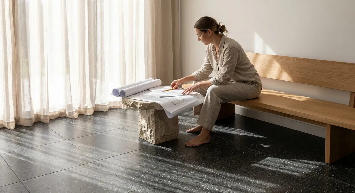
Most projects start with paint colors and furniture, then “fit in” tile toward the end. In high-end design, the sequence is often reversed: the tile story comes first, then everything else supports it.
Begin with how you want the room to feel underfoot—cool and monolithic, warm and textured, or elegantly patterned. Select the primary floor tile as though it were a foundational architectural element, not a mere floor finish. Think about its interaction with thresholds, stair treads, and adjacent rooms, so the material reads as part of the home’s overall narrative.
Once the tile is set, wall colors, fabrics, and metal finishes become supporting players instead of competing focal points. This approach naturally curates the palette; you’ll find that a single, beautifully chosen tile can eliminate the need for excessive decoration. The result is a space that feels resolved from the ground up, with the tile quietly anchoring every other choice.
The Power of Negative Space: Using Grout as a Design Instrument
In sophisticated interiors, grout is never an afterthought—it’s the negative space that defines the tile’s geometry and character. Tiny shifts in grout color, joint thickness, and finish can completely change the reading of a room.
For an almost seamless, monolithic effect, choose grout that echoes the tile tone within a single shade. This minimizes joint visibility, allowing the room to feel calm, expansive, and architectural. To celebrate pattern and layout, select a grout that is intentionally a step lighter or darker, sharpening each line and making the layout itself a design feature.
Consider matte grout for a more natural, stone-like impression, or a slightly smoother finish in areas that demand easier maintenance. Align grout strategies across connected spaces—such as entry, kitchen, and bath—so the eye reads continuity rather than disjointed decisions. Treated with this level of intention, grout becomes the soft voice that clarifies every edge and elevation.
Elevation as Luxury: Extending Tile Beyond the Expected
Tile’s most luxurious moments often occur where it departs from tradition. Instead of limiting tile to “wet zones” or predictable backsplashes, think in terms of elevations—where surfaces rise, wrap, and fold through a room.
Consider carrying a floor tile up a short riser, plinth, or platform to subtly frame a tub, dining area, or fireplace. Run a wall tile higher than standard—well beyond the typical 4-inch or even 18-inch backsplash—so that it meets a window frame or ceiling line with purpose. In a hallway or mudroom, a half-height tiled wainscot in a refined format can add both resilience and a crisp architectural datum.
When tile climbs a wall or turns a corner, it signals intention and craftsmanship. The space suddenly feels built, not decorated. This vertical extension also allows light to play more dramatically across surfaces, enriching shadows, reflections, and texture in a way paint alone never achieves.
Controlled Contrast: Balancing Texture, Scale, and Sheen
Premium tile design is less about bold color and more about controlled contrast across three dimensions: texture, scale, and sheen. When these are thoughtfully balanced, rooms feel layered and quietly complex.
Pair a large-format, low-variation porcelain on the floor with a smaller, more tactile tile vertically—such as a slim stacked rectangle or gently ribbed wall tile. The scale contrast adds interest without resorting to busy patterns. Introduce a deliberate shift in sheen: a matte floor tile offers stability and softness underfoot, while a silk-matte or lightly glossy wall tile reflects just enough light to animate the space.
Texture should be purposeful rather than arbitrary. A subtly structured tile behind a vanity, for example, can create a play of light without dominating the mirror or fixtures. Keep the color story restrained—tone-on-tone or closely related hues—so the contrast reads through surface qualities, not competing colors. This is the kind of depth that reveals itself slowly, rewarding a second and third glance.
Seamless Transitions: Thresholds, Edges, and the Art of the Almost-Invisible
The real luxury in tile work is often visible at the edges: where one material gives way to another, where an elevation changes, or where tile stops just shy of a corner or opening. These micro-transitions are where refined projects distinguish themselves from merely competent ones.
Plan transitions as intentionally as you plan feature walls. Decide where tile will end before installation begins: align edge terminations with architectural lines such as door frames, window sills, or built-in millwork. Use minimal, well-finished profiles or carefully mitred edges rather than bulky trims wherever possible, so the tile reads as part of the architecture, not an applied layer.
At thresholds, consider continuing the tile under doors so that when the door is open, the flooring feels uninterrupted and generous. If changing materials is necessary, create a deliberate pattern break—a centered strip, a clean metal inlay, or a change in direction—so the transition reads as a design decision, not a compromise. When edges are this refined, the space feels quiet, seamless, and inherently more bespoke.
Conclusion
Exceptional tile design is rarely loud. It’s expressed through decisions that most guests never consciously notice: the way grout aligns, how a floor turns a corner, where tile stops and paint begins, how light moves across a surface at different times of day.
By designing from the floor up, using grout as a compositional tool, extending tile beyond predictable boundaries, controlling contrast with nuance, and perfecting transitions, you move from simply “having nice tile” to orchestrating a complete architectural experience. Tile becomes more than a finish—it becomes the quiet structure that holds the room’s character in place.
Sources
- [Porcelain Tile Selection Guide – The Tile Council of North America](https://www.tcnatile.com/faqs/74-porcelain-tile.html) – Technical background on porcelain tile characteristics and performance
- [Floor Tile Installation Patterns – The Ceramic Tile Education Foundation](https://www.ceramictilefoundation.org/blog/tile-layout-patterns) – Insight into how layouts and patterns influence visual impact
- [Grout Color Selection Tips – MAPEI](https://www.mapei.com/us/en-ca/home-page/tools-and-downloads/grout-color-collection) – Professional guidance on how grout color affects the final aesthetic
- [Universal Design and Flooring Transitions – U.S. Access Board](https://www.access-board.gov/ada/guides/chapter-3-floors-and-ground-surfaces/) – Best practices for safe, subtle transitions between floor surfaces
- [Lighting and Surface Interaction – Harvard Graduate School of Design](https://www.gsd.harvard.edu/course/light-material-and-space/) – Academic perspective on how light and material choices shape spatial perception