Below are five exclusive, design‑forward insights that move tile from “well done” to unforgettable.
1. Composed Transitions: Treat Thresholds as Micro‑Architectural Moments
Most homes treat transitions—doorways, room shifts, floor changes—as afterthoughts. Sophisticated tile design elevates these boundaries into deliberate, crafted details.
Instead of abrupt cuts where tile meets wood or stone, consider a slender “framing” strip in a complementary material. A honed marble pencil, a slim brass inlay, or a narrow border of the same tile laid in a different orientation can create a sense of architectural intention. This approach is particularly effective where a tiled foyer opens onto hardwood, or where a kitchen meets a scullery.
Within a single tiled space, use gentle transitions to imply zones without building walls. Shift from a straight lay in the main area to a herringbone or chevron at the kitchen island, or introduce a border that outlines a dining area. The room remains open, but the floor quietly explains how it should be used.
Executed well, these micro‑architectural moments feel like original features of the home, not after‑the‑fact design tricks. They add a sense of custom tailoring—the visual equivalent of a hand‑finished hem.
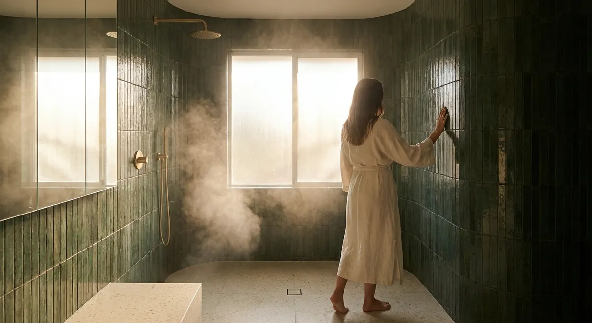
2. Layered Sheen: Mixing Finishes for Depth, Not Distraction
Color and pattern usually get the spotlight, but surface sheen—matte, satin, gloss—often does more to determine how luxurious a space feels. The most elevated tile interiors use sheen the way a lighting designer uses dimmers: to sculpt mood and depth.
Matte tiles absorb light, creating a soft, grounded presence. High‑gloss tiles throw light back into the room, introducing shimmer and energy. Rather than choosing one or the other, create a controlled interplay. For example, pair a predominantly matte floor with a subtly glossy wall tile in the same color family; the result is tonal tranquility with a quiet flicker of life.
In a shower, a satin or low‑sheen wall tile with a glossy niche interior can make products appear almost curated, while maintaining a calm envelope overall. In a kitchen, a nearly matte backsplash punctuated with a glossy accent line or border will catch candlelight and evening illumination, adding atmosphere without feeling busy.
The key is to keep the palette tight and let the finish variations do the work. The eye reads dimension and craftsmanship, not “pattern,” and the room feels more expensive than its material list would suggest.
3. Intelligent Scale: Oversized Tile as a Subtle Luxury Signal
Tile size is one of the most underleveraged design tools in residential spaces. While standard formats are serviceable, large‑format tile—when properly specified and installed—signals a level of investment and sophistication that is instantly legible, even if not consciously understood.
In smaller rooms, such as powder baths or compact ensuites, a larger tile can counterintuitively make the space feel more expansive. Fewer grout lines mean fewer visual interruptions; the eye perceives a broader, calmer surface. Large‑format porcelain that mimics stone is particularly effective here, giving the impression of monolithic slabs at a more accessible price point.
On floors, consider extending a single large‑format tile seamlessly from the interior to an adjoining terrace or balcony (with the appropriate exterior‑rated product and slip resistance). The continuity blurs boundaries between inside and out, lending even modest footprints a resort‑like sensibility.
Intelligent scale is not about going large everywhere. It is about contrasting scale strategically: a generous floor tile with a smaller, tactile mosaic on the shower floor; a broad wall tile with a fine, textural liner; a large‑format field tile with a tightly scaled border. This interplay suggests a designer’s hand—and a homeowner who understands proportion.
4. Tonal Narratives: Working in One Color Family, Many Characters
Sophisticated tile schemes often appear monochromatic at first glance, but the refinement lies in their nuance. Working within a single color family—stone greys, warm sands, deep inky blues—creates cohesion, while subtle variations in undertone, pattern, and texture add depth.
For example, a bathroom might use a warm grey porcelain on the floor, a slightly lighter warm grey with faint veining on the walls, and a textured, almost fabric‑like tile in a similar tone for the vanity backsplash. Each surface belongs to the same chromatic story, yet each contributes a different “character”: grounding, enveloping, or tactile.
In kitchens, a tonal approach allows cabinetry, hardware, and lighting to shine without competition. A soft, off‑white tile in a handcrafted finish behind a range can pair beautifully with a cooler white on perimeter walls and a warm, stone‑inspired countertop. The overall effect reads serene, but in-person the layers reveal themselves: edges catching light, textures inviting touch, variations in tone giving the space a lived‑in elegance.
A tonal narrative also ages exceptionally well. Because it is not dependent on high‑contrast statements or fashionable colors, it tends to feel considered rather than dated, even as trends shift around it.
5. Crafted Imperfection: Embracing Subtle Variation for a Collected Feel
Many homeowners mistakenly equate perfection with uniformity. In truly elevated tile work, perfection often comes from orchestrated irregularity—small, controlled variations that give a space soul.
Handmade‑look tiles, for instance, introduce gentle differences in shade, edge, or surface that catch the light unevenly, producing a soft shimmer and a sense of artisanry. When laid with intention—consistent grout lines, thoughtful pattern planning—these variations feel curated, not chaotic.
One powerful technique is to mix two or three closely related shades of the same tile in a deliberate ratio, rather than buying a single, flat color. A backsplash composed of, say, 70% one tone and 30% of a slightly lighter or darker companion results in a surface that feels quietly alive. The effect is particularly striking in elongated subway or zellige‑inspired tiles.
On floors, a stone‑look porcelain with subtle pattern variation can emulate high‑end natural stone while offering better durability and maintenance. The key is to review multiple samples and photographs of the full pattern range before committing, then work with your installer to blend the tiles during installation so that the variations are evenly distributed, not clustered.
Crafted imperfection communicates confidence: it suggests a homeowner who is comfortable with subtlety, who values the story a material tells over time rather than the static certainty of a showroom vignette.
Conclusion
Exceptional tile design is not about louder patterns or bolder colors; it is about the intelligence of the decisions you do—and do not—make. A considered threshold detail, a layered play of sheen, a thoughtful approach to scale, a tightly edited tonal story, and an embrace of controlled variation can transform tile from a mere finish into a defining element of your home’s character.
When you attend to these refined nuances, your tile work begins to behave like bespoke joinery or tailored upholstery: quietly luxurious, endlessly livable, and deeply personal. The result is a space that feels complete, not decorated—one that continues to reward attention long after the last grout line has cured.
Sources
- [The Tile Council of North America (TCNA) – Design & Installation Resources](https://www.tcnatile.com) – Industry standards and guidance on tile formats, transitions, and best practices
- [Ceramics of Italy – Design Trends and Case Studies](https://www.ceramica.info/en/) – Insight into contemporary Italian tile design, large formats, and finish combinations
- [Porcelanosa – Large Format & Surface Collections](https://www.porcelanosa.com/uk/tiles/) – Real‑world examples of large‑format tiles, tonal palettes, and mixed finishes in premium interiors
- [University of Minnesota Extension – Choosing and Using Ceramic Tile](https://extension.umn.edu/floors-and-flooring/ceramic-tile) – Practical considerations on tile type, slip resistance, and durability that underpin design decisions
- [Daltile – Tile Layout & Design Inspiration](https://www.daltile.com/inspiration) – Visual references for scale, pattern transitions, and tonal compositions in residential spaces