For homeowners who care about craftsmanship and longevity, tile is not simply a finish; it is an investment in daily experience. The following design insights go beyond surface-level trends and speak to the subtler decisions that distinguish a pleasant room from an unforgettable one.
Layered Monochrome: Depth Without Visual Noise
A monochrome palette does not have to mean “flat” or “safe.” In fact, working within a single color family can be the most luxurious choice, provided you layer tone, texture, and finish with care. Imagine a soft stone-gray scheme: large-format matte porcelain on the floor, subtly veined satin-finish tiles on the walls, and a smaller, slightly darker mosaic in the shower niche. The color remains consistent, but the shifts in scale and texture create quiet depth.
This approach works beautifully in bathrooms, kitchens, and entryways where you want visual calm but not sterility. Use grout to gently emphasize the structure: a tone one shade deeper than the tile for definition, never starkly contrasting unless you want an intentionally graphic look. The result feels tailored rather than trendy—an environment that photographs beautifully, yet is even more satisfying in person. For social sharing, layered monochrome reads as refined and timeless, making your space look instantly “designed” without shouting for attention.
Architectural Borders: Using Tile To Draw The Floor Plan
Tile can subtly guide movement and define zones without a single wall being moved. By introducing borders, insets, or framed “carpets,” you can shape the perception of your floor plan in a way that feels architectural rather than decorative. Consider a long hallway with a narrow central runner in a contrasting tile, bordered by a calmer field tile on either side. The eye is drawn forward, elongating the space and giving it a sense of purpose.
In open-plan living areas, a framed tile “rug” under a dining table or seating area creates a tailored island within a larger sea of flooring. Choose a border that is related in tone but distinct in pattern or finish; think honed limestone field tile surrounded by a slim band of tumbled mosaic, or a minimalist terrazzo body with a razor-thin marble outline. For homeowners, this technique adds order and sophistication without clutter; for social media, these crisp lines and defined islands photograph beautifully and tell an immediate story about how the space is meant to be used.
Soft Sheen, Hardwearing: Mastering The Luxurious Matte-Gloss Mix
True luxury often lies in contrast—not of color, but of light. Combining matte and glossy surfaces within the same tile composition can make a room feel quietly luminous rather than aggressively shiny. For example, in a kitchen, pair a low-sheen, honed porcelain floor with high-gloss, hand-pressed tiles on the backsplash. The floor absorbs light and hides everyday wear, while the backsplash gently reflects under-cabinet lighting, giving depth and sparkle at eye level.
In a bathroom, consider a mostly matte envelope with selective gloss accents: perhaps a glossy chair rail, a vertically stacked glossy stripe in the shower, or a high-sheen mosaic only at the vanity wall. These touches catch light like jewelry without overwhelming the senses. The key is restraint—let the gloss be the accent, not the default. This subtle play of reflection feels sophisticated in person and translates beautifully on camera, capturing the way light moves across the room throughout the day.
Seamless Thresholds: Designing Tile Transitions Like Tailored Seams
One of the most telling details in a well-designed home is how flooring changes from room to room. Abrupt or clumsy transitions can undermine even the most beautiful tile. Think of thresholds as tailored seams in a couture garment: they should be intentional, precise, and almost effortless to the eye. If you are transitioning from tile to wood, plan patterns and board directions early, so grout lines and planks meet with logic and grace rather than collision.
Where multiple tile styles meet—say, a patterned tile in a mudroom and a quieter large-format tile in an adjacent hall—consider a “silent” border of a shared material between them to mediate the change. This could be a slim strip of stone or a single row of neutral tile that both patterns can touch. Align thresholds with existing architectural features—door frames, cased openings, or changes in ceiling height—to make them feel inevitable instead of improvised. These refined seams are subtle in photos but dramatically affect how polished and expensive the space feels in real life.
Quiet Pattern: Using Layout To Introduce Sophistication
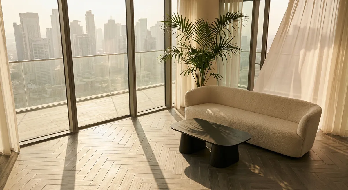
Pattern does not always require bold colors or busy prints. The way tiles are laid—herringbone, chevron, basketweave, or even an offset stack—can introduce a sense of craftsmanship that elevates simple materials. A soft, neutral tile in an elegant herringbone can feel more luxurious than a loud patterned tile in a standard grid. The rhythm of the layout becomes the design, making the floor feel considered from every angle.
In long, narrow spaces such as galley kitchens or corridors, a herringbone or diagonal layout can visually widen the room and soften the sense of a tunnel. In more formal areas, a simple rectangular tile set in a clean, aligned stack—both horizontally and vertically—can read as modern and gallery-like, especially when paired with minimal grout joints. The beauty of layout-driven pattern is its longevity: it ages far better than loud prints, while still giving you a striking “after” moment that resonates on social platforms and in daily life alike.
Conclusion
Sophisticated tile design is less about chasing what is viral and more about orchestrating how a space feels over years, not seasons. By layering monochrome palettes, using tile to define architecture, balancing sheen with intention, tailoring transitions, and harnessing pattern through layout rather than loudness, you create rooms that reveal their quality slowly—and reward close attention.
For homeowners who see tile as part of the home’s long-term narrative, these decisions transform surfaces into quietly powerful design statements, offering both daily pleasure and a distinctly premium presence whenever the camera comes out.