Below, you’ll find five exclusive, design‑driven insights that move beyond basic “tile trends” and into the realm of curated, enduring interiors. These ideas are crafted for homeowners who value restraint, longevity, and the kind of craftsmanship that rewards a second look.
Insight 1: Designing for Distance, Not Just for the Sample
Most tile decisions are made with a single piece in hand, viewed at arm’s length under showroom lighting. Refined interiors are conceived differently: from the vantage points that truly matter—doorways, hallways, stair landings, and seating areas.
Consider how your tile will read:
- From 10–20 feet away: The eye blends fine patterning into tone and value. Busy veining or heavy contrast can become visual noise, while subtle variation in a narrow palette creates calm continuity.
- In peripheral vision: Large-format tiles with minimal joint lines feel expansive and composed. Repetitive motifs, if too small, can strobe or distract at the edges of sight.
- Across thresholds: Ask how your tile connects with adjacent flooring. A graceful transition—via a border, metal trim, or shift in pattern orientation—creates a sense of intentional choreography instead of an abrupt material change.
When reviewing samples, lay multiple pieces together and step back 8–12 feet. View them in daylight and in evening lighting. A premium space is not just beautiful close-up; it reads as coherent geometry from every approach.
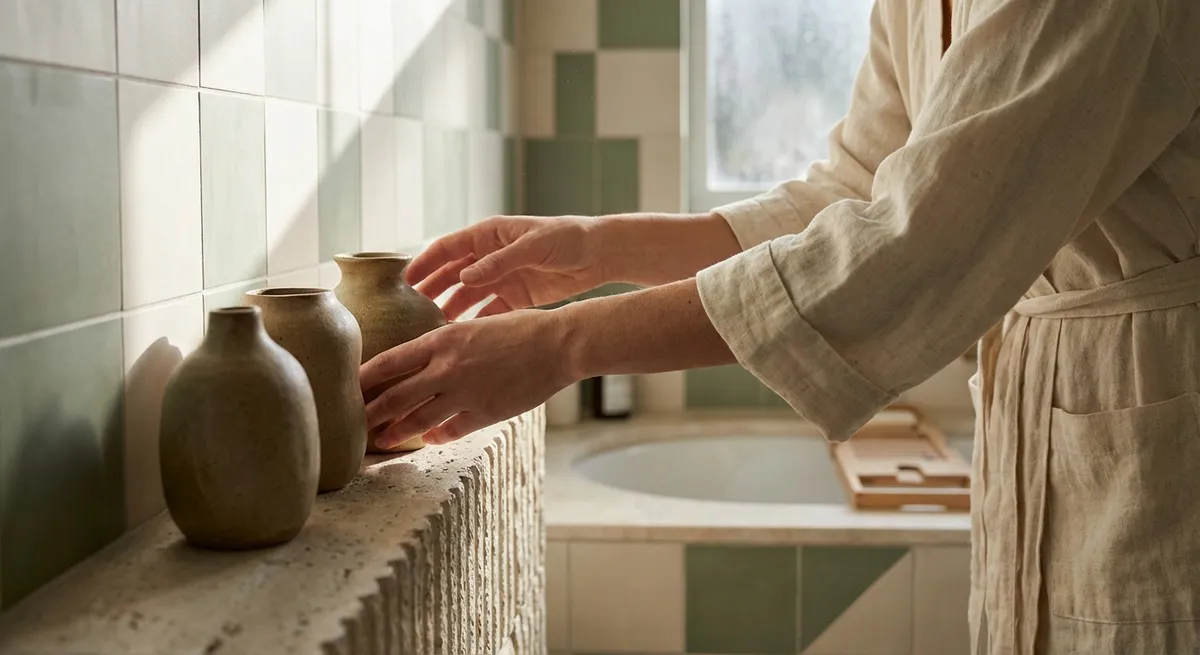
Insight 2: Curated Tonal Palettes Over Literal “Matches”
Sophisticated tile design rarely attempts to perfectly “match” counters, cabinetry, or fixtures. Instead, it operates within a curated tonal field—a quiet conversation between undertones, rather than a rigid pairing of exact colors.
To achieve this:
- Define your temperature first: warm, cool, or carefully neutral. Marble‑effect porcelain with cool gray veining will clash with creamy, yellow‑leaning paints; a warm limestone look harmonizes beautifully with brushed brass and off‑white cabinetry.
- Layer values, not colors: Work within two to three shades of lightness/darkness across flooring, walls, and accent tile. This creates visual depth without fragmentation.
- Limit strong accents: A single contrasting element—such as a dark pencil liner in a shower niche or a deep-toned floor in an otherwise soft bathroom—feels tailored. Multiple strong contrasts quickly become chaotic.
The restraint of a measured tonal palette allows subtle details—fine grout lines, edge profiles, and delicate textures—to emerge. Luxury is often felt in what is edited out, not in what is added.
Insight 3: Using Pattern Direction as a Quiet Wayfinding Tool
In a well-considered home, tile pattern is not purely decorative; it can gently guide movement, define zones, and indicate hierarchy without a single word.
Thoughtful strategies include:
- Directional layouts for flow: In long corridors, a plank or rectangular floor tile aligned with the walking direction subtly elongates the space and encourages forward movement.
- Rotated fields to define zones: Turning the same tile 90 degrees in a dining niche, breakfast corner, or shower floor can create a distinct “room within a room” using nothing more than geometry.
- Herringbone and chevron as emphasis, not default: These patterns are powerful. Used judiciously—as an entry inlay, a shower feature wall, or behind a vanity—they signal importance. When used everywhere, their authority is diluted.
- Borders as invisible frames: A field tile framed by a single row of contrasting orientation (e.g., straight‑set border around a diagonal field) reads as a custom rug or platform, particularly effective beneath dining tables or freestanding tubs.
By treating pattern as a quiet form of wayfinding, you turn tile into an intuitive navigator of space, making the home feel both more organized and more serene.
Insight 4: Grout as a Deliberate Design Element, Not an Afterthought
In many projects, grout is chosen at the last minute and treated as a technical necessity. In elevated interiors, grout color, joint size, and alignment are considered as carefully as the tile itself—they are the fine lines that define the drawing.
Refined grout decisions include:
- Near‑tone for continuity: Matching grout closely to the predominant tile tone minimizes visual grid lines and allows the material itself to take focus. This is ideal for large-format stone or porcelain and for serene, spa-like baths.
- Quiet contrast for definition: A subtle but distinct difference—one or two shades darker or lighter—can emphasize individual tiles without appearing busy. This works particularly well for subway tiles and artisanal, hand‑pressed looks.
- Consistent joint sizing: Micro-shifts in joint width are instantly felt as visual “wobbles,” even if not consciously identified. In a premium setting, a consistent joint—aligned meticulously on both wall and floor—is a hallmark of craftsmanship.
- Strategic use of ultra‑thin joints: With rectified porcelain or precision‑cut stone, minimized joints (where technically appropriate) create an almost monolithic look, ideal for contemporary interiors. The result feels architectural rather than merely decorative.
Treat grout as the ink that outlines your composition. When thoughtfully chosen, it adds nuance, rhythm, and quiet sophistication.
Insight 5: Layering Texture and Finish to Shape Light, Not Just Style
True luxury in tile work is often revealed when daylight moves across a surface. The most considered spaces are designed not only for their static appearance, but for the way they interact with light throughout the day.
Elevated approaches to finish and texture:
- Matte as the foundation: Matte and honed surfaces minimize glare and feel inherently more architectural. They are especially convincing in large wall expanses and floors where softness and calm are desired.
- Selective gloss for emphasis: A glossy mosaic in a shower niche or a polished pencil trim against a honed field wall introduces contrast in reflectivity rather than color. This kind of subtle highlight feels quietly opulent.
- Relief and fluted tiles as shadow tools: Three‑dimensional or fluted tiles capture and release light as it shifts, creating a living surface. Used sparingly—behind a vanity mirror or as a fireplace surround—they lend depth without overwhelming.
- Synchronizing with lighting design: Tile finish should be chosen in dialogue with your lighting plan. Wall‑washing fixtures across textured tile can create a gallery‑like effect, while overly harsh downlights on high‑gloss surfaces can produce unwanted glare.
When texture and finish are orchestrated with intention, your tilework becomes a responsive canvas for light, changing character from morning to evening while remaining resolutely elegant.
Conclusion
In a refined home, tile is more than a durable surface—it is a language of order, calm, and nuanced detail. By designing from the vantage of distance, curating tonal harmony, using pattern as wayfinding, elevating grout from afterthought to instrument, and shaping the way light moves across texture, you create spaces that quietly signal craftsmanship and care.
These insights require more thought at the design stage, but they pay dividends in rooms that age gracefully, photograph beautifully, and feel composed from every angle. When tilework is approached with this level of intention, it ceases to be mere background—and becomes part of the home’s enduring character.
Sources
- [National Kitchen & Bath Association (NKBA) – Kitchen & Bath Design Trends](https://nkba.org/insights/kitchen-bath-trends/) - Industry insights on layout, materials, and design preferences that inform high-end tile decisions.
- [Ceramic Tile Education Foundation (CTEF) – Technical Articles](https://www.ceramictilefoundation.org/blog) - Detailed guidance on grout joints, layout precision, and installation standards that support premium design outcomes.
- [Tile Council of North America (TCNA) – Handbook & Resources](https://tcnatile.com) - Authoritative reference on best practices for tile installation, pattern layout, and performance considerations.
- [Houzz – Research: Home Design & Remodeling Trends](https://www.houzz.com/research) - Data on homeowner preferences, finishes, and stylistic directions relevant to contemporary tile design.
- [Mapei – Grout Color Selection Guide](https://www.mapei.com/us/en-us/home-page/products-and-solutions/products/detail/grout-color-chart) - Practical examples of how grout color alters the visual effect of tile fields and patterns.