This is tile design for the attentive eye—where layout, material, and detail are choreographed with the same care as fine cabinetry or tailored clothing. Below are five exclusive, design-forward insights that will help you work with tile not just as a finish, but as a structural part of your home’s visual language.
1. Design the Room Around the Joint, Not the Tile
In refined spaces, grout joints are not an afterthought; they are the grid that quietly governs the room. Instead of beginning with the tile size and forcing it into the space, start by considering where the joints will land relative to architectural features: door casings, window mullions, vanity legs, island bases, and even light fixtures.
A meticulously planned joint layout allows vertical and horizontal lines to “speak” to one another across the room. Floor joints can align with wall joints, shower niches, or kitchen uppers, creating a continuous visual rhythm. This alignment makes the space feel composed and tailored, even when the pattern is understated. It also helps irregular spaces feel more deliberate: a slightly off‑center window is less noticeable if its edge relates to a grout joint rather than arbitrarily cutting through a tile. When you treat the joint pattern as the primary design framework, tile becomes a precise architectural instrument rather than mere decoration.
2. Use Texture as a Quiet Counterpoint to Light
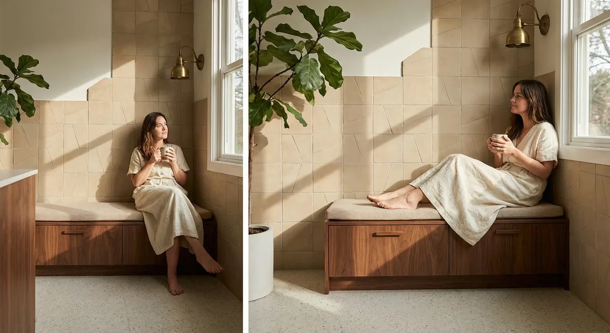
Color often receives the most attention in tile selections, but the most elevated rooms lean heavily on texture and how it behaves under changing light. Subtle relief patterns, hand‑pressed edges, and satin or honed finishes introduce a nuanced play of shadow that adds depth without visual noise.
In naturally bright rooms, a slightly textured tile softens glare and gives daylight something to “hold on to,” producing a gentle, shifting surface across the day. In more controlled or low‑light environments, a fine matte or honed finish absorbs just enough light to avoid harsh reflections, especially on floors and shower walls. This is particularly effective in neutral palettes: rather than relying on multiple colors, you can layer a single tone in different textures—glossy wall, honed floor, ribbed accent—to create a sophisticated, tonal composition. The result feels rich but never busy, like a well-curated wardrobe of similar hues in different fabrics.
3. Let Transitions Tell a Story, Not Expose a Compromise
The most telling detail in any tiled space is not the feature wall; it’s the transition: tile to wood, tile to carpet, tile to plaster, tile to glass. In premium interiors, these junctions are not disguised—they are refined. A flush transition between a tiled bathroom and a wooden bedroom floor, for instance, reads as seamless and deliberate, avoiding clumsy thresholds that interrupt the flow.
Think of each transition as a punctuation mark in the architectural narrative. Oversized metal trims, mismatched heights, and abrupt pattern changes break the rhythm. By contrast, carefully selected profiles—slim, color-matched, or even recessed—can create an elegant edge that frames the tile rather than competes with it. Where different tile types meet (say, a stone‑look floor meeting a glossy ceramic wall), consider a deliberate shift in joint alignment or orientation, so the change feels composed rather than accidental. When transitions are curated with this level of intention, the eye travels calmly through the space, and the tile feels naturally integrated into the architecture.
4. Exploit Scale Shifts to Shape How a Room Is Experienced
Scale is one of the most powerful, underused tools in tile design. Sophisticated spaces often use deliberate shifts in tile size to subtly define zones, adjust perceived proportions, and guide movement—without resorting to loud color or pattern changes.
In a primary bathroom, large-format floor tiles can visually widen a narrow space, while a smaller mosaic in the shower tray offers both traction and an intimate, tailored feel. Continuing the same color in different scales creates cohesion, while the change in module size gently signals a functional shift. In kitchens, using a generous, elongated subway tile laid vertically behind the range can lift the eye and counteract a low ceiling, while a more compact tile behind open shelving adds fine detail where you’re closer to the surface. These scale transitions, when carefully aligned and color-coordinated, act like a crescendo and diminuendo in music: subtle, controlled, and deeply influential on how you experience the room.
5. Elevate “Necessary” Details into Signature Moments
Luxury emerges when the elements you must have—drains, niches, outlets, slopes—are treated with as much design rigor as the elements you choose for pleasure. In tiled environments, these functional necessities offer rare opportunities for discreet yet memorable detailing.
A linear drain precisely aligned with floor joints, for example, can virtually disappear, turning a utilitarian requirement into a visual highlight for those who notice. Shower niches that land perfectly within the tile grid, with mitred or minimally trimmed edges, feel more like built‑in joinery than cavity in a wall. Even the way tile terminates around electrical outlets can be elevated with careful planning: centering outlets within a tile rather than cutting erratically through joints preserves the integrity of the pattern. When these details are carefully orchestrated, the entire room takes on a sense of inevitability—everything is exactly where it ought to be, and nothing feels improvised.
Conclusion
Exceptional tile work is not about spectacle; it is about discipline, alignment, and a profound respect for proportion and light. When you design from the joint outward, use texture to modulate brightness, choreograph transitions, orchestrate scale, and dignify functional details, tile becomes the quiet foundation of a truly considered home.
For the attentive homeowner, these decisions redefine tile from “finish material” to architectural language. The reward is a space that ages with grace, withstands careful scrutiny, and feels as composed in ten years as it does on the day the last joint is grouted.
Sources
- [Tile Council of North America (TCNA) Handbook](https://www.tcnatile.com/products-and-services/publications/tcna-handbook.html) - Industry reference for tile installation standards, detailing best practices for layout, transitions, and detailing
- [American National Standards Institute (ANSI A108/A118/A136.1)](https://webstore.ansi.org/standards/tca/tcaa108a118a1362019) - Technical standards for ceramic tile installation, including recommendations that inform precise, durable detailing
- [Schluter Systems – Tile Edge Profiles](https://www.schluter.com/schluter-us/en_US/Profiles/c/P) - Manufacturer guidance on refined edge and transition treatments between tile and adjacent materials
- [Virginia Tech – Lighting and Interior Design Resource](https://www.housing.vt.edu/content/dam/housing_vt_edu/living-on-campus/design-resources/lighting-interiors.pdf) - Explores how light interacts with surfaces, useful for understanding how tile texture and finish shape perception
- [NC State University – Universal Design Principles](https://projects.ncsu.edu/design/cud/about_ud/udprinciplestext.htm) - Framework for functional design decisions (like drains, thresholds, and accessibility) that can be elevated into thoughtful architectural details