For homeowners who care about refinement, tile layout is where an ordinary installation becomes architectural. Below, we explore five exclusive, often-overlooked insights that separate merely acceptable work from genuinely elevated surfaces.
The First Line You Draw Is More Important Than the First Tile You Set
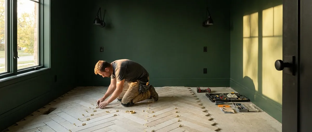
Before thinset is opened, a thoughtful installer stages the entire room in graphite and tape: chalk lines, reference marks, dry layouts. The first control line determines how every subsequent decision will read—how tiles meet thresholds, how joints align with vanities, and whether the room feels balanced or subtly “off.”
Rather than centering the layout purely on the room’s dimensions, a refined approach begins with sightlines: the axis you see from the doorway, the view from the tub, the line you catch at the top of the stairs. A slightly off-center layout that privileges the primary sightline will often feel more resolved than a mathematically perfect one that forces awkward cuts at highly visible edges.
Ask your installer to walk the space with you before a single tile is set. Discuss where your eye naturally goes first, which edges should be pristine, and which corners can discreetly absorb smaller cuts. The first line on the floor should honor how you live in and move through the room—not just how the tape measure reads.
Corners as Compositions, Not Afterthoughts
In sophisticated interiors, corners behave like hinges in a book: they should close cleanly and align with quiet authority. Too often, corners are where a tile layout “gives up”—with sliver cuts, misaligned grout joints, or jarring shifts in pattern.
A premium installation treats every inside and outside corner as a composition. On walls with patterned or elongated tiles, this may mean “wrapping” the pattern around the corner so joints appear to fold instead of break. On large-format slabs, it might involve carefully bookmatching veining so the corner becomes a feature rather than a seam to be hidden.
You’ll know corners were prioritized when:
- No tile slivers under 1/3 width appear at eye-level corners
- Grout joints visually continue around the corner with intention
- Bullnose, metal profiles, or miters are specified to match the aesthetic rather than chosen as an afterthought
This level of planning often requires slight advances or retreats in layout—shifting a pattern by millimeters early on—to preserve purity at corners. When done well, you’re left with rooms that feel calmly resolved, even if you can’t immediately articulate why.
Grout as a Design Material, Not a Filler
Grout is frequently treated as a technical necessity: a gap filled, a joint sealed. In elevated tilework, it is a design material in its own right, responsible for atmosphere as much as durability. The color, joint width, and finish of grout can either amplify the tile’s sophistication or flatten it entirely.
Narrow joints (often 1/16"–1/8", depending on tile and substrate) tend to feel more tailored and architectural, especially with rectified porcelain and natural stone. Larger joints can work beautifully in rustic or handmade contexts, where irregular edges become part of the charm. The crucial distinction is intent, not size.
Color is equally critical. Tone-on-tone grout creates a monolithic, serene field, ideal for contemporary spaces. A slightly contrasting grout can reveal pattern and geometry, while a strongly contrasting grout can turn a simple layout into a graphic statement. For premium installations, request:
- A physical grout mockup on sample tiles, wet and dry
- Confirmation of joint width before work begins
- A discussion of sanded vs. unsanded (or epoxy) grout based on tile type and use
In exceptional spaces, grout doesn’t merely “disappear” or “pop”—it participates in the design conversation with subtle confidence.
The Art of Transition: Where One Surface Gently Yields to Another
The elegance of a tiled room is often decided at its edges: thresholds, doorway transitions, shower entries, and the places where tile ends and another material begins. These liminal zones are where poor planning is most apparent—abrupt height changes, clumsy metal trims, or misaligned patterns that break the visual rhythm.
A sophisticated transition does three things:
- Resolves height differences gracefully – Through proper subfloor preparation, underlayment, or tapered transitions, rather than abrupt lips that become tripping hazards or visual interruptions.
- Respects the hierarchy of materials – Stone or finely finished wood may be allowed to “frame” tile, or vice versa, depending on the design intent. Transitions feel deliberate, not improvised.
- Aligns geometry across rooms – Tile joints that sightline cleanly into wood plank seams, carpet patterns, or stone thresholds suggest a home designed as a whole, not as a series of disconnected decisions.
Discuss thresholds early: Will there be marble saddles? Flush transitions? Metal profiles in a finish that repeats elsewhere (door hardware, fixtures, window frames)? When transitions are curated rather than defaulted, the entire home feels more cohesive, quietly expensive, and resolved.
Large-Format and Stone: Precision as a Luxury
The rise of large-format porcelain and stone slabs has changed what’s possible in residential tilework. Fewer joints, uninterrupted veining, and almost monolithic surfaces can transform bathrooms and kitchens into gallery-like spaces. But this visual calm is only achieved when the underlying preparation and technical execution are unusually rigorous.
With large-format tile, minor substrate imperfections become major visual disruptions. A premium installation will include:
- Comprehensive substrate flattening and leveling beyond basic code minimums
- Thoughtful placement of unavoidable seams where they are least visually intrusive
- Strategic orientation of veining or pattern to lead the eye and complement the architecture
- Expansion joints and movement accommodation discreetly integrated, not ignored
For natural stone, additional care—sealing, appropriate thinset, consideration of moisture sensitivity—is non-negotiable. In the most refined projects, bookmatched slabs in showers, feature walls, or floors become statement pieces on par with fine art.
If you are investing in large-format or stone, insist on seeing your installer’s previous work with similar materials. This category rewards mastery and punishes shortcuts more than any other.
Conclusion
True tile luxury is rarely about price per square foot alone. It resides in the intelligence of the layout, the restraint of the grout choices, the poise of the corners, and the grace of the transitions. These are the details that reward repeated viewing and long-term living—the quiet geometry behind a space that simply feels “right.”
As you plan your next tile project, step beyond color and style boards and into the architectural discipline of layout. Partner with an installer who treats each decision as part of a larger composition. In the end, the most refined tiled rooms are not loud, but lasting—surfaces that whisper their quality every time you cross the threshold.
Sources
- [Tile Council of North America (TCNA) Handbook](https://www.tcnatile.com) - Industry standards and best practices for tile installation, including substrates, layout, and movement joints
- [Schluter Systems – Tile Installation Systems](https://www.schluter.com/schluter-us/en_US/intro) - Technical resources on underlayments, transitions, waterproofing, and profiles for refined edge detailing
- [American National Standards Institute (ANSI) – A108/A118/A136.1](https://webstore.ansi.org) - Standards governing tile installation methods, materials, and tolerances
- [National Tile Contractors Association (NTCA)](https://www.tile-assn.com) - Professional guidance, technical articles, and educational resources on high-quality tile installations
- [University of Tennessee – Natural Stone Institute Technical Resources](https://www.naturalstoneinstitute.org/technical) - Detailed information on natural stone selection, installation, and care for premium projects