Below are five exclusive design insights that move beyond trend-chasing into the realm of enduring sophistication. Each one is less about “what’s popular now” and more about how to think about tile as a permanent, architectural presence in your home.
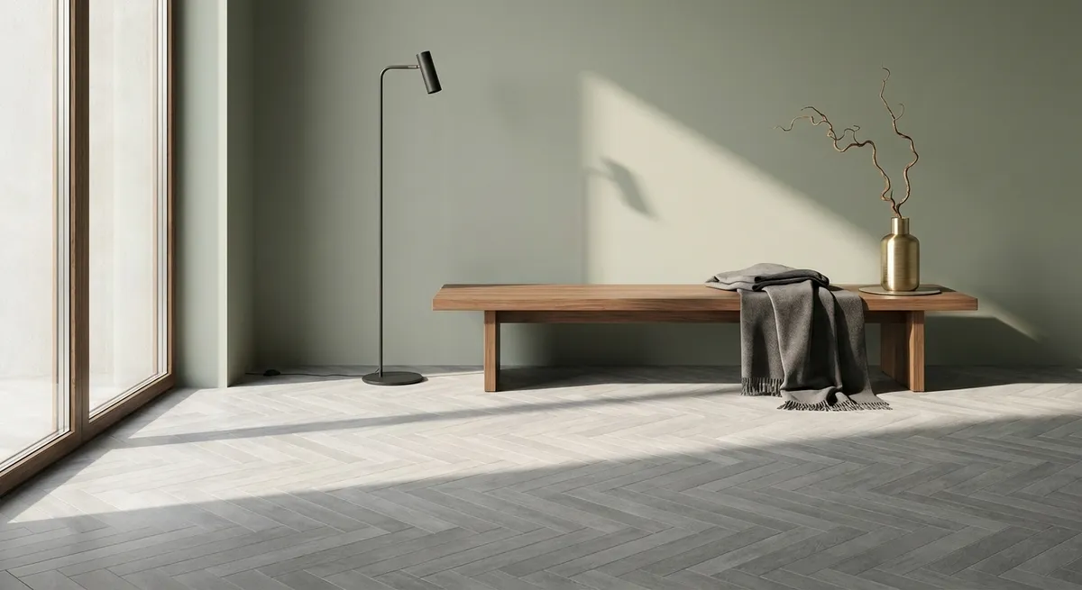
1. Designing with Shadow: How Relief and Finish Shape the Mood
A refined tile scheme is as much about shadow as it is about color. Subtle relief patterns, bevels, and softly structured surfaces create a play of light that changes over the day, giving walls and floors a sense of quiet movement.
On walls, consider low-relief, matte or satin-finish tiles that avoid glare yet still register depth. In a shower, for instance, a vertical fluted tile in a muted tone will read as a calm backdrop from a distance, but up close its grooves will catch light like fabric pleats. On floors, gently textured porcelain in large formats can deliver the warmth of stone without the visual noise of heavy veining or extreme variation.
The key is restraint: choose one primary surface with pronounced relief and allow the surrounding materials—paint, cabinetry, metal finishes—to remain optically calm. This hierarchy lets the tile become a subtle focal point rather than part of a visual argument.
2. Monochrome, Elevated: Working with a Single Hue in Multiple Textures
Monochrome design need not be minimal; it can be richly layered—if you vary texture, sheen, and scale within the same tonal family. Instead of mixing many colors, work within a sophisticated palette of one hue and its near neighbors.
For example, a deep, blue-grey floor tile in a honed porcelain, paired with a wall tile in the same color but a glossier, smaller format, can create depth without ever feeling busy. Add a third variation, such as a narrow mosaic strip in a matte glass of nearly identical tone, to mark a niche, vanity backsplash, or shower ledge.
The effect is elevated and tailored: light picks up each finish differently, but the harmony of color keeps the space cohesive. This approach is especially successful in compact rooms—powder baths, ensuites, butler pantries—where visual clutter is amplified. Monochrome sophistication allows every square inch to feel intentional and composed.
3. Intelligent Transitions: Using Tile to Draw Boundaries Without Walls
Open-plan living calls for subtle ways to define zones without adding physical barriers. Tile is an exceptional tool for this when used with precision rather than spectacle.
Consider changing the tile layout, not the material, to define spaces. In a kitchen that opens to a dining area, you might run a large-format porcelain in a straight stack pattern throughout, but rotate only the kitchen zone to a herringbone or chevron layout. The color and tile remain the same, yet the pattern shift quietly signals “workspace” versus “living space.”
Thresholds can also be articulated with a single, deliberate detail. A slender border tile in a contrasting tone or finish can frame an entry or outline the footprint beneath a dining table, creating the effect of a “built-in rug” that will never wear or wrinkle. The luxury here lies in subtlety—when transitions feel discovered, not announced.
4. The Precision Palette: Pairing Stone-Look and Wood-Look Without Imitation
Sophisticated interiors rarely rely on obvious imitation. When using stone-look and wood-look porcelain tiles, the goal is not to fool the eye, but to capture the spirit of those materials while making the most of porcelain’s technical advantages.
Select stone-look tiles with controlled veining and a limited color range, more akin to fine European limestones or Belgian bluestone than dramatic marbles. For wood-look tiles, opt for planks with restrained grain patterns and minimal contrast between boards—think quietly aged oak rather than rustic barnwood.
When pairing the two, maintain a clear hierarchy: one “reads” as the architectural base, the other as a refined accent. For example, a stone-look tile in a generous format (24"x48" or larger) may serve as the main flooring throughout the ground level, while a careful selection of wood-look planks defines an intimate reading nook or library area. Keep undertones aligned (warm with warm, cool with cool) so the combination feels curated rather than competing.
5. Micro-Details with Macro Impact: Grout, Edges, and Alignment
In elevated tile work, the most luxurious decisions are often the smallest. Three micro-details—grout color, edge treatment, and alignment—can transform the perceived quality of the entire installation.
- Grout Color: For a serene, gallery-like feel, choose grout that closely matches the tile, particularly for large-format floors and walls. Where you do want to celebrate pattern—such as a handset mosaic backsplash—shift to a slightly contrasting grout to trace the geometry without creating harsh outlines.
- Edge Treatment: Rectified tiles with clean, precise edges support tight joints and crisp lines, ideal for contemporary or tailored interiors. In more classic spaces, consider tiles with softened or pillowed edges that diffuse light and make grout lines appear graceful, never stark.
- Alignment and Sightlines: Lay out tile with full awareness of how it aligns with architectural elements: the centerline of the sink, the sightline from the entry, the edge of a window casing. A niche that lands exactly in the center of a tile grid, or a floor pattern that visually “locks into” a doorway, signals craftsmanship that clients may not be able to name—but immediately feel.
When these details are resolved with care, the finished room feels calm, deliberate, and quietly expensive—even if the materials themselves are modestly priced.
Conclusion
Truly refined tile design is not about chasing dramatic statements; it is about orchestrating proportion, texture, light, and alignment so that the room feels inevitable—as though it could not have been designed any other way. By considering shadow as a design tool, elevating monochrome palettes, using tile to draw subtle boundaries, pairing material looks with intention, and obsessing over the smallest details, homeowners can achieve spaces that age gracefully and reward close attention.
In the end, the most luxurious tilework is not merely seen. It is felt—in the quiet confidence of a room that has nothing to prove and everything to reveal over time.
Sources
- [Tile Council of North America (TCNA) Handbook](https://www.tcnatile.com/technical-highlights/handbook-faq.html) - Authoritative reference on tile installation standards and best practices
- [Ceramic Tile Education Foundation](https://www.ceramictilefoundation.org/blog) - Technical insights and professional perspectives on tile selection and installation
- [Porcelanosa – Design & Trends](https://www.porcelanosa.com/uk/trends/) - High-end tile and surface design trends, finishes, and applications
- [Fiandre Architectural Surfaces – Design Solutions](https://www.granitifiandre.com/projects) - Case studies showcasing sophisticated use of large-format and stone-look porcelain
- [Architectural Digest – Tile Design Features](https://www.architecturaldigest.com/search?q=tile) - Curated examples of elevated tile use in luxury residential interiors