The Primary Sightline: Designing Your Layout from the Room’s First Glance
Before a single tile is set, establish the room’s “first view”—the perspective your eye naturally takes when you enter. This is the most powerful sightline in the space, and it should dictate how your layout begins.
Stand in each doorway and note where your eye lands first: the far wall, a shower niche, a kitchen range, or a large window. Your goal is to place your most intentional tile alignments—full tiles, centered patterns, continuous grout joints—directly along or perpendicular to that line. In a shower, for example, you might center a feature tile band exactly on the main viewing axis, then allow cuts to fall discreetly near the floor or behind glass.
This approach often means ignoring nominal room symmetry in favor of visual symmetry. A layout that is mathematically centered but looks off-balance from the entry is a missed opportunity. Establishing the dominant sightline early guides every subsequent decision: where to start your grid, how to treat thresholds, where to tolerate small cuts, and where perfection is non-negotiable.
The Grout Narrative: Curating Tone, Width, and Rhythm
Grout is not a filler; it is a narrative thread that either calms a surface or breaks it into noise. Refined tile work treats grout decisions as deliberately as tile selection itself.
Color should be selected for the story you want the surface to tell. A tonal grout matched closely to the tile creates an expansive, near-monolithic plane—ideal for minimalist or gallery-like rooms. A slightly contrasting grout reveals the grid and can emphasize handcrafted edges, particularly with zellige or artisanal ceramics. High contrast, by contrast, skews graphic; used judiciously, it’s compelling, but in elegant interiors it is typically reserved for specific feature moments, not entire rooms.
Width affects perception as much as color. Narrow joints (often 1/16"–1/8", depending on tile tolerance) tend to feel more tailored and architectural, but they demand precise tile and substrate preparation. Wider joints can suit rustic or handmade tiles, allowing subtle variation to appear intentional rather than flawed. Consider grout as rhythm: how tightly or loosely the lines repeat across your field will determine whether the space feels relaxed, energetic, or serenely continuous.
Substrate as Sculpture: The Hidden Architecture Behind Flawless Tile
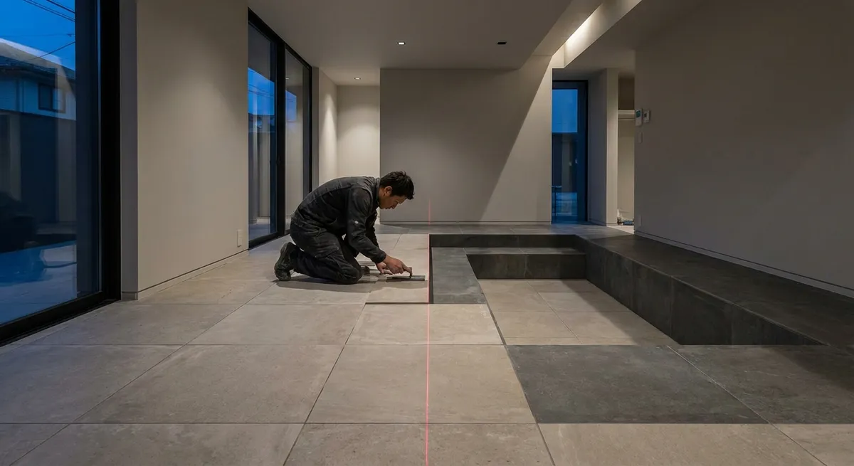
Exquisite tile work is impossible over a casual substrate. Behind every seemingly effortless installation is a substrate treated like a sculpted plane, not a rough base.
Flatness and rigidity are the governing principles. Large-format tiles, popular in contemporary luxury spaces, are particularly unforgiving; even small deviations in the substrate produce lippage—those minute height differences at tile edges that catch light and feel unrefined underfoot. Skilled professionals will use self-leveling compounds or meticulous float work to create surfaces that are not just “within tolerance” but visually dead-flat, especially where raking light from windows or wall washers will expose any imperfection.
Moisture management is equally critical, especially in showers, steam rooms, and spa-like baths. Proper waterproofing membranes, correctly overlapped and sealed, protect your structure and preserve the longevity of grout and setting materials. The homeowner’s refined role is to insist on the invisible: to require documentation of waterproofing systems, inquire about flatness tolerances, and ensure that the substrate is treated as intentionally as the visible tile.
Thresholds and Transitions: Composing Seamless Room-to-Room Moments
The most elegant tile installations are often revealed at the edges—where tile meets wood, stone, or carpet; where a shower floor meets a bathroom floor; where a kitchen backsplash meets a window casing. These transitions are moments to either elevate or diminish the entire space.
Consider continuity first. Aligning grout joints through doorways into adjacent tiled rooms, or along a hallway spine, gives an almost architectural calm. Even when materials shift—from tile to hardwood, for example—maintaining shared axes or proportional relationships between joints and boards preserves visual harmony. In some spaces, it is worth gently adjusting the starting layout to avoid awkward slivers at thresholds and to ensure transitions land gracefully under doors or at centered points.
Next, refine the edge details. Understated metal profiles in finishes aligned with hardware (brushed nickel, aged brass, blackened steel) can create a slim, disciplined transition. In more traditional interiors, carefully milled stone or wood thresholds, scribed precisely to tile and adjacent materials, create a bespoke impression. Avoid standard off-the-shelf trims where a custom or minimally visible detail is possible; refined work often looks expensive not because of ostentation, but because of the restraint and precision at each boundary.
Light as a Finish Material: Installing for Shadow, Reflection, and Depth
Tile does not exist in isolation; it exists in light. The same wall can look either quietly luxurious or disappointingly uneven depending on how it responds to natural and artificial illumination. Sophisticated tile installations are designed in concert with lighting, not in sequence after it.
Raking light—from floor-to-ceiling windows, wall washers, or linear LEDs—will dramatize even small irregularities. If your design calls for this type of light (for instance, a washed feature wall in a living area or a shower niche lit by a concealed strip), the tile plane must be executed to a higher standard of flatness and consistency. Rectified tiles, tight joints, and impeccable substrate preparation become essential, not optional.
Conversely, certain tiles—handmade, deeply textured, or lightly irregular—benefit precisely from this interplay of highlight and shadow. When intentional, the micro-variations become a virtue, creating depth and softness in the surface. The key is alignment between tile character and lighting strategy. Discuss with your installer where fixtures will be placed and how the light will fall; in some cases, a subtle shift in fixture spacing or aiming can turn a merely good installation into something quietly extraordinary.
Conclusion
In distinguished homes, tile is not simply a finish; it is an architectural instrument that controls line, light, and proportion. The most memorable installations rarely call attention to themselves loudly. Instead, they reward the observant eye: the perfectly aligned sightline from entrance to feature wall, the barely perceptible but comforting flatness beneath bare feet, the restrained and thoughtful transitions from one material to another. By approaching tile installation as a composition—one in which grout, substrate, thresholds, and light all participate—you transform a standard surface into a deliberate, architected experience. For homeowners who appreciate refinement, these details are not embellishments; they are the very essence of luxury.
Sources
- [Tile Council of North America (TCNA) Handbook](https://www.tcnatile.com/handbook.html) - Industry guidelines on installation methods, substrates, and performance standards
- [American National Standards Institute (ANSI) A108/A118/A136](https://www.nxtbook.com/nxtbooks/ansi/a108_2017/index.php) - Technical standards for tile installation, setting materials, and grout performance
- [Schluter Systems – Waterproofing and Substrate Preparation](https://www.schluter.com/schluter-us/en_US/installation) - Manufacturer guidance on membranes, transitions, and substrate requirements
- [Laticrete – Large Format Tile Installation Best Practices](https://laticrete.com/en/support-and-downloads/technical-design-manuals) - Technical resources on flatness, lippage control, and setting materials for large-format tile
- [University of Tennessee Extension – Ceramic Tile Installation Guide](https://extension.tennessee.edu/publications/Documents/W436.pdf) - Educational overview of substrate preparation, layout, and grout considerations