Below are five exclusive, often-overlooked insights that separate merely “good” tile work from the sort of surfaces that feel intentionally crafted and enduringly elegant.
Insight 1: Design the Grid Before You Choose the Tile
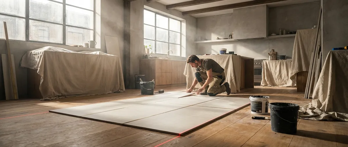
Most homeowners start with color and pattern. Professionals start with the grid.
Before you fall in love with a particular tile, map how the layout intersects with your architecture: doorways, transitions, cabinetry, windows, and focal points. A refined installation aligns tile joints with these elements rather than cutting around them as an afterthought.
For a long corridor, consider running tile joints centered on the hallway, letting cuts fall symmetrically at both walls instead of starting “full tile against one side.” In a bathroom, align major grout lines with the center of the vanity or shower niche, not the back wall where no one is looking. For open-plan spaces, imagine a faint grid running across the entire floor and determine where you want that geometry to be most visually coherent—perhaps along a primary sightline from the entry to the window wall.
This level of pre-planning often means adjusting tile size, orientation (stacked vs. offset), or even the width of grout joints. But when the grid serves the room—rather than the room surrendering to whatever is easiest to install—the result feels proportionate, harmonious, and quietly tailored.
Insight 2: Treat Transitions as Design Moments, Not Afterthoughts
Where one surface meets another is where luxury is usually revealed—or lost.
Transitions between tile and adjacent flooring, thresholds at doorways, and the edges where tile ends on walls deserve the same care as the field itself. Sophisticated installations rarely rely on crude reducer strips or abrupt cut edges; they use purpose-selected trims and thoughtfully managed levels.
Consider a flush transition between tile and hardwood, both sitting on carefully adjusted underlayments so there is no perceptible lip. If a height difference is unavoidable, specify a low-profile metal transition in a finish that echoes your door hardware or plumbing fixtures. For wall terminations, choose between a crisp metal profile that frames the tile or a deliberately aligned field tile edge that ends on a plumb, architecturally meaningful line (for example, aligned with the edge of a mirror or a window casing).
By treating every meeting point as a deliberate design decision, you eliminate the visual “noise” that so often makes even expensive tile installations feel unresolved.
Insight 3: Honor the Tile’s Natural Character Instead of Fighting It
True refinement acknowledges what a material wants to do rather than forcing it into submission.
Porcelain, stone, and ceramic each have inherent characteristics—variation in tone, slight warpage, directional pattern, or veining—that should guide how they are installed. Large-format rectangular tiles, for instance, tend to have subtle bowing that becomes obvious with heavy offsets. Instead of a traditional 50% brick pattern, a 1/3 overlap or even a clean stacked layout often produces a flatter, more composed surface.
Natural stone demands an even more curated approach. Lay out every piece before installation and sequence them as you would artwork—balancing strong veining with quieter pieces, softening shifts in color so the surface has a natural, flowing rhythm instead of sudden patches of drama. With wood-look planks, mix tiles from multiple boxes as you go; this ensures the patterning feels organic rather than repetitive.
The goal is not to erase variation but to orchestrate it with intention. When you work with, rather than against, the tile’s character, the final surface feels expensive not because it is loud, but because it is deeply resolved.
Insight 4: Specify Grout as a Design Element, Not a Filler
Grout is often treated as a necessity; in elevated spaces, it is treated like a finish.
The color, width, and type of grout substantially influence how the tile reads. A near-tone-on-tone grout can create a continuous, monolithic effect that feels serene and modern, while a contrasting grout emphasizes the pattern and geometry of the layout. For subtle luxury, many designers now favor grout that is one to two shades softer than the tile—a gentle definition without harsh grid lines.
Joint width should be chosen with the tile’s dimensions and rectification in mind. Oversized joints can make even premium tile feel utilitarian, while joints that are too narrow can draw attention to minor lippage or manufacturing tolerances. High-performance cementitious or epoxy grouts, while more demanding to work with, offer superior stain resistance and color stability—critical in kitchens, entries, and baths where cleanliness and longevity matter.
By involving grout decisions early—alongside fixtures, hardware finishes, and lighting—you ensure it supports the room’s palette and mood rather than disrupting it.
Insight 5: Calibrate Lighting and Tile Together for a Flawless Read
Light can either flatter tile work or expose every flaw.
Highly directional lighting—recessed downlights, wall grazers, or strong natural light raking across a surface—will exaggerate even minor unevenness. This is why some installations that appear perfect under soft ambient light suddenly look wavy once task lighting is turned on.
For feature walls or large-format floors, coordinate your lighting plan with your tile choices and installation methods. If you prefer strong grazing light to highlight subtle texture, insist on meticulous substrate preparation: flatter underlayments, properly leveled mortar beds, and careful management of lippage. For highly reflective polished surfaces, slightly diffused lighting can be more flattering, softening the appearance of joints and microscopic imperfections.
The most sophisticated spaces treat tile and lighting as a coordinated pair. When they are designed together, the surface appears calm and flawless throughout the day, rather than betrayed by the sun at 3 p.m. or the under-cabinet LEDs at night.
Conclusion
Exceptional tile installation is not defined by how bold the pattern is or how costly the material might be. It is defined by the quiet discipline that happens before a single tile is set: the planning of the grid, the choreography of transitions, the respect for material character, the deliberate choice of grout, and the calibration of light.
For homeowners who value refinement over spectacle, these details become non-negotiable. They are the difference between a surface that merely covers a space and one that completes it—silently, gracefully, and with the kind of composure that only thoughtful craftsmanship can achieve.
Sources
- [Texas A&M University – Tile Installation Guide](https://agrilifeextension.tamu.edu/library/landscaping/tile-installation/) – General principles of tile installation, substrate prep, and layout fundamentals
- [Schluter Systems – Installation Handbook](https://www.schluter.com/schluter-us/en_US/technical-center/handbooks) – Technical details on transitions, trims, waterproofing, and movement joints
- [Custom Building Products – Grout Selection & Use](https://www.custombuildingproducts.com/how-to/product-selector/grout) – Guidance on grout types, color selection, and performance considerations
- [MAPEI Technical Articles](https://www.mapei.com/us/en-us/home-page/knowledge-bank/realta-mapei-articles) – Professional insights on large-format tile, substrate preparation, and lighting-related issues
- [U.S. Department of Housing and Urban Development – Residential Rehabilitation Guidelines](https://www.hud.gov/program_offices/healthy_homes/rrmodelguidelines) – Broader standards for durable, moisture-resistant finishes in residential construction