Below are five exclusive, design-forward insights that treat tile not as a surface you simply install, but as a crafted element of the home’s architecture.
1. Designing in Plan, Not Just in Elevation
Many tile layouts are conceived as flat front views—what you see on a wall or floor. Sophisticated spaces, however, begin on the plan: how tile governs movement, thresholds, and alignment across an entire room or series of rooms.
When you design in plan, grout lines become quiet guides that direct how you enter a space, where your eye lands, and how one room “speaks” to the next. A large-format tile in a long hallway, for instance, can be oriented so its longest edge subtly pulls you toward a focal point—perhaps a window, fireplace, or sculpture niche. In open-plan homes, you can shift the tile module slightly where one functional zone ends and another begins, creating a spatial cue without resorting to thresholds or trim pieces.
This approach demands rigor: aligning tile joints with architectural elements such as door jambs, kitchen islands, bath vanities, and even ceiling beams. The result is a plan in which tile seems inevitable rather than applied—an invisible arithmetic of order that feels calm even if no one can quite explain why.
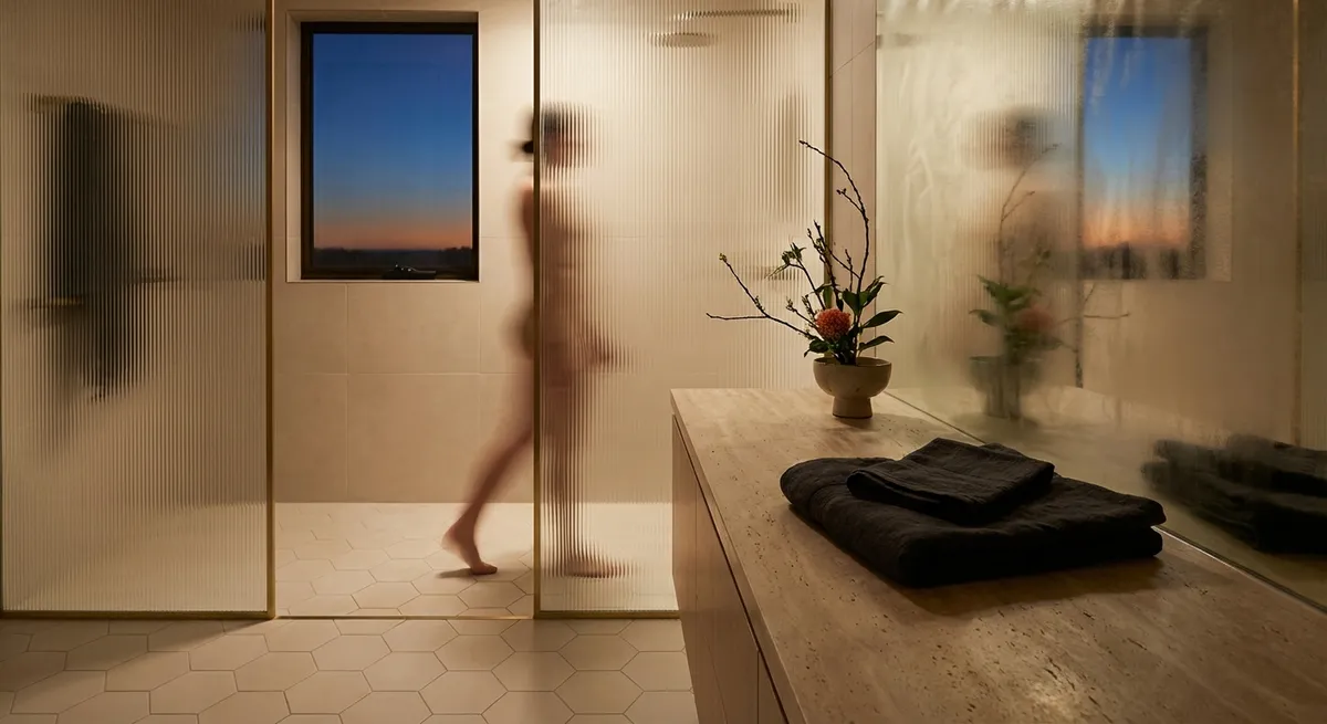
2. Grout as a Design Instrument, Not an Afterthought
For cultivated interiors, grout is never “whatever is close.” It’s a deliberate instrument—often the difference between a surface that feels integrated and one that feels busy.
A tone-on-tone grout (just a shade deeper or lighter than the tile) softens the grid and lets the material read as continuous. This is particularly effective for natural stone or stone-look porcelain, where you want the veining to take precedence over joints. Conversely, a slightly contrasty grout—perhaps 1–2 tones darker—can accentuate the geometry of a classic running bond or herringbone, giving it a tailored, textile-like feel.
For large-format tiles with minimal joint lines, consider how grout width influences the perception of quality. Narrow, consistent joints feel more bespoke and architectural, but they must be executed with precision to avoid telegraphing minor irregularities. In wet areas, high-performance, stain-resistant grouts (including epoxy options) extend the life of your design, ensuring that the grout color you obsess over today still reads correctly years from now.
In refined spaces, grout is not just a technical necessity—it’s part of the color story, the visual rhythm, and even the maintenance plan.
3. Layered Surfaces: Mixing Finishes Within the Same Tile Family
Rather than mixing many different tiles, a particularly elevated strategy is to work within a single tile family but vary the finish selectively—polished, honed, matte, structured, or fluted—across zones or planes.
In a primary bathroom, for example, the floor might use a honed or matte version of the tile for slip-resistance, while the shower walls employ the same color in a subtle polish that catches the light. A small inset niche could introduce a structured or ribbed finish of the same material, creating a play of shadow that feels sculptural without relying on contrasting colors.
Kitchens benefit greatly from this subtlety as well. A backsplash in a gently textured finish paired with a smoother matching slab-look tile on the floor can create depth while maintaining chromatic restraint. The key is to think of the space as a layered composition: same hue, same base material, but different surface interactions with light and touch.
This layered approach yields a sense of custom tailoring—everything appears coordinated, but nothing feels flat or one-note.
4. Tile Transitions as Architectural Jewelry
Transitions are where a tile project either quietly fails or quietly triumphs. The most discerning homes treat these junctions—between materials, levels, or functions—as opportunities for understated “architectural jewelry.”
Instead of bulky metal strips or standard reducer pieces, consider recessed transitions where the materials meet on a carefully planned, level plane. For example, where timber flooring meets large-format porcelain, you can align joints so the wood planks and tile modules appear to converse rather than collide. A slim, color-matched stone or porcelain border can serve as a “frame” around a field of tile, especially in entries or dining rooms, evoking classic stonework in a modern language.
In showers, the shift from wall tile to floor tile can be refined by using the same material cut into smaller formats for the base, allowing for proper drainage while preserving visual continuity. For thresholds, matching stone saddles or porcelain pieces cut from the same tile can eliminate the sense of a “break” and instead feel like a purposeful pause.
These micro-decisions are rarely celebrated on social media, yet they are what make a project feel custom—and they are precisely what trained eyes notice immediately.
5. Calibrating Scale and Orientation to the Architecture
Beyond color and pattern, the true sophistication of tile lies in its proportion relative to the room and its architecture. The tile size, shape, and orientation should respond to sightlines, ceiling height, and the scale of furnishings.
In a narrow powder room, large-format vertical tiles installed in a stacked pattern can elongate the walls, making the space feel more gallery-like than corridor-like. In broad, low-ceilinged rooms, running rectangular tiles parallel to the longest wall can visually “stretch” the space, while a chevron or herringbone pattern can introduce movement and counteract squat proportions.
Subway tiles, still beloved, become elevated when their dimensions are reconsidered—perhaps a taller, slimmer format set in a refined stack bond for a quietly modern aesthetic, or laid vertically for a sense of height behind a vanity or cooktop. In entryways or great rooms, overscaled tiles reduce grout lines and create a more monolithic, architectural feel; just be sure the room’s dimensions and structural tolerances support that scale without excessive cutting.
The most sophisticated designs read the architecture first, then choose tile that harmonizes with it—never the other way around.
Conclusion
Tile, at its most refined, is less about decoration and more about discipline. It is the orchestration of joints with architecture, grout with color story, finish with light, and scale with proportion. For homeowners who demand more than trend-driven surfaces, these quiet, meticulous decisions are where luxury truly resides.
By designing in plan, treating grout as a design tool, layering finishes, elevating transitions, and calibrating scale to the architecture, you transform tile from background material into a subtle, enduring expression of taste. The end result is a space that feels composed rather than assembled—one whose elegance deepens the longer you live with it.
Sources
- [American Institute of Architects (AIA) – Residential Design Best Practices](https://www.aia.org/topics/153646-residential-architecture) – Discusses principles of residential architecture and spatial planning that underpin thoughtful tile layout.
- [Tile Council of North America (TCNA) Handbook](https://www.tcnatile.com/) – Industry reference for tile installation standards, grout recommendations, and performance considerations.
- [Ceramic Tile Education Foundation (CTEF)](https://www.ceramictilefoundation.org/blog) – Articles on advanced installation techniques, transitions, grout selection, and surface preparation.
- [Porcelanosa – Tile Collections and Technical Information](https://www.porcelanosa.com/en/tile/) – Examples of coordinated tile families (finishes, formats, and applications) used in refined residential designs.
- [Architectural Digest – Tile Trends and Design Inspiration](https://www.architecturaldigest.com/search?q=tile) – Curated editorial showcasing high-end tile applications and design-forward residential projects.