Designing a Visual Rhythm, Not a Pattern
Pattern is obvious; rhythm is persuasive. The distinction matters.
Instead of choosing tile solely for its motif, consider how your layout can introduce a cadence that leads the eye through a room. A classic herringbone or chevron, for example, can feel entirely different depending on its scale and orientation—running the “spine” of the pattern toward the main view line of the room creates a sense of motion, while setting it perpendicular can visually widen a narrow corridor.
The most sophisticated rooms harness restraint: a field of large-format porcelain in a calm tone, punctuated by a deliberate shift—perhaps a border of the same tile in a different finish, or a subtle modulation in joint spacing to signal a threshold between spaces. When tile layout is treated like musical notation rather than wallpaper, the room gains a quiet energy that feels intentional rather than decorative.
This approach also allows your tile to age gracefully. A well-planned rhythm transcends fleeting stylistic trends; the geometry remains compelling even as furnishings and color palettes evolve around it.
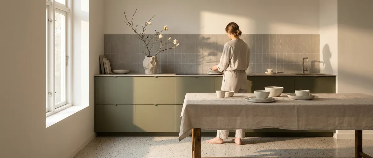
Material Pairings That Whisper, Not Compete
Premium interiors are rarely about a single “hero” surface; they are about conversation between materials. Tile excels when it becomes an articulate partner rather than a loud statement.
Pair strongly veined marble or marble-look porcelain with matte, low-reflectance counterparts—brushed metal fixtures, honed plaster, or oiled wood. The high drama of the stone is then grounded by materials that absorb light rather than reflect it back in competition. In reverse, a subtly textured limestone floor can be elevated with high-polish lacquer cabinetry or burnished brass, allowing the tile’s tactile quality to be discovered up close rather than from across the room.
A particularly elegant strategy is “tone echoing”: select a dominant hue from your tile—perhaps the warm gray in a Calacatta-inspired porcelain—and repeat it in adjacent textiles, paint, or metal finishes at a slightly different value (lighter or darker). This gentle echo creates coherence without drifting into sameness. The room feels layered, not matched.
For homeowners, the practical benefit is long-term flexibility. When tile is chosen with an eye toward material dialogue instead of novelty, it accommodates future changes in furniture and décor with ease.
Exclusive Insight #1: The 70/20/10 Surface Rule
Sophisticated tile schemes often succeed because they obey an invisible hierarchy. A useful framework:
- 70%: Quiet foundation
- 20%: Character surface
- 10%: Accent or punctuation
In practice, this might mean 70% of the space rendered in a restrained large-format porcelain, 20% in a more expressive material (a feature wall in the shower, a fireplace surround, or a kitchen backsplash), and 10% in a concentrated accent—perhaps an inlay at an entry threshold, or a slim band of contrasting mosaic outlining a niche.
This ratio prevents overdesigning. When everything is special, nothing is special. By consciously assigning each tile choice to one of these roles, you avoid the trap of competing surfaces. The result is a space that feels curated and resolved, not busy.
To apply this rule, begin by identifying your “quiet” tile—the one you’d still love in 15 years. Let that choice dominate floors and large expanses. Then, designate a secondary tile with more presence for focal areas, keeping its use restrained. Finally, add the 10% accent only if it adds clarity to the design—never simply because “there’s space for it.”
Exclusive Insight #2: Orientation as a Subtle Architectural Tool
The orientation of your tile can perform architectural work without a single wall being moved.
Linear tiles laid vertically elongate walls and emphasize height—ideal for lower-ceilinged bathrooms or powder rooms. The same tile laid horizontally broadens a space, particularly effective behind a freestanding tub or along a kitchen backsplash where you want a sense of width and calm.
Rectangular floor tiles installed on a bias (at 45 degrees) can soften the severity of a long corridor, while running them parallel to the main circulation path reinforces direction and purpose. Even small shifts—such as turning the same subway tile 90 degrees in a shower niche or above a vanity—create discrete “zones” without resorting to a change in material.
Treat orientation like a set of architectural lines drawn across the room. Ask: should this line guide me forward, hold me in place, or open the space sideways? Tile becomes more than cladding; it becomes a tool to subtly sculpt the room’s proportions.
Exclusive Insight #3: Layering Finishes Within a Single Color Story
Rather than relying on multiple colors, consider exploring a single hue in multiple finishes—gloss, honed, satin, and textured. This “monochrome with depth” approach feels particularly elevated.
Imagine a bathroom wrapped in warm ivory: the floor in a honed porcelain with gentle texture, the walls in a satin variation of the same tone, and the shower niche backed in a glossy, small-format tile that catches the light like still water. The color story remains quiet and cohesive, but the shifts in sheen and texture produce a richness that reveals itself gradually.
This strategy is especially powerful in compact spaces, where too many colors or patterns can feel busy. Keeping the palette tightly controlled while varying surface reflectivity allows you to maintain serenity without sacrificing visual interest.
From a practical standpoint, it also simplifies long-term maintenance and updates. Swapping hardware or paint becomes effortless when the tile language is unified; the room adapts to new accents without feeling disjointed.
Exclusive Insight #4: Framing and Edge Details as Luxury Markers
In truly refined tile work, the edges and transitions are where the luxury shows. A beautifully tiled surface can be diminished by abrupt terminations; conversely, disciplined framing can make even modest materials feel bespoke.
Consider:
- Tile “frames” around mirrors, art, or built-in shelving, using a bullnose or mitered edge to create the effect of a stone or tile surround.
- Shadow reveals—a slim, intentional gap between tile and adjacent surfaces (such as cabinetry or ceiling)—to create a floating, gallery-like effect.
- Threshold inlays where one flooring material meets another, using a single row of contrasting tile or stone to signal passage from public to private space.
Pay close attention to how tile meets baseboards, door casings, and window returns. Aligning grout joints with architectural elements, or intentionally offsetting them in a controlled way, communicates craftsmanship. These micro-decisions are rarely obvious to the casual eye, but they are acutely felt; the room simply “reads” as more considered.
Homeowners who emphasize these finishing details with their installer often achieve results that feel custom at a fraction of full bespoke cost.
Exclusive Insight #5: Designing for Patina—Even with Porcelain
Patina is often associated with natural stone, but the concept is broader: it’s about how a surface will live over time. Thoughtful tile design anticipates this trajectory from the beginning.
For stone lovers, select finishes and tones that welcome soft wear—a honed or leathered limestone in a forgiving mid-tone, for example, will evolve gracefully, whereas a highly polished, very light stone may reveal every etch and scratch. In high-use kitchens, pairing natural stone on the perimeter with robust, stone-look porcelain on the floor can balance romance with resilience.
Even with porcelain and ceramic, think about the “life” of the surface. Matte or lightly textured finishes are more forgiving than mirror-polish in busy households, and tiles with subtle variation (rather than perfectly flat color) tend to age visually with more grace. Opt for grout colors that harmonize with the tile instead of stark contrast; this not only feels more sophisticated but also masks the inevitable micro-changes that come with daily use.
The most successful interiors are designed not for the first photograph, but for the thousandth day of living. When you choose tile with patina in mind—whether literal or visual—you create spaces that feel better, not worse, as they accumulate time and memory.
Conclusion
Refined tile design is less about spectacle and more about orchestration. Visual rhythm replaces busy pattern; material pairings become dialogues, not arguments. Orientation, finish variation, edge detailing, and an understanding of patina all work together to yield rooms that feel quietly assured. For homeowners, embracing these principles and the five exclusive insights above transforms tile from “selection” to “strategy”—and ultimately, from background finish to a timeless architectural presence within the home.
Sources
- [Porcelain Tile Certification Agency – Technical Resources](https://ptcaonline.org/technical-resources/) – Background on porcelain tile performance and characteristics
- [Ceramic Tile Education Foundation](https://www.ceramictilefoundation.org/blog) – Articles on best practices in tile design, layout, and installation quality
- [Architectural Digest – Tile Trends and Ideas](https://www.architecturaldigest.com/search?q=tile) – Design-forward examples of sophisticated tile use in high-end projects
- [U.S. General Services Administration – PBS Marble and Stone Guidelines](https://www.gsa.gov/real-estate/design-construction/engineering-and-architecture/design-standards-and-guidelines/pbs-marble-and-stone) – Guidance on selection and long-term performance of stone surfaces
- [National Institute of Building Sciences – Whole Building Design Guide: Flooring](https://www.wbdg.org/space-types-buildings/flooring) – Technical considerations for flooring materials, including tile, in architectural design