1. Designing with Light, Not Just Tile
Sophisticated tile design begins with studying light—natural and artificial—before a single piece is specified. Rather than choosing a finish in a showroom and hoping it translates, consider how the tile will behave from dawn to dusk and under evening task lighting.
In north-facing rooms, honed and matte tiles can keep glare in check while still capturing a soft, velvety glow. In south-facing spaces with abundant daylight, a gentle satin finish or a lightly polished surface can refract light without feeling slick or ostentatious. Vertical surfaces—showers, fireplace surrounds, kitchen backsplashes—respond especially well to directional light; a subtle ribbed or fluted tile can cast delicate shadows that change throughout the day, turning the wall into a living canvas.
Plan your lighting with equal rigor: recessed fixtures grazing a tiled wall, concealed LED strips along a tiled niche, or dimmable undercabinet lighting can all dramatize the tile’s texture and proportion. In sophisticated interiors, the question is never “Which tile do we like?” but “How do we want the light to move across this surface?”
2. Micro-Joint Mastery: Grout as a Design Instrument
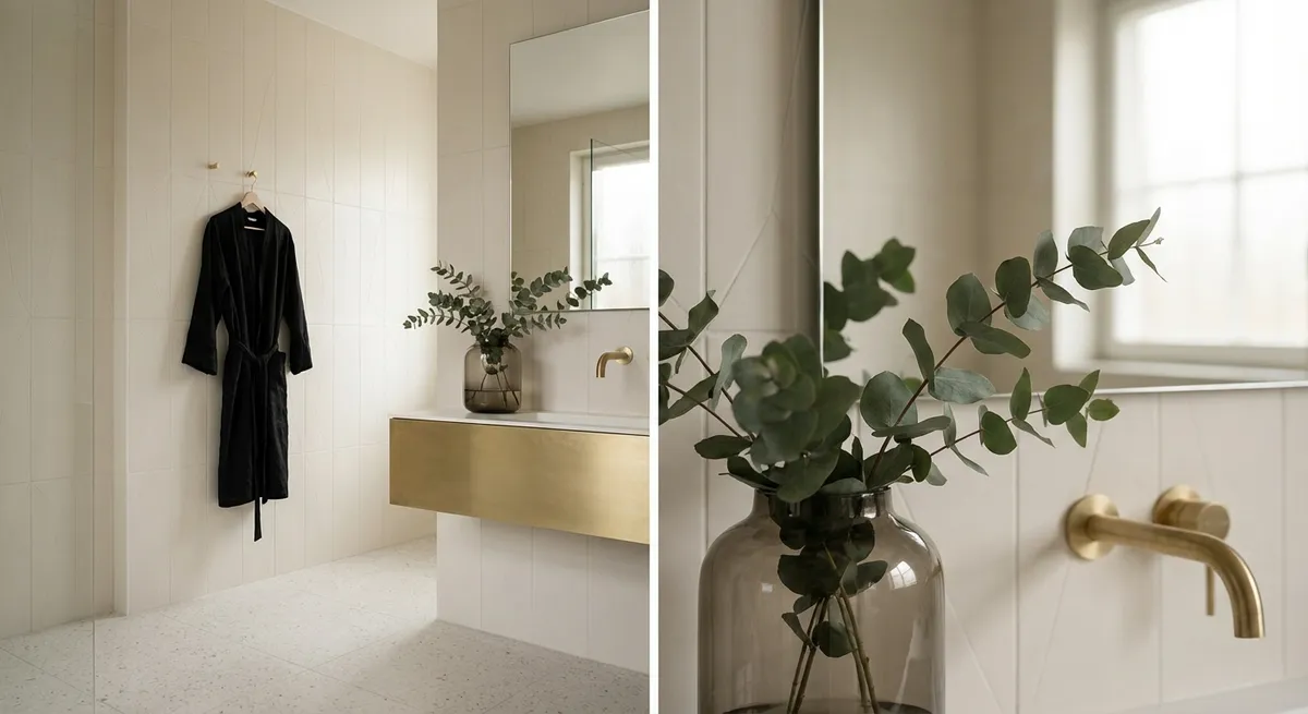
Grout is often treated as a necessary afterthought, when in refined interiors it functions as a deliberate design instrument. Ultra-narrow joints—achieved with rectified tiles and meticulous installation—immediately elevate a space, creating a near-monolithic surface that feels tailored rather than tiled. The key lies in choosing grout that either disappears or quietly articulates the geometry.
Tone-on-tone pairings (for example, warm limestone-effect tile with a slightly warmer, nearly identical grout) create a soft, continuous field perfect for tranquil bathrooms and formal living areas. Conversely, a barely perceptible contrast—a mid-warm gray grout with a pale stone look, or a charcoal grout with deep green tiles—can sharpen the grid just enough to read as architectural rather than decorative.
Pay particular attention to transitions: where grout lines meet thresholds, edges, and fixtures, the alignment should feel intentional. Aligning grout joints with window mullions, cabinetry reveals, and even hardware centers can create an almost subliminal sense of order. Luxury often reveals itself not in what is immediately seen, but in what never feels “off” when you look twice.
3. Composed Color Fields: Treating Tile Like Architectural Artwork
Rather than defaulting to a single tile throughout a room, consider composing color fields and zones the way a gallery curator might orchestrate wall color. The most compelling spaces often use a limited palette, but deploy it with precision.
Imagine a bathroom where the shower is wrapped in a slightly deeper shade of the main floor tile, visually receding and cocooning the bather. Or a kitchen where the backsplash shifts in tone—cooler near the cooking zone, warmer near an integrated coffee bar—creating subtle emotional cues within the same continuous material story. Colored tile doesn’t need to be bright to be powerful; deep smoke, muted eucalyptus, inky midnight blue, and warm putty neutrals can all lend a space a quiet, enveloping richness.
Borders and insets, once ornate flourishes, can be reinterpreted with restraint. A single band of smaller-format tile at eye level in a shower, executed in the same color but a different texture, can define a horizon line. A softly framed “tile rug” in a foyer using slightly tighter joints and a quieter tone can signal arrival without resorting to obvious pattern. In all cases, the goal is not contrast for its own sake, but calibrated shifts that guide the eye and define function.
4. Texture Pairing: Curating Tactility for Different Rooms
Texture in tile is not simply a safety feature in wet areas; it is an essential tool for emotional and sensory design. Elevated interiors are choreographed so that each room has its own tactile identity, while still feeling part of a cohesive whole.
In living areas and primary suites, large-format tiles with a soft-honed or “silk” finish can evoke the feel of worn stone or hand-burnished plaster, adding warmth to otherwise hard surfaces. In kitchens, pair a slightly textured floor tile—enough to add grip and disguise minor spills—with a refined, smoother backsplash to balance practicality and poise. For powder rooms, dramatic textures such as fluted, chiseled, or softly three-dimensional tiles can transform a small space into an immersive sensory experience, especially under low, warm lighting.
The most refined schemes typically blend no more than two or three levels of texture in any connected space. For example, a matte stone-look floor, a barely textured large-format wall tile, and a single accent niche in a more pronounced ribbed finish. This hierarchy keeps the room coherent, allowing the eye to rest even when the details are intricate. Texture should invite touch while respecting the calm of the overall composition.
5. Seamless Transitions: Elevation Changes as Design Opportunities
Where one tile meets another—at thresholds, level changes, and room boundaries—is where true craftsmanship becomes visible. Instead of hiding these transitions, sophisticated design treats them as opportunities to underscore continuity, rhythm, and refinement.
Between a tiled bathroom and a timber-floored bedroom, consider a slim stone or porcelain threshold in the same tone as the bathroom floor, subtly chamfered for comfort. This not only resolves material expansion differences but also creates a visual “comma” between zones. In open-plan spaces, you might maintain a single tile type but shift orientation—from a linear stack pattern in the kitchen to a more formal grid in the dining area—quietly delineating functions while preserving visual flow.
Floor-to-wall transitions deserve equal care. Running the same tile from the floor up the wall (even if only 12 to 18 inches) can ground a room, protecting lower walls and giving baseboards a more intentional role. Where tile stops mid-wall, aligning the terminal edge with architectural features—window sills, countertop heights, or the bottom of wall cabinetry—prevents the finish from feeling arbitrary.
For homeowners seeking a genuinely elevated outcome, these transitions are discussed early, not improvised onsite. Precise shop drawings, dry layouts, and coordination with millwork and fixtures ensure that every joint and edge feels inevitable rather than improvised.
Conclusion
Luxury in tile design is rarely about spectacle; it is about unbroken lines, controlled light, orchestrated texture, and transitions so considered they nearly disappear. By approaching tile not as mere “finish” but as architectural language, homeowners can create spaces that feel quietly confident and enduringly relevant. When every grout line, reflection, and threshold is deliberate, tile stops being simply the surface underfoot or behind the sink—and becomes the silent framework of a truly sophisticated home.
Sources
- [Tile Council of North America (TCNA) – Handbook & Resources](https://www.tcnatile.com/resources/installation-guides.html) - Technical references on tile installation methods, grout joints, and substrate preparation that inform high-quality design decisions.
- [Ceramic Tile Education Foundation (CTEF)](https://www.ceramictilefoundation.org/blog) - Educational articles on best practices, craftsmanship, and standards that underpin refined tile work.
- [American Institute of Architects (AIA) – Architectural Finishes Guidance](https://www.aia.org/resources/6077662-materials) - Context on how surface materials, including tile, integrate with broader architectural and lighting strategies.
- [ArchDaily – Tile in Contemporary Architecture](https://www.archdaily.com/search/projects/categories/ceramic-tiles) - Case studies and projects showcasing sophisticated uses of tile, light, and texture in high-end design.
- [Porcelanosa – Technical & Design Resources](https://www.porcelanosa.com/uk/architects-and-designers/) - Manufacturer guidance on finishes, formats, and applications relevant to premium, design-led tile schemes.