Below are five exclusive, design‑driven insights that move beyond trends and into the realm of enduring refinement—ideas that treat tile not as background, but as a quiet co‑author of your home’s architecture.
1. Designing with Light First, Tile Second
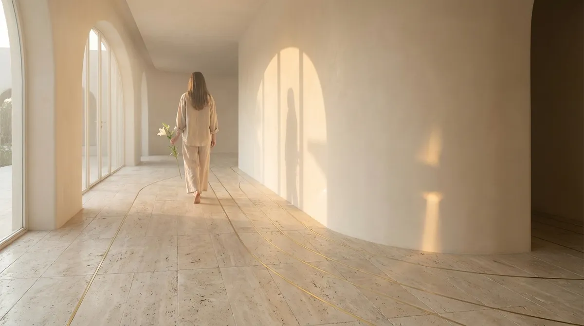
Most tile schemes begin with color or pattern; the most refined ones begin with light. Instead of asking, “Which tile do I like?” start with, “How do I want light to behave in this room?”
In sun‑drenched spaces, matte or honed finishes soften glare, allowing daylight to drape rather than bounce. In darker rooms or evening‑centric spaces, a strategic mix of satin and subtly glazed surfaces can capture even minimal light, creating a gentle shimmer rather than a harsh reflection. Vertical wall tiles with a slight curve or fluting catch side‑light beautifully, creating shadows that change from morning to night, turning a simple shower wall or backsplash into a living relief.
Consider where natural and artificial light will originate: a window, an under‑cabinet strip, a cove light, a pendant. Place tiles that respond well to raking light—textured stone, three‑dimensional ceramics, or hand‑pressed zellige—where they can reveal their nuance. Conversely, keep highly polished stone or tile away from direct glare paths to avoid hot spots and visual fatigue. Designing from the light outward allows tile to frame illumination with choreography rather than chaos.
2. Elevating Grout from Afterthought to Design Language
Grout is often treated as a technical necessity—color‑matched, minimized, and forgotten. In a truly elevated scheme, grout is a design language all its own, capable of tightening or relaxing a pattern, sharpening lines, or softening geometry.
For a monolithic, gallery‑like feel, choose a grout tone that sits just half a shade away from the tile color. This near‑match reduces visual “noise” and allows the architecture and furnishings to take precedence, ideal for large format porcelain, limestone, or concrete‑look tiles. In contrast, a deliberate grout contrast—deep charcoal with white tile, or warm taupe around a pale stone—can frame each piece like a miniature border, emphasizing module and rhythm.
Joint width is equally expressive. Razor‑thin joints (set within technical limits) feel tailored and architectural, especially on rectified porcelain or honed stone. Slightly wider joints, thoughtfully chosen, can lend a relaxed, European air to handmade tile or terracotta, where subtle irregularity is part of the charm. Resist the temptation to default: treat grout as you would a fine seam in couture—precise, intentional, and integral to the overall silhouette.
3. Curated Transitions: Where Surfaces Meet Matters Most
Luxurious spaces are often defined not by what you see at first glance, but by what you notice at the edges. Tile transitions—at thresholds, wall terminations, and material junctions—are where many interiors betray their compromises. When executed with care, these intersections can quietly elevate the entire room.
Consider the move from tile to wood flooring: instead of a standard metal strip, explore precision‑cut stone thresholds, insets that echo a neighboring material, or a flush, perfectly aligned joint where both surfaces meet on the same plane. In bathrooms, rather than abruptly stopping tile mid‑wall, explore full‑height tiling that returns neatly onto adjacent walls, or a carefully proportioned wainscot capped with a stone or bullnose trim that aligns with window heads or vanity heights.
For open‑plan spaces, inlayed tile “rugs” beneath dining tables or entry zones can define territories without walls, especially when their edges align with architectural cues—columns, beams, or changes in ceiling treatment. The key is choreography: every transition should feel like a deliberate punctuation mark in the room’s composition, never a forced compromise or afterthought.
4. Layering Texture and Scale for Quiet Complexity
An elevated interior rarely relies on a single “statement” tile. Instead, it weaves a restrained palette of materials, playing with subtle shifts in texture and scale to create depth that reveals itself slowly.
Start with a primary field tile that feels timeless—perhaps a honed limestone, a softly veined porcelain, or an understated ceramic in a classic format. Then, introduce a second tile from the same color family but in a different scale or texture: a micro‑mosaic version of the floor stone for a shower pan, or a narrow vertical stack of the same hue on a feature wall. This creates a layered, bespoke effect while preserving harmony.
Texture is your most underutilized luxury tool. A glossy tile beside a matte one in the same tone adds richness without visual chaos; a ribbed or fluted tile in a niche can make even a small recess feel custom. The restraint lies in the palette: keep color variation subtle and let the interplay of finish, dimension, and format carry the design. The result is a room that feels simple at first glance, but rewards closer inspection with thoughtful complexity.
5. Designing “Tile Moments” as Architectural Focal Points
Rather than distributing visual interest evenly across every surface, consider designing two or three highly intentional “tile moments” in your home—areas where craftsmanship and composition are allowed to take center stage.
An entry vestibule with a meticulously laid patterned floor can serve as a first impression of the home’s personality. A kitchen backsplash that rises all the way to the ceiling behind a range hood, using a single sculptural tile, can create a vertical column of interest that anchors the space. In a bathroom, a single wall in a deeply toned stone or artisan tile, perfectly book‑matched or symmetrically composed, can offer a sense of calm drama without overwhelming the room.
The secret is editorial discipline. When one plane is given a strong visual story, let adjacent surfaces recede, using quieter finishes and minimal pattern. This hierarchy not only feels more sophisticated but also emphasizes craftsmanship: the precision of cuts, the alignment of joints, the care with which the pattern meets edges and fixtures. In an era of over‑stimulation, a few exquisitely executed moments speak louder than a room crowded with competing ideas.
Conclusion
Exceptional tile work is not about extravagance; it is about intention. When you begin with light, treat grout as a design decision, choreograph transitions, layer texture and scale with restraint, and curate a few signature tile moments, your surfaces cease to be mere finishes. They become part of the home’s architectural narrative—subtle, enduring, and quietly dazzling.
For homeowners who care deeply about refinement, tile offers one of the most powerful ways to encode taste into the very bones of a space. The difference lies not in how much you do, but in how precisely you choose to do it.
Sources
- [The National Kitchen & Bath Association (NKBA) – Design Trends](https://nkba.org/insights/design-trends/) – Industry insights on kitchen and bath design directions, including surfaces and materials
- [Tile Council of North America (TCNA)](https://www.tcnatile.com/technical.html) – Technical resources on tile types, grout, and installation standards that underpin high‑quality design decisions
- [American Society of Interior Designers (ASID) – Research & Reports](https://www.asid.org/resources/research) – Studies on how design, materials, and lighting influence the experience of interior spaces
- [Porcelanosa – Design Collections](https://www.porcelanosa.com/en-us/) – Examples of high‑end tile applications, finishes, and formats for inspiration
- [Houzz – Bathroom Tile Ideas & Designs](https://www.houzz.com/photos/bath/bathroom-tile-ideas-phbr1-bp~t_712~a_27-21195) – Curated project photography illustrating advanced uses of tile, transitions, and focal points in real homes