Below, you’ll find five exclusive, design-forward insights that go beyond basic color-and-pattern choices—subtleties that designers and high-end builders use to create rooms that feel effortlessly polished and enduring.
1. Seamless Sightlines: Designing the Room Around the Tile Termination
In luxury interiors, where tile begins and ends is as important as the tile itself. Rather than treating tile as a “fill” material, sophisticated spaces are planned around sightlines and terminations.
Think first about where your eye naturally lands: the end of a shower wall, the edge of a kitchen backsplash, the boundary between tile and wood flooring. These thresholds should feel intentional, not abrupt. Specify clean terminations with bullnose pieces, metal schluter profiles in a finish that echoes your hardware, or a slender stone trim that reads as an architectural detail rather than a necessity.
In a bathroom, for example, consider aligning the top of the shower tile with the top of the door frames or window casings to unify the room’s visual horizon. In a kitchen, resist the impulse to stop tile at the edge of the countertop alone; instead, carry it to a logical architectural break—such as a window frame or a change in ceiling plane—so the backsplash feels integrated rather than applied.
Planning terminations at the design stage—not at installation—ensures that grout joints, trim pieces, and transitions become quiet, deliberate gestures that refine the whole room.
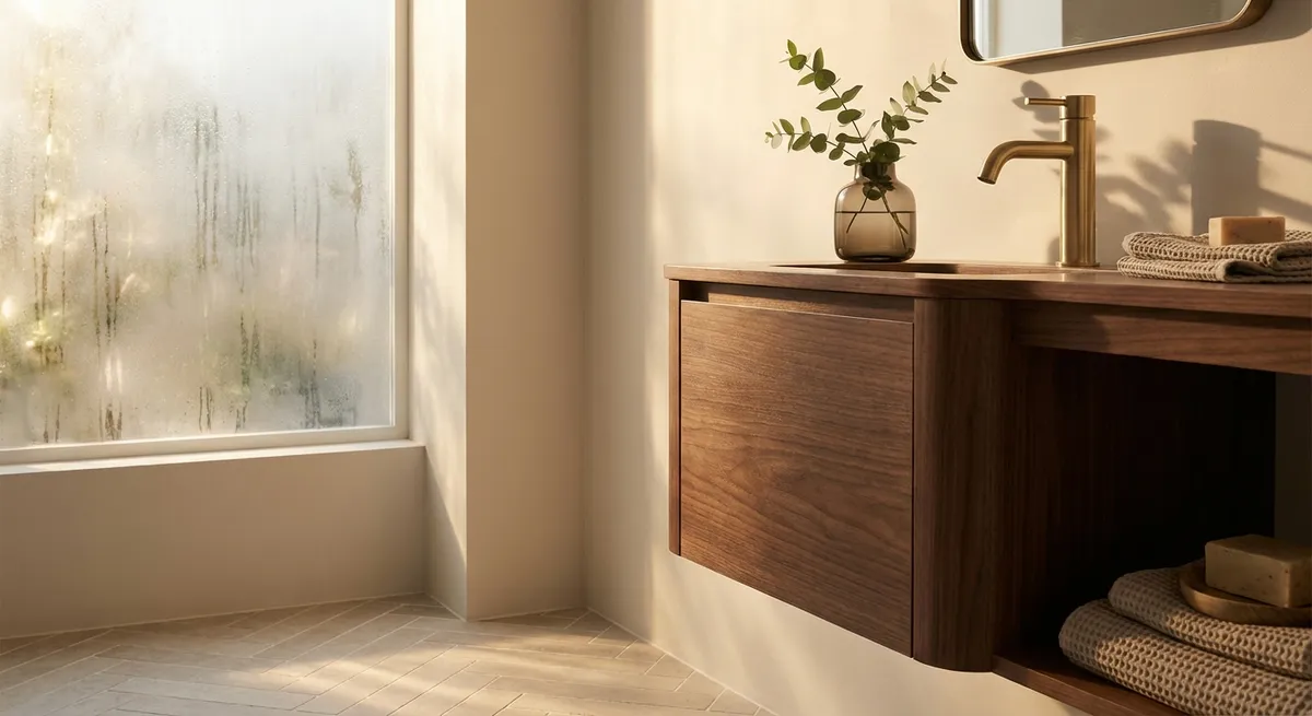
2. Texture Before Pattern: Elevating Neutrals with Surface Character
While dramatic patterns have their place, quietly luxurious rooms often rely on texture rather than overt graphics. The right surface character can make even a neutral field tile feel layered and bespoke.
Consider pairing honed and polished finishes of the same stone in adjacent areas to create a subtle play of light. In a monochromatic bathroom, slim matte tiles contrasted with a glossy pencil liner can capture shadows in a way that feels more like tailored fabric than hard surface. For large-format porcelain, seek out tiles with a gentle, tactile relief—ridges, fluting, or linen-like textures—that catch side light and create depth without visual chaos.
Texture is also a powerful way to differentiate zones in open-plan spaces. A smooth, low-sheen porcelain in the kitchen can transition to a slightly more textured pattern in a dining nook, offering underfoot grip and visual warmth while maintaining chromatic continuity. This approach allows you to stay within a controlled palette yet still achieve that layered, curated feeling associated with custom design.
By prioritizing surface texture first—and pattern second—you create rooms that feel calm, expensive, and resilient to changing trends.
3. The Grout as Couture: Fine-Tuning Proportions and Palette
In elevated tile work, grout is not an afterthought; it is a precision tool. The best designers treat grout much like fine tailoring: almost invisible at a glance, but crucial to the overall impression.
Begin by considering joint width relative to tile size. Contemporary, high-end rooms often lean toward thinner joints, especially with rectified porcelain, to emphasize expanses of material rather than a grid. That said, ultra-narrow joints only work well when substrate preparation is meticulous and tiles are of consistent caliber—conditions worth investing in if you desire a near-monolithic look.
Color choice should either reinforce or deliberately contrast the tile. A closely matched grout creates a seamless, almost stone-like plane, especially effective with large-format floor tiles or expansive walls. A deliberately darker or lighter grout, by contrast, can frame each tile in a way that nods to craftsmanship—ideal with handmade or smaller-format pieces where slight irregularities are part of the charm.
For patterned or artisanal tiles, select grout that withdraws rather than competes. A warm gray with cream or terracotta, a soft taupe with cooler stones, or a desaturated beige with warm marble veins can quiet transitions and make the pattern feel integral, not busy.
Careful grout decisions—width, color, sheen—can turn a standard installation into one that feels custom and impeccably considered.
4. Layered Fields: Mixing Formats Within a Single Material Story
One of the most refined ways to work with tile is not to mix multiple colors or patterns, but to vary formats within a single material or tight color family. This “layered field” approach creates subtle complexity without visual noise.
Imagine a bathroom where the floor, shower walls, and niche interiors all share the same stone-look porcelain. Instead of changing materials, alter the scale and shape: large-format rectangles on the walls, a herringbone mosaic on the shower floor for slip resistance, and slim stacked tiles around the vanity. The continuity of color calms the room, while the shifts in scale provide quiet interest and highlight different zones.
In a foyer, a large-format limestone-look tile can be framed by a border of the same material cut into smaller planks, creating the suggestion of an inlaid stone rug. In a kitchen, matching the countertop stone with a smaller-format tile of the same material on the backsplash can feel more cohesive and intentional than introducing an unrelated decorative tile.
This strategy works particularly well with high-quality porcelain or engineered stone lines that offer multiple sizes, trims, and mosaics within the same collection. By designing in “chapters” of scale rather than color blocks, the entire space feels harmonized, tailored, and architecturally coherent.
5. Light as a Design Partner: Orienting Tile to Capture Shadow and Glow
The most sophisticated tile installations are designed with light in mind—natural and artificial. How light travels across a surface throughout the day can dramatize or soften the tile, changing how the room feels at different times.
In spaces with strong directional light, consider linear tiles oriented to either align with or gently counter that direction. Vertical stacking in a shower with a high window can pull the eye upward and emphasize height, while horizontal layouts in a long corridor can broaden the room’s perceived width.
For textured or fluted tiles, side lighting is transformative. A wall sconce placed near a subtly ribbed tile creates elongated shadows that read as depth and craftsmanship. In kitchens, under-cabinet lighting washing down a matte or lightly undulating backsplash can reveal nuanced tones that are invisible under overhead lighting alone.
Even with smooth tiles, sheen and orientation matter. High-gloss tiles can be breathtaking in small doses or on accent walls, especially when they catch reflected light from windows or pendants—but they must be positioned to avoid glare at seating or work zones. Conversely, low-sheen or honed surfaces thrive in high-traffic, bright spaces where they quietly absorb light and convey a calm, grounded presence.
By treating light as an equal design material—alongside tile format, color, and pattern—you unlock another layer of quiet luxury that reveals itself with every shift of the day.
Conclusion
Exquisite tile work is not defined by how bold or intricate it appears, but by how considered it feels. From the precision of terminations and grout selection to the orchestration of texture, light, and scale, the finest spaces are composed of decisions that most people never consciously notice—yet immediately recognize as quality.
For homeowners who view their interiors as long-term investments rather than seasonal projects, these subtle design strategies offer a roadmap: tiles that do not merely cover surfaces, but shape the character, comfort, and quiet luxury of the entire home.
Sources
- [Porcelain Tile: Selection and Care – The Tile Council of North America (TCNA)](https://www.tcnatile.com/faqs/72-porcelain-tile.html) - Technical background on porcelain tile properties and performance
- [Stone Selection and Finishes – Marble Institute of America (Natural Stone Institute)](https://www.naturalstoneinstitute.org/consumers/stone-selection/) - Insight into stone finishes (honed, polished, textured) and their visual impact
- [Lighting for Residential Spaces – U.S. Department of Energy](https://www.energy.gov/energysaver/lighting-choices-save-you-money) - Guidance on residential lighting types and placement, useful for planning how tile and light interact
- [Ceramic Tile Technical Information – ANSI & TCNA via CTEF](https://www.ceramictilefoundation.org/blog/topic/ansi-standards) - Details on grout joints, installation standards, and substrate preparation
- [Interior Finishes and Transitions – GSA Facilities Standards](https://www.gsa.gov/real-estate/design-construction/engineering-and-architecture/facilities-standards-for-the-public-buildings-service) - Federal guidelines on finish materials and transitions, relevant to planning high-quality terminations