What follows are five exclusive, design‑forward insights that homeowners rarely hear—ideas that move beyond basic “tile color and size” into the realm of curated detail, architectural intention, and discreet luxury.
Composed Continuity: Designing the Room Around the Joint Lines
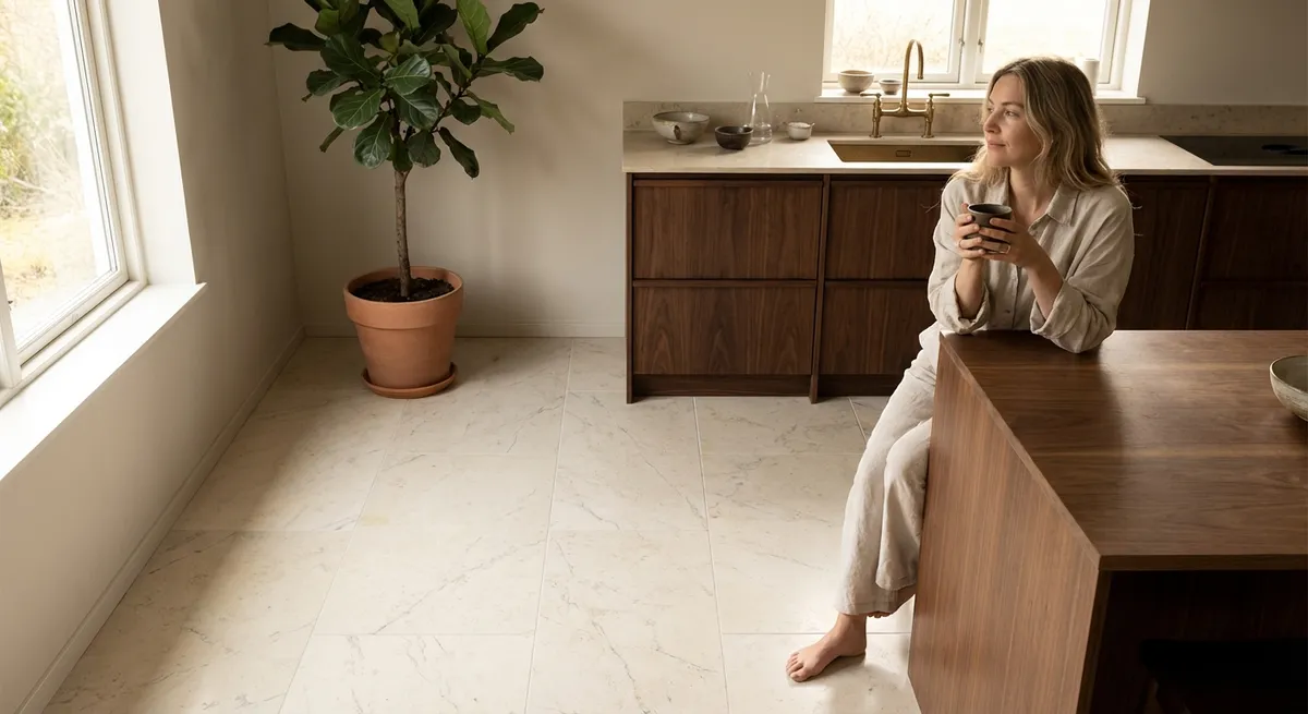
Most tile projects begin with a color palette and end with a grout choice. The most elevated projects, however, begin with the grid.
Think of your tile layout as an invisible architectural framework that should align with key elements of the room: the centerline of a vanity, the midpoint of a window, the edge of a kitchen island, or the axis of a hallway. When tile joints land precisely on these landmarks, the space feels intuitively “correct,” even if guests can’t say why.
In a large-format floor, this might mean shifting the entire grid so a grout line runs perfectly under a door leaf when it’s closed, or so that a joint divides a shower niche symmetrically. On walls, plan for tile courses to meet at the exact height of a countertop, window stool, or built‑in bench so cuts are minimized and visual rhythm is maximized.
Request full‑room layout drawings before a single tile is set. Ask your installer to “mock” key views on paper or digitally: the first impression from the doorway, the kitchen standing at the sink, the seated view in a primary bath. This level of pre‑planning transforms tile from mere surface finish into quiet architectural ordering.
Vein Matching as Art: Turning Stone and Porcelain Into Connected Canvases
In luxury interiors, stone and stone‑look porcelain become more than patterns—they become narratives. Vein matching and bookmatching are the techniques that make those narratives legible.
Rather than treating tiles as individual pieces, imagine the entire surface as a single slab that has been carefully divided and reassembled. Veins should appear to “flow” from floor to wall, across shower niches, around an island, and even through bench fronts. Done properly, this creates a sense of continuity and tailored craftsmanship usually reserved for couture joinery.
For natural stone, specify sequential slabs or tiles from the same bundle and have your fabricator map how they’ll be oriented. For porcelain, choose collections that offer bookmatched sets or large-format panels specifically designed for continuous veining. Insist on dry‑laying (laying out tiles on the floor before installation) to refine the composition, particularly in focal zones such as behind a freestanding tub or on a fireplace face.
The end result is an impression that the surface was conceived as one uninterrupted plane and then elegantly folded around the architecture—subtle, but unmistakably high‑end.
Elevated Thresholds: Transitions as Jewelry, Not Afterthoughts
Most homes reveal their level of refinement at the edges—where materials meet, stop, or change. Nowhere is this more evident than at tile transitions.
Instead of relying on generic metal trims or abrupt changes from tile to wood or carpet, treat every transition as an opportunity for design choreography. For example:
- In doorways, use a stone or porcelain slab cut to the full door width as a threshold, perfectly level with adjacent surfaces, so the transition reads as deliberate rather than compensatory.
- Between two different tiles (say, a honed marble in the bath and a patterned porcelain in the dressing room), consider a slim border tile or inlaid strip that creates a tailored “frame” rather than a collision.
- At external corners (shower walls, niche reveals, steps), explore mitered corners, factory bullnose, or minimalist profiles that match the finish of your fixtures for a cohesive, jewelry‑like detail.
Even in open‑plan spaces, subtle transitions within the same tile can signal functional zones: a change in layout direction beneath a dining table, a fine border defining a reading nook, or a gentle shift from a straight lay to a herringbone in front of a fireplace.
When transitions are designed with intent, the room feels finished in the way a perfectly hemmed garment does—complete, considered, and comfortable to live with.
Layered Reflectivity: Playing With Sheen, Light, and Quiet Shadow
Color and pattern often dominate tile conversations, but in sophisticated spaces, the more elusive quality of reflectivity can be even more powerful.
Combine different surface finishes within the same color family—matte, honed, lappato (semi‑polished), and glossy—to create depth that only reveals itself in changing light. A matte floor paired with a subtly lustrous wall tile can make a room feel calmer yet more dimensional. In a shower, a honed tile on the walls with a textured matte mosaic on the floor ensures both tactile safety and visual softness.
Consider where daylight enters the space and where artificial lighting will graze the tiles. Linear wall washers can dramatize the texture of a lightly structured tile; conversely, a high‑gloss finish on a full accent wall can softly reflect pendant lights, turning a kitchen backsplash into a gentle mirror for the room’s ambience rather than a bright, distracting shine.
For truly elevated results, specify finish changes with precision: for instance, a shower where the lower band is matte for grip and quietness, while the upper band is subtly more reflective to lift the space and catch natural light. This layered approach creates rooms that feel serene at first glance, then increasingly nuanced the longer you inhabit them.
Intelligent Zoning: Using Tile to Shape Experience, Not Just Surfaces
Beyond aesthetics, tile can be a powerful tool for orchestrating how a space is used and experienced. The most sophisticated homes use tile strategically to define zones, control acoustics, and manage maintenance—without obvious visual “lines in the sand.”
For example, a continuous floor tile might run from entry to kitchen to terrace, but subtle pattern shifts or insets signal different functions: a denser, darker mosaic just inside the front door as a refined “landing pad” for weather, a herringbone field beneath a dining table, or a slightly darker band delineating the circulation path through an open space.
In bathrooms, pairing a quieter large‑format field tile with a more textural mosaic only in high‑touch areas (shower floor, vanity wall, bench front) creates zones of tactile focus without visual clutter. In living areas, a tile “hearth” that extends beyond the fireplace can define a conversation area, especially when framed by softer flooring beyond.
Think of tile as environmental choreography: it can slow movement near an entry bench, gently frame a workspace in a kitchen, or suggest where a reading chair naturally belongs. When zoning is handled with this level of subtlety, the home feels instinctive to use and effortlessly ordered.
Conclusion
Truly refined tile design lives in the details most people never name: the way a joint aligns with a window mullion, how a vein wraps around a corner, or how a subtle shift in sheen catches late‑afternoon light.
By treating tile not as decoration, but as a foundational design language—composed layouts, artful veining, tailored transitions, layered reflectivity, and intelligent zoning—you create rooms that feel calm, resolved, and enduringly luxurious. These are surfaces that age gracefully, reveal new pleasures over time, and quietly affirm that every decision was made with care.
Sources
- [Ceramic Tile Education Foundation – Tile Layout Considerations](https://www.ceramictilefoundation.org/blog/tile-layout-the-importance-of-planning) – Discusses the importance of layout planning and alignment in tile installations.
- [Marble Institute of America (Natural Stone Institute) – Vein Matching & Stone Design](https://www.naturalstoneinstitute.org/consumers/whystone/stone-design/) – Explains stone veining, bookmatching, and design strategies for natural stone.
- [Schluter Systems – Profiles and Transitions](https://www.schluter.com/schluter-us/en_US/Profiles/c/P) – Technical overview of edge profiles and transition solutions between materials.
- [U.S. General Services Administration – Flooring Design Guide](https://www.gsa.gov/technical-procedures/flooring-design-guide) – Provides guidance on flooring selection, zoning, and performance considerations in high‑end, functional spaces.
- [Architectural Digest – Using Large Format Tile in Luxury Interiors](https://www.architecturaldigest.com/story/large-format-tile-design-trend) – Design‑oriented discussion of large‑format tile, veining, and visual continuity in contemporary homes.