Designing with Light: Tiles as Luminous Architecture
Before color or pattern, consider light. The way a tile receives and returns light can transform even the most restrained palette into something sculptural. A honed stone in a north-facing room will read as velvety and calm, while a soft-gloss porcelain on a sunlit wall becomes a changing surface, catching daylight and shadow like fabric.
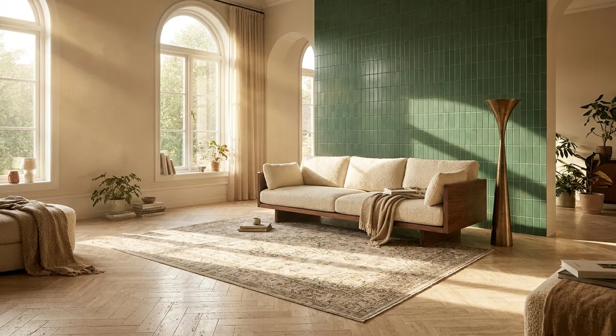
Vertical surfaces deserve particular attention. In showers, powder rooms, or kitchen backsplashes, a subtly irregular glaze or handcrafted finish can break up flatness and lend a gentle shimmer—more a suggestion than a statement. In darker spaces, a low-sheen, finely textured tile can prevent glare while still articulating form, allowing wall-wash lighting or concealed LEDs to graze the surface and reveal depth.
Flooring, too, can participate in this choreography. A large-format, matte tile in a continuous field from room to room quietly lengthens sightlines, while carefully chosen grout color (matched closely to the tile) keeps the plane serene. The most elevated spaces feel as though the light has been designed with tile in mind from the beginning, not as an afterthought.
Curated Transitions: Thresholds as Intentional Moments
Luxury often reveals itself not in the main gesture, but in the transitions—the places where one material hands off to another. Tile offers powerful opportunities to refine these thresholds so that rooms feel connected, yet distinctly tuned.
Consider the passage from foyer to living space. Instead of a jarring cut line between stone-look tile and wood, a slender border of mosaic or narrow-format tile can act as a “stitched seam,” echoing the tone of both materials while signaling a shift in mood. In bathrooms, a subtle change in tile scale at the shower entry can imply a threshold without any physical step, enhancing accessibility while preserving visual elegance.
Even grout lines themselves can become part of the transition language. Aligning grout precisely with door casings, cabinetry edges, and architectural axes creates a quiet sense of order that the eye perceives, even if the mind doesn’t name it. When every intersection and meeting point feels intentional, the home begins to resonate with an underlying calm—nothing is accidental; everything is resolved.
The Art of Restraint: Pattern, Scale, and Negative Space
Pattern in tile design is most powerful when it serves the architecture rather than competes with it. For a cultivated interior, the goal is often not more, but better—fewer moves, executed with more discipline and nuance.
Large-format tiles can visually expand smaller rooms when installed with tight grout joints and aligned to architectural lines (windows, focal walls, main circulation paths). Yet, pairing these with a single, confined zone of intricate pattern—perhaps behind a freestanding tub or as a framed “rug” beneath a dining table—prevents monotony and gives the eye a place to rest and return.
Negative space is equally vital. A serene expanse of understated tile can be as luxurious as the most elaborate mosaic when it is allowed to remain uninterrupted. Avoid needless cuts around fixtures and consider simplifying penetrations (air grilles, outlets, switches) so that the tile field reads cleanly. Sophisticated tile design often comes down to knowing where not to add pattern, preserving just enough quiet to let the refined details breathe.
Material Dialogues: Pairing Tiles with Wood, Metal, and Stone
Truly elevated tile design acknowledges that tile never lives in isolation; it is always in conversation with adjacent materials. The key is to orchestrate that dialogue so that each material amplifies, rather than overpowers, the others.
With wood, contrast temperature thoughtfully. A cooler, stone-look porcelain with minimal movement can ground warm, character-rich oak or walnut, balancing the composition. Metals—brass, bronze, or blackened steel—should feel like jewelry, not armor. Use them as restrained inlays, edge trims, or linear drains that harmonize with hardware and lighting rather than shout for attention.
When combining real stone with porcelain or ceramic, respect hierarchy. Allow natural stone to occupy the primary focal zone (a vanity wall, a fireplace surround), and support it with more understated tiles that echo its undertones without imitating its veining too literally. This layered approach avoids a “theme” room and instead creates a nuanced, collected atmosphere, as though the materials have evolved together over time.
Five Exclusive Insights for the Tile-Conscious Homeowner
These refined principles offer a more insider’s lens—details that professionals quietly obsess over, and that discerning homeowners increasingly demand:
Grout as a Design Finish, Not a Commodity
Treat grout like a deliberate finish choice, alongside hardware and fixtures. The right tone can either sharpen geometry (with a gentle contrast) or create a seamless monolithic effect (by closely matching the tile). Premium, stain-resistant grouts also preserve visual clarity over time, keeping surfaces looking composed rather than busy.
Layout Mockups on Paper—Not Just on Site
Before a single tile is set, request scaled drawings or digital layout mockups for complex spaces. This allows refinement of focal alignments, pattern terminations, and niche placement before installation begins. Such pre-planning prevents the all-too-common compromises made under time pressure and protects the integrity of the design.
Consider the Sound of the Room
In highly tiled environments—entry halls, bathrooms, kitchens—acoustics matter. Combining matte tiles with soft furnishings, textured rugs, or strategically placed acoustic treatments keeps spaces from becoming echo chambers. The ultimate luxury is not just how a room looks, but how quietly and comfortably it sounds.
Design for Patina, Not Perfection
Some materials are meant to develop character. If choosing natural stone or handmade tiles, understand and embrace their aging behavior. Pair them with more resilient, low-maintenance tiles in high-traffic zones so that the patina reads as intentional and romantic, not as damage or neglect. A refined home ages gracefully, not anxiously.
Continuity Beyond the Room: Exterior Echoes
For homes with terraces, balconies, or pool decks, consider extending an interior tile aesthetic outdoors with compatible exterior-rated options. Even if the exact tile cannot be used, selecting a related tone, scale, or finish creates a visual continuum from inside to outside, subtly reinforcing architecture and blurring boundaries between the two.
Conclusion
In a world where tile is often treated as a quick finish selection near the end of a project, elevating it to a central design consideration yields profound results. By thinking in terms of light, transitions, restraint, material dialogues, and the nuanced details professionals guard closely, homeowners can move beyond the standard showroom vignette into something more personal, enduring, and quietly luxurious.
The most refined tile work never announces itself loudly. It reveals its intelligence over time—in the way rooms flow into one another, in how materials age together, and in the effortless calm one feels inhabiting the space. When tile is composed with this level of intention, it becomes more than surface; it becomes the silent architecture of daily life.
Sources
- [Tile Council of North America (TCNA)](https://www.tcnatile.com) - Industry standards and technical guidelines for tile design, installation, and performance
- [Ceramic Tile vs. Porcelain Tile – The Spruce](https://www.thespruce.com/ceramic-vs-porcelain-tile-1821576) - Clear explanation of material characteristics and suitability for various applications
- [Natural Stone Institute – Stone Selection & Care](https://www.naturalstoneinstitute.org/consumers/whystonenow/selectioncare/) - Guidance on selecting, maintaining, and understanding the aging of natural stone surfaces
- [U.S. Department of Energy – Daylighting and Windows](https://www.energy.gov/energysaver/daylighting) - Background on managing light in interiors, useful for understanding how surfaces interact with daylight
- [Harvard Graduate School of Design – Material Processes & Systems](https://www.gsd.harvard.edu/mde-material-processes-systems/) - Insight into advanced material thinking in architecture and design