Below are five exclusive, design-first insights that move tile work beyond the expected. Each one is less about decoration and more about orchestration—of light, texture, proportion, and space.
1. Composed Light: Designing Tile to Capture and Control Glow
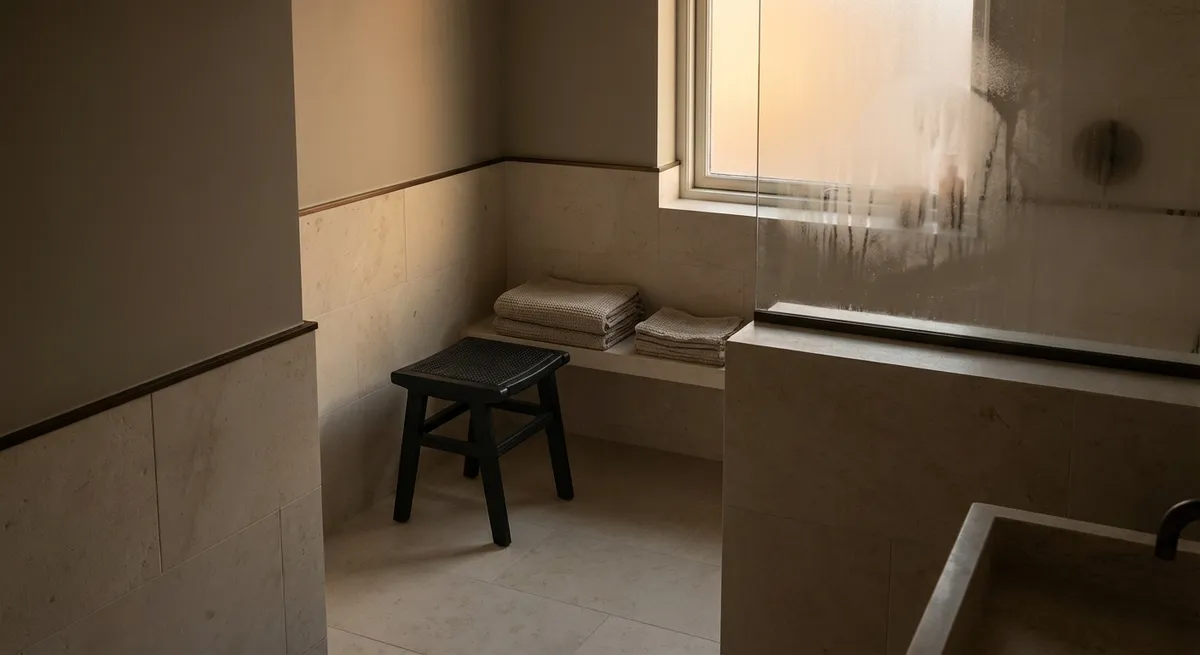
Most homeowners choose tile purely on color and pattern; refined spaces begin instead with light. In a room-by-room analysis, consider how natural and artificial light will interact with the tile’s surface throughout the day.
Gloss, satin, and honed finishes are not merely aesthetic choices—they are tools for directing ambiance. A soft-honed limestone on the floor can gently absorb harsh midday light, while a satin ceramic on the wall can return a diffused, flattering glow in the evening. In narrow corridors, vertically oriented, slightly reflective tiles can elongate the space and bounce just enough light to avoid relying on overly bright fixtures.
For areas near windows, examine how a tile sample responds at morning, midday, and dusk. Subtle tonal variation (especially in handmade or hand-finished tiles) creates a slow, shifting play of light that feels luxurious without being loud. The most successful installations feel like they were designed with the sun in mind—not just the showroom spotlight.
2. Quiet Geometry: Using Proportion and Layout as a Design Language
Pattern rarely needs to be loud to be compelling. In sophisticated homes, geometry is often expressed through proportion and layout, not overt motifs. Tile dimensions and joints can quietly guide the eye, define pathways, and visually organize space.
Consider aligning grout joints with key architectural lines—door casings, window mullions, or the edge of a kitchen island. Large-format tiles in a meticulously planned grid can flatten visual noise and lend a sense of calm, while a subtle shift in layout (for example, moving from straight stack bond in a main area to a refined herringbone in an alcove) can signal a shift in function without any change in material.
Using mixed formats in the same color family—say, a 24"x24" on the floor and a slender 2"x10" on the wall—creates a layered, custom-feeling composition. The key is restraint: limit the palette, control the grout color, and let proportion and pattern do the storytelling. When geometry is handled with precision, the tile becomes an architectural element rather than a mere finish.
3. Seamless Thresholds: Elevating Transitions into Design Moments
Transitional details often betray the difference between standard and truly elevated work. Doorways, floor changes, shower entries, and stair edges are where tile installations either break down or quietly exceed expectations.
Aim for continuity wherever possible. Instead of using off-the-shelf metal trims at every edge, explore mitered tile corners, stone saddles cut to proportion, or flush transitions where tile meets wood or carpet at the same finished height. A continuous grout joint running from a tiled hallway across a threshold and into a bathroom, for instance, creates a visual thread that feels designed rather than incidental.
In wet areas, a curbless shower with subtly sloped large-format tiles can read as a single, uninterrupted plane, avoiding visual clutter. In kitchens, continuing a backsplash material into a windowsill, niche, or hood surround creates a sense of custom millwork, even when the underlying structure is simple. Refined homes are often defined less by bold statements and more by the absence of awkward breaks.
4. Tactile Zoning: Using Texture to Shape How Spaces Feel
Texture is one of the most underused tools in tile design. Beyond slip resistance, a carefully curated mix of finishes can subtly organize a space, guiding behavior and mood without a single visual “accent.”
In a primary suite, for example, a smoother, almost silky porcelain in the dry area can transition to a subtly textured, matte tile within the shower, signaling a distinct zone of experience while remaining within the same tonal palette. In entryways, a slightly more textured tile underfoot can ground the space and visually balance softer furnishings nearby.
For open-plan living, pairing a calm, low-variation floor tile with a hand-textured, softly irregular tile on select wall planes can add richness without visual noise. The interplay of smooth and textured surfaces invites touch and creates a sense of depth that photographs beautifully while remaining timeless in person. The goal is not contrast for its own sake, but a nuanced choreography of tactile experiences that make a home feel truly lived-in, yet impeccably curated.
5. Curated Continuity: Extending Tile Beyond the Expected Zones
Luxury emerges when design thinking extends past the obvious. Tile, traditionally confined to kitchens and baths, becomes far more compelling when used to create continuity across the home’s architecture.
A stone-look porcelain begun in an entry hall can wrap a fireplace surround, forming a visual axis through the main living area. The same tile used on a powder room floor might reappear as an inset “rug” beneath a freestanding tub in the primary bath, turning repetition into a signature. On terraces and patios, specifying an outdoor-rated version of your interior tile (or a closely related series) can blur the line between indoors and out, especially when floor levels are carefully coordinated.
Even small moments—a tiled bench in a mudroom that echoes the kitchen backsplash, or a tiled niche in a hallway for art objects—communicate an intentional through-line. The result is a home where each room feels distinct yet clearly part of a single, coherent vision. Rather than a collage of individually styled spaces, you get a composed narrative that unfolds as you move through the house.
Conclusion
Exceptional tile work is not defined solely by its materials, but by the intelligence and restraint with which those materials are deployed. By shaping light, honoring geometry, refining transitions, orchestrating texture, and extending tile beyond traditional boundaries, homeowners can transform familiar surfaces into a quietly luxurious backdrop for daily life.
In the most sophisticated interiors, tile does not compete for attention. It creates the conditions for everything else—furniture, art, and even routine rituals—to feel more considered, more intentional, and ultimately more enduring.
Sources
- [Ceramic Tile Distributors Association – Technical Resources](https://www.ctdahome.org/content/technical-resources) – Industry guidance on tile types, performance, and best practices
- [The Tile Council of North America (TCNA) – Handbook Information](https://www.tcnatile.com/faqs/89-handbook-faqs.html) – Authoritative reference on tile installation standards and design considerations
- [American Society of Interior Designers (ASID) – Design Trends and Insights](https://www.asid.org/resources/resources) – Professional perspective on contemporary interior design strategies and material use
- [U.S. Department of Energy – Daylighting and Windows](https://www.energy.gov/energysaver/daylighting) – Insight into how natural light behaves in interiors, relevant to tile finish and placement
- [Harvard Graduate School of Design – Material Processes and Systems](https://www.gsd.harvard.edu/project-tag/material-processes-and-systems/) – Academic exploration of material behavior and architectural applications