The following design ideas focus on subtle sophistication—where proportion, finish, and layout do as much work as color or pattern. Woven throughout are five exclusive insights that homeowners and design‑driven renovators can use to bring an elevated, almost bespoke quality to any tiled space.
Designing with Transitions: Where One Surface Ends and Another Begins
In truly polished interiors, the most memorable design moments often occur not on the main field of tile, but at the threshold—where one material yields to another. Instead of abrupt cuts or generic metal strips, you can treat transitions as fine joinery on the floor and walls.
Consider pairing honed limestone with rift‑sawn oak and using a razor‑thin stone border to “frame” the timber, giving the impression of an inlaid rug. In showers, allow wall tile to extend beyond the glass line and die gracefully into a painted wall with a minimal bullnose or mitered edge, avoiding bulky trims. At doorways, shift grout lines so that tiles align with the centerline of the door leaf, making the transition feel deliberate rather than accidental. Similarly, changing tile format—say, from a large-format field in a hallway to a small mosaic in an adjoining powder room—can define zones of use without any need for visual noise.
Exclusive Insight #1: Design the threshold before the field. Decide exactly how your tile will start, stop, and meet adjacent materials before finalizing the overall pattern. This single discipline prevents awkward slivers, misaligned joints, and cheap‑looking metal trims, and immediately elevates the entire installation.
The Discipline of Restraint: Controlled Color, Intentional Texture
Premium tile work often avoids dramatic color swings in favor of rich, controlled palettes that reveal their nuance up close. When a space aims for longevity, color is best treated as a whisper rather than a shout.
Soft tonal variations—porcelain that mimics artisan stone, white tiles with a gentle warmth or coolness, or desaturated blues and greens—offer sophistication without visual fatigue. But restraint in color does not mean visual blandness. Texture and finish become the quiet protagonists: a combination of matte and satin tiles on the same wall can gently break up light, while fluted or ribbed tiles create shadows that shift throughout the day. In floor areas, pairing a subtly textured tile in traffic zones with a smoother one in less exposed areas creates a nuanced play between tactile comfort and slip resistance.
Exclusive Insight #2: Build a “three‑distance” palette. Select tiles that look harmonious from across the room (overall tone), at conversational distance (subtle movement or texture), and up close (fine detail such as glaze pooling or edge variation). If a tile fails at any of these three distances, it will feel less refined over time.
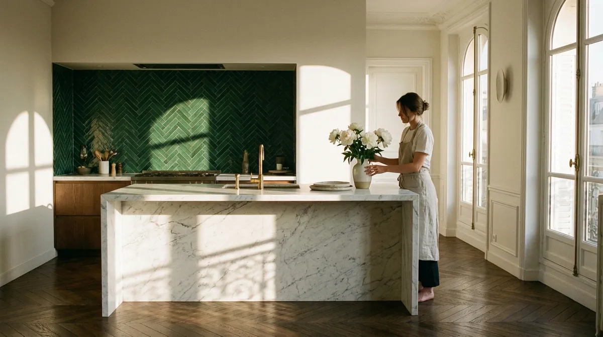
Architectural Layouts: When Pattern Follows the Room, Not the Box
Many tile layouts default to what fits in a box, rather than what honors the architecture. A premium environment does the opposite—tile patterns are aligned with sight lines, furniture plans, and structural elements.
On floors, consider centering grout lines on major focal points: fireplaces, kitchen islands, or freestanding tubs. In a long corridor, running rectangular tiles lengthwise subtly enhances the sense of proportion, while a herringbone or chevron layout can be oriented to lead the eye toward a window or key view. For walls, stacking tiles rather than staggering them can lend a contemporary calm, especially when joints align precisely with cabinetry, mirrors, or niche openings. Even in small bathrooms, setting the tile grid to align with the center of the vanity or the edges of the shower glass can make the room feel more intentional and less generic.
Exclusive Insight #3: Draft your tile plan over the furniture and lighting plan. Ask your designer or installer to overlay grout lines onto a scaled floor and elevation plan showing cabinets, fixtures, and lighting locations. Let the architecture dictate the tile grid, not the dimensions of the box they came in.
Layered Finishes: Coordinating Sheen, Light, and Reflection
Light is the ultimate collaborator in a tiled interior, and sheen is how you negotiate that relationship. Choosing finishes based solely on slip resistance or ease of cleaning can undermine an otherwise elegant design if reflection is not considered.
On walls that receive strong natural light, a highly glossy tile can create harsh glare and distracting hotspots, while a silky matte can soften reflections and highlight form instead of shine. Conversely, in darker rooms or windowless baths, placing a controlled amount of gloss—perhaps as a band behind a vanity or inside a shower niche—can gently bounce light and keep the space from feeling flat. Floors near full‑height glazing benefit from a low‑sheen, lightly textured finish to avoid visible streaks and reflections of furniture legs. When combining multiple tiles, think of them as a family of finishes: one dominant finish (matte or satin), one accent (gloss or structured), and one supporting surface (stone, wood, or paint) that ties the entire composition together.
Exclusive Insight #4: Test tiles vertically and horizontally under real light. Before committing, place samples on both the floor and wall near windows and under your actual light fixtures. Observe them morning, midday, and evening. High-end spaces are often made or broken by how surfaces behave in changing light, not just in showroom conditions.
Quiet Luxury Details: Edges, Joints, and Intentional Imperfection
In premium interiors, refinement often shows up where most people never look: in the precision of cuts, the handling of corners, and the calibration of grout joints. Thin, consistent joints signal craftsmanship; so do clean terminations at windows, niches, and built‑ins.
Edge treatments are critical. Mitred corners on stone‑look porcelain or natural stone can transform a standard shower into a sculpted envelope, while carefully specified matching trims allow complex layouts to feel seamless. Niches that align perfectly with grout joints read as integrated architecture rather than afterthought storage. For handmade or intentionally irregular tiles, true sophistication comes from strategic placement: using them on a feature wall or splash zone, then pairing them with more disciplined tiles elsewhere to keep the space feeling composed, not chaotic.
Exclusive Insight #5: Choose a grout color that edits, not competes. For most luxury applications, grout should either (a) gently recede to make the surface feel monolithic, or (b) calmly emphasize a pattern you truly want to highlight. Avoid defaulting to stark white or standard gray—custom‑tinting to echo the tile’s undertone produces a far more considered, couture result.
Conclusion
Exceptional tile design is less about spectacle and more about orchestration: the choreography of transitions, the discipline of a restrained palette, and the alignment of patterns with architecture and light. When you treat tile as a permanent, almost architectural element rather than mere decoration, decisions about layout, finish, and detail gain weight—and the resulting spaces feel calmer, richer, and more enduring.
By planning thresholds first, building a three‑distance palette, letting architecture lead the grid, testing finishes in real light, and refining grout and edge details, homeowners can achieve a level of subtle luxury usually associated with bespoke design studios. The outcome is a home where every tiled surface feels inevitable—quietly confident, meticulously considered, and deeply satisfying to live with.
Sources
- [Ceramic Tile Trends – Tile Council of North America](https://www.tcnatile.com/industry-issues/trends.html) - Industry perspective on contemporary tile aesthetics, formats, and performance considerations
- [Porcelain Tile Selection & Installation – ANSI A108 / TCNA Handbook Overview (University of Tennessee, Knoxville)](https://archdesign.utk.edu/wp-content/uploads/2017/07/Porcelain-Tile.pdf) - Educational guide on porcelain tile characteristics and best practices
- [Slip Resistance and Surface Finishes – Health and Safety Executive (UK)](https://www.hse.gov.uk/slips/flooring.htm) - Authoritative discussion of finishes, texture, and safety in floor specification
- [Lighting for Interior Spaces – U.S. Department of Energy](https://www.energy.gov/energysaver/lighting-choices-save-you-money) - Explains how different lighting conditions affect material appearance and perception
- [Color Theory and Perception – MIT OpenCourseWare](https://ocw.mit.edu/courses/mas-963-special-topics-in-media-technology-architecture-and-computation-spring-2003/resources/color_theory) - In-depth look at how color and tone function in designed environments