Below, you’ll find five exclusive, design-forward insights that move beyond routine tile advice. Each one is tailored to homeowners who expect their spaces to feel intentional, enduring, and quietly luxurious.
Insight 1: Treat the Floor as a Canvas, Not a Grid
Most tile layouts default to a mechanical grid—efficient, but visually predictable. In refined rooms, the floor is composed with the same care as an artwork, using geometry to guide the eye and define zones.
Consider running large-format tiles in a calm, directional layout that aligns with the room’s longest axis, subtly lengthening the space. In an open-plan setting, a change in tile pattern—say, transitioning from a straight stack in the kitchen to a herringbone in the dining area—can delineate function without a single partition wall.
Borders and insets offer another elevated strategy. A tone-on-tone border in the same tile family, perhaps in a different scale or finish, can frame a seating area like a custom rug while retaining the durability of porcelain or stone. The key is restraint: limit the number of patterns and let intentional shifts in direction, scale, and grout line rhythm create the sophistication.
When discussing plans with your tile professional, speak in terms of “sightlines” and “field versus frame.” This shared vocabulary encourages a layout conversation that goes beyond coverage and into composition.
Insight 2: Work with Light as a Material
Tile is not just color and pattern—it is a light-modulating surface. The most refined spaces use tile to temper brightness, introduce softness, or heighten drama depending on the time of day.
Glossy tiles, for example, amplify light and sparkle, but in excess they can feel harsh or busy. Reserve higher-sheen finishes for vertical surfaces where they can catch and reflect natural light: a softly rippled, glossy wall tile in a powder room or behind a freestanding tub can feel luminous rather than flashy. On the floor, prioritize matte or honed finishes for a gentle, non-glare surface that reads luxurious and is practical underfoot.
In north-facing rooms or spaces with limited daylight, select tiles with a subtle variation in tone and surface movement. Slightly variegated glazes or stones with quiet veining keep the light alive, preventing the room from feeling flat. In bright, sun-filled spaces, cooler neutrals and micro-textured finishes can balance glare and create a calm, gallery-like backdrop for furnishings and art.
Ask your installer to dry-lay a sample area and observe it throughout the day. How does the tile behave at dawn, at midday, and under evening artificial light? This simple exercise often reveals whether a chosen finish will feel serene or restless in real life.
Insight 3: Curate Transitions Like Jewelry, Not Hardware
Thresholds, edges, and transitions are where even expensive tile work can feel compromised if overlooked. In a truly polished interior, the junctions between surfaces are treated as jewelry—precise, intentional, and proportionally refined.
Between different tile fields (for example, a stone-look porcelain and a patterned encaustic), consider a minimal brass, stainless, or powder-coated metal profile as a clean, linear accent. When executed with care, this “line” feels like a considered design detail rather than a necessity. For door thresholds, align cuts with the centerline of the door or the stop so the transition feels symmetrical and deliberate when the door is closed.
Wall terminations deserve equal attention. Instead of abrupt tile endings, explore framed edges: bullnose or mitered edges for stone, matching trim pieces for ceramic, or ultra-slim metal trims color-matched to grout. In showers, niche edges and bench fronts should align perfectly with grout lines and field tile; the smallest misalignment is instantly visible in such focal points.
Discuss alignment early: where cuts will fall, how patterns will meet at corners, and how floor grout joints relate to door casings and built-ins. This is where luxury reveals itself—not in the price of the tile, but in the precision of its transitions.
Insight 4: Use Scale and Repetition to Calm Complex Patterns
Patterned tile is alluring, but it can easily overpower a room. The most sophisticated applications rely on scale, repetition, and quiet companions to make even intricate designs feel collected rather than chaotic.
When working with bold encaustic patterns, for example, consider limiting them to a defined area where their impact feels intentional: an entry vestibule, a powder room floor, or the backing of a bar niche. Then, pair that expressive tile with solid, low-contrast companions—large-format porcelain in a complementary hue or a subdued stone with minimal veining—to give the eye a place to rest.
Scale is your ally. A strong geometric pattern in a small tile might feel busy wall-to-wall, but when used in a larger format or restricted “panel” area, it becomes a feature. Conversely, large-format pattern (such as book-matched marble porcelain) is best treated as artwork: a single wall, a fireplace face, or a shower back wall, framed by simpler tiles on surrounding surfaces.
Repetition brings order. Let one pattern be the protagonist and repeat it with discipline: echo a floor pattern in a shower niche, or repeat a border motif around a kitchen hood. Avoid introducing multiple graphic styles in one sightline; instead, build a cohesive story of one hero pattern and a supporting cast of quiet, textural solids and neutrals.
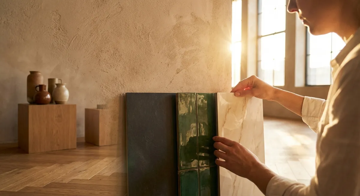
Insight 5: Compose a Palette Around Tactility, Not Just Color
In elevated interiors, the most memorable rooms are not necessarily the most colorful—they are the most tactile. Tile offers an extensive vocabulary of texture, and when you prioritize how a surface feels (visually and physically), you create rooms that invite touch and linger in memory.
Think in terms of contrast-within-harmony. A honed limestone-look floor paired with a gently fluted ceramic wall tile creates a dialogue between soft matte and refined ribbed texture. A satin-finish porcelain vanity backsplash against polished metal fixtures yields a subtle interplay between cool sheen and muted reflection.
Rather than assembling a palette purely from a fan deck of colors, build a material board that you can run your hand across: smooth, ribbed, lightly pitted, or gently undulating tiles, juxtaposed with fabrics, woods, and metals. Aim for three to four distinct tactile notes—no more. This keeps the room layered yet coherent, luxurious but not loud.
When selecting grout, consider it part of the texture story. A slightly darker grout can emphasize a beautiful handmade edge or a deliberate pattern, while a carefully matched grout can turn a wall of mosaic into a near-monolithic, fabric-like surface. The best combinations feel inevitable, as if they could not have been designed any other way.
Conclusion
Exceptional tile design is less about spectacle and more about control: of light, of proportion, of transitions, and of how a room feels under hand and foot. By treating floors as canvases, working deliberately with light, refining transitions, disciplining pattern, and prioritizing tactility, homeowners can achieve spaces that feel bespoke and enduring—even in the most demanding, high-use rooms.
The result is a home where tile is not a background material but a carefully composed surface language—quietly confident, functionally resilient, and undeniably luxurious.
Sources
- [Porcelain Tile: Selection and Installation](https://www.ceramictilefoundation.org/blog/topic/porcelain-tile) - The Ceramic Tile Education Foundation provides technical insights on porcelain tile performance, formats, and best practices.
- [Tile Council of North America (TCNA) Handbook](https://www.tcnatile.com) - Authoritative industry standards and guidelines for tile design, layout, and installation quality.
- [Porcelain Enamel Institute (PEI) Wear Ratings](https://www.homedepot.com/c/ab/types-of-tile/9ba683603be9fa5395fab901f3f66cc) - Overview of tile wear ratings and suitability for different applications, hosted by Home Depot with references to industry standards.
- [National Kitchen & Bath Association Design Guidelines](https://nkba.org/insights/design) - NKBA provides best-practice design principles for kitchens and baths, including surface and material considerations.
- [Harvard Graduate School of Design – On Light and Space in Architecture](https://www.gsd.harvard.edu) - General research and publications on how light interacts with architectural surfaces, informing material and finish choices.