Below are five exclusive, design-driven insights to help you think about tile not as “finish work” but as a primary creative medium.
Designing with Negative Space, Not Just Pattern
Most tile conversations begin with color and pattern; the most refined ones start with blank space. Negative space—the deliberate areas of “quiet”—is what allows a tiled surface to feel intentional rather than busy.
Consider a shower where the feature wall is tiled in a subtle, elongated rectangle, but the adjacent walls and floor remain visually calmer, perhaps in a larger-format stone-look porcelain. The feature wall reads like a panel in a gallery; the surrounding surfaces become the frame. You’re not simply matching tile to paint; you’re composing a field where the eye has room to rest.
Spacing and layout are powerful tools here. A minimalist grid layout with tight grout joints can create a monolithic plane that feels architectural rather than decorative. Conversely, allowing a slightly wider grout line in a hallway floor can visually “slow” the space, lending it gravity and rhythm. By consciously deciding where you want quiet surfaces versus focal areas, you transform tile from a decorative layer into an integral part of the room’s architecture.
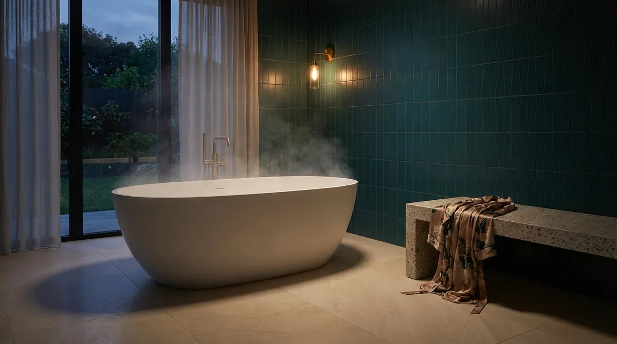
Curating Texture to Modulate Light
In a refined interior, light is the true luxury material. Tile, chosen well, determines how that light is broken, softened, or amplified. Instead of defaulting to gloss versus matte, treat texture as a light-sculpting device.
Matte, honed, or subtly structured tiles diffuse light, creating velvety surfaces that photograph beautifully and feel calm in person. These are especially compelling for large wall expanses—behind a freestanding tub, along a stair, or in a dining niche—where you want depth without glare. Micro-textures, like fine ribbing or gentle fluting, catch light in bands, adding sophistication without shouting for attention.
Highly polished tiles, meanwhile, can be strategic rather than ubiquitous. A restrained strip of glossy mosaic at eye level along a vanity wall, or a polished border in an otherwise matte entry floor, can mimic jewelry: small, luminous moments that punctuate the composition. Think in terms of contrast—pairing matte field tiles with a subtly shimmering accent—so the room feels layered rather than flat.
The most successful projects test samples in actual conditions. Observe how the tile behaves in morning shadow, artificial evening light, and full sun. A tile that seems ordinary under showroom lighting can become quietly extraordinary in your home’s particular light.
Elevating Grout from Afterthought to Design Element
Grout is often treated as a practical necessity, selected hurriedly at the end of a project. In high-level work, it is treated as seriously as the tile itself. The grout line sets the cadence of the surface and can refine or disrupt the entire composition.
A tone-on-tone grout (closely matched to the tile) lets the form of the tile dominate. This is ideal when you want a seamless, monolithic field—on a kitchen backsplash that should read like one slab, or on a floor where you want the sense of continuous stone. It can make modest tiles look notably more luxurious.
In contrast, a deliberately contrasting grout transforms the joint into a graphic element. Think of a classic white subway tile with a warm, mid-tone gray grout that echoes the cabinet hardware and window frames. The grout traces the geometry, emphasizing the pattern in a way that feels deliberate and tailored. In large-format installations, a slightly deeper grout color can visually “ground” the surface, preventing a big floor from feeling too slick or anonymous.
Joint width is equally important. Ultra-narrow joints evoke a precision and minimalism akin to paneling, while slightly wider joints can lend a handcrafted, European sensibility—especially with zellige or handmade-look tiles. Discuss these dimensions early with your installer; a 1/16" versus 1/8" choice can completely shift the aesthetic.
Aligning Tile Layout with the Architecture, Not the Room’s Edges
Luxury tilework rarely begins from the nearest corner; it begins from the room’s logic. Instead of asking, “How do we fill this wall?” ask, “What lines already exist that we can honor or extend?”
Identify key sightlines: centered on a window, aligned with a range hood, or directly in view when you enter a room. Use those as your organizing principles. For example, center a primary grout line on a bathroom vanity sink, allowing cuts to fall in less conspicuous corners. In a kitchen, align vertical tile joints with cabinet divisions or the edges of a range. This creates a harmony between the built-ins and the tiled surface that feels subliminally “correct.”
In floor layouts, consider how tiles lead you through space. A rectified porcelain laid lengthwise down a hallway can visually elongate it, while a herringbone pattern turned at a deliberate angle can direct the eye toward a window or a fireplace. Breaking pattern at thresholds—with a slim border tile or a change in direction—can define zones in open-plan living without adding walls.
This level of alignment requires early coordination between designer, installer, and sometimes even the cabinet maker. But the result is a room where tile feels integrated into the architecture instead of pasted onto it.
Layering Tile as a Narrative Across Adjoining Rooms
In sophisticated homes, tile is not chosen room by room; it is curated as a continuous story. Each space may have its own character, but there is a deliberate thread—color, finish, format—that ties the sequence together.
Begin with a “primary voice”: a foundational tile that appears in more than one space. This might be a stone-look porcelain that runs from the entry into the kitchen and reappears on a powder room floor. Then introduce “supporting characters”: perhaps a smaller, textured version of that tile on a shower floor, or a complementary tone in a handmade wall tile at the bar. The conversation between these materials should feel fluent, not repetitive.
Subtle repetition is key. You might echo the warm veining of a living room floor tile in the ceramic used on a nearby fireplace surround, or pick up a kitchen backsplash hue in the mosaic of a distant guest bath. When guests move through the home, they experience continuity—each room distinct, yet clearly belonging to the same narrative.
This approach also extends to scale. Varying tile formats with intention (large planks in the living area, smaller squares in mudrooms, mosaics where more slip resistance is needed) allows the home to feel both coherent and finely tuned to function. A thoughtful tile narrative not only elevates daily living but also reads as deeply considered to future buyers and design-conscious guests.
Conclusion
Exceptional tile design is rarely about grand gestures. It lives in the calibration of grout tone, the way a layout acknowledges an architectural axis, the gentle difference between matte and satin under evening light. For homeowners who appreciate craft and longevity, tile becomes more than a hard surface—it becomes a language of proportion, restraint, and tactility.
When you curate negative space as carefully as pattern, treat grout as a design tool, align layouts with the architecture, and weave a story from room to room, your home gains a layer of refinement that feels both contemporary and enduring. The result is not just beautiful tilework, but an environment where every surface feels deliberately, quietly exceptional.
Sources
- [American Institute of Architects – Residential Design Trends](https://www.aia.org/resources/6498312-home-design-trends-survey) - Offers insight into broader architectural and interior trends, including surface materials and spatial planning
- [Tile Council of North America (TCNA) – Installation Handbook](https://www.tcnatile.com/handbook.html) - Authoritative technical guidance on tile layouts, grout joints, and best practices for long-lasting installations
- [Ceramic Tile Education Foundation](https://www.ceramictilefoundation.org/blog) - Professional perspectives on tile craftsmanship, detailing, and installation quality
- [Architectural Digest – Tile Design Features](https://www.architecturaldigest.com/search?q=tile) - Curated design stories illustrating sophisticated uses of tile in high-end residential projects
- [NC State University – Daylighting and Interior Surfaces](https://content.ces.ncsu.edu/daylighting-design) - Explores how interior surface finishes interact with natural light, relevant to selecting tile texture and sheen