Below are five exclusive, design‑forward insights that move beyond basic “pattern and color” talk and into the realm of intentional, elevated tile work.
1. Designing for Light First, Pattern Second
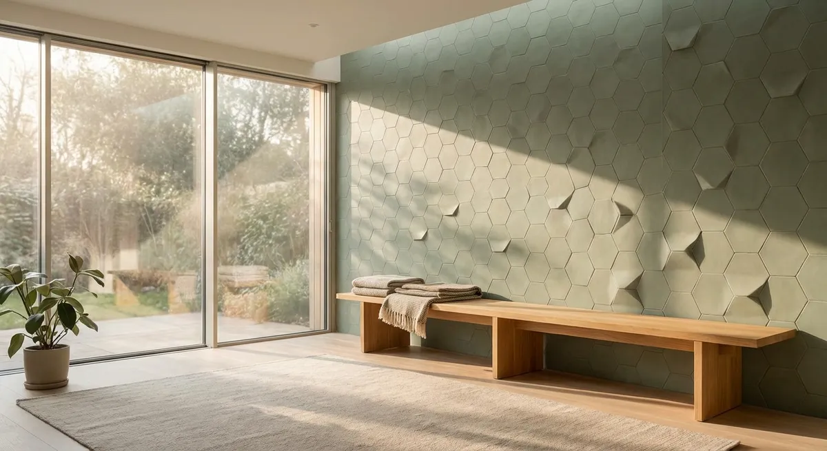
Most tile conversations begin with pattern or color; the more sophisticated approach begins with light. The way natural and artificial light slide across a tile surface will often matter more than the pattern you choose.
In rooms with generous daylight, slightly textured or honed tiles capture soft, nuanced shadows that read as depth rather than noise. In lower‑light spaces, a high‑gloss tile on a feature wall can quietly act as a light amplifier, catching stray beams from a window or pendant and returning them to the room in a subtle shimmer. Consider the cardinal direction of the room: north-facing spaces benefit from warmer undertones in stone and porcelain, while south-facing rooms can play comfortably with cooler grays and muted blues without feeling cold. Instead of asking, “Does this tile match the cabinet color?” ask, “What will this look like at 8 a.m., at noon, and at dusk?” Ordering extra samples and taping them to walls or placing them flat on the floor over several days gives you a more truthful preview than any showroom spotlight ever could.
2. Creating Visual Silence With Controlled Variation
High-end interiors often feel calm not because they lack detail, but because their details are disciplined. Tile is no exception. The secret is using variation intentionally—never accidentally.
Many stone-look porcelains and natural stones come with significant movement in veining and tone. For large, open areas, sorting tiles by intensity of pattern before installation allows you to create a gradient or zones of calmer and more dramatic sections rather than a random patchwork. In wet rooms or spa-like bathrooms, choosing a narrowly calibrated palette—perhaps three values of the same color (light, mid, dark)—lets you layer floor, wall, and niche tiles without visual chaos. Even patterned cement or encaustic tiles become more sophisticated when surrounded by quieter companions: a simple border in a solid field tile, or a shift from busy pattern on the floor to almost monastic simplicity on the walls. The goal is not to eliminate character, but to choreograph it so the eye has intentional places to rest.
3. Treating Transitions as Design Moments, Not Afterthoughts
What separates bespoke tile work from merely competent installations is often what happens at the edges—where tile meets another material, another room, or another plane. These transition points are where thoughtful design can quietly declare itself.
Instead of a standard metal trim everywhere, consider where a mitered edge, stone pencil, or flush transition strip would better support the architecture. A threshold between a tiled hall and a wood-floored living room might be expressed as a single, solid stone or porcelain slab, aligned with door jambs, rather than a thin, generic strip. In showers, recessing niches so that grout lines align perfectly with surrounding tiles creates a sense of calm precision. Even changes in tile orientation—say, a herringbone field that resolves into a straight-lay border at a doorway—can signal a gentle shift between zones without any jarring breaks. When homeowners plan these transitions at the design stage, rather than leaving them to be improvised on install day, the end result feels custom rather than compromised.
4. Calibrating Scale to Space, Not Just Trend
Large-format tiles and intricate mosaics both have their place in a premium interior—but only when scale is calibrated to the room’s proportions and architectural lines. Tiles that are simply “on trend” can feel off-key if they fight the geometry of the space.
In smaller rooms, the default instinct is often to use small tiles, but that can lead to a busy grid of grout lines. A more elegant strategy is to choose moderately large tiles whose dimensions relate logically to the room itself. For instance, in a narrow powder room, a plank tile running lengthwise can visually elongate the space, while a staggered joint pattern can disrupt that line in a way that feels less deliberate. In larger, open spaces, oversized porcelain slabs can create a gallery-like calm—provided they align cleanly with major sightlines, such as an island edge, a fireplace, or a major doorway. Mosaics are most powerful when treated as an accent with clear boundaries: a tiled rug under a freestanding tub, a framed field behind a vanity, or a deliberate band along a stair riser. Scale is less about what you can physically fit and more about what feels proportionate to how the room is experienced.
5. Embedding Tactile Luxury Underfoot and at Hand
True luxury is as much about feel as it is about appearance. The most refined tile schemes consider not only what you see but what your bare feet and fingertips encounter every day.
A honed or matte tile on a primary bathroom floor can feel warmer and softer than a polished surface, even when the actual temperature is the same—especially when paired with radiant heat. In kitchens, a subtly textured tile underfoot can offer grip where you need it while preserving a visually sleek look; pairing that with a smoother, easily wiped backsplash distinguishes zones by touch as well as function. Consider where your hand will naturally land: the edge of a tub surround, the top step into a sunken living room, or the ledge of a shower half-wall. Specifying a bullnose, eased edge, or a slightly rounded stone cap at these points elevates daily rituals in a way that is almost subconsciously perceived. When texture shifts are purposeful—soft under bare feet, smooth where you wipe often, grippier near water—the home feels quietly tailored to the people living in it.
Conclusion
Sophisticated tile design is rarely loud. It succeeds when each decision—from how light moves across a surface to how one material hands off to the next—feels measured and intentional. For homeowners who appreciate refined detail, the goal is not to show off the tile, but to create spaces where the tile, the architecture, and daily life feel in seamless conversation. When tile is chosen and installed with this level of care, it stops being a finish and becomes part of the home’s enduring character.
Sources
- [The American Institute of Architects (AIA) – Light and Architecture](https://www.aia.org/resources/6077666-light-and-architecture) - Discusses the role of light in architectural design, useful for understanding how surfaces interact with daylight.
- [Tile Council of North America (TCNA) – Handbook for Ceramic, Glass, and Stone Tile Installation](https://www.tcnatile.com/) - Authoritative industry guidelines on tile installation, transitions, and best practices.
- [National Kitchen & Bath Association (NKBA) – Design Resources](https://nkba.org/resources) - Offers professional insights on scale, proportion, and material choices in kitchens and baths.
- [U.S. Department of Energy – Daylighting in Buildings](https://www.energy.gov/energysaver/daylighting) - Explains how natural light behaves in interior spaces, informing light-first design decisions.
- [University of Minnesota – Color and Light in Architectural Space](https://www.cala.umn.edu/research/color-light) - Academic perspective on how color, surface, and light interact in built environments.