Below are five exclusive, design‑driven insights that move beyond basic “style boards” and into the realm of considered, enduring tile decisions.
Insight 1: Design the Room’s “First Glance” in Tile, Not Paint
Most homes are unconsciously designed in paint first—color on the walls, tile as an afterthought. Reversing this hierarchy produces more sophisticated, coherent rooms. Tile should anchor the “first glance”: the moment your eye enters and understands the space.
Begin by identifying the single surface you want to carry the room’s visual weight. This might be a kitchen backsplash wall that runs unbroken to the ceiling, a fireplace surround, or a shower wall opposite the door. Treat this surface as the primary canvas and select tile with a deliberate relationship to light—satin, honed, or subtly faceted rather than hyper‑glossy or aggressively textured.
Once that key surface is defined, allow the remainder of the room to recede. Wall color becomes a quiet support act, echoing a clay tone from the tile body, a warm veining note from stone‑effect porcelain, or a softened version of the grout. This approach creates a “lead” and “chorus” relationship in the room, giving it visual hierarchy and calm. The difference is immediate: the space feels curated, not assembled from parts.
Insight 2: Treat Grout as a Design Material, Not a Necessary Evil
In refined interiors, grout is no longer an afterthought; it’s a calibrated instrument of contrast, rhythm, and perceived quality. The right grout can make an affordable tile read bespoke, while the wrong one can flatten even the most exquisite slab.
Instead of simply “matching” or “contrasting,” think in terms of three distinct grout strategies:
- Vanishing Joints – A near‑tone match between tile and grout minimizes the grid and emphasizes the plane. This is ideal for large‑format porcelain, continuous floors, or minimalist baths where serenity is paramount.
- Tailored Outline – A finely judged contrast—one or two shades darker or lighter than the tile—gives quiet definition to each piece without shouting. This works beautifully with subway, stacked, or elongated formats, lending them a tailored, shirt‑seam quality.
- Graphic Framework – A deliberate, darker grout with light tile (or vice versa) turns joints into part of the composition: ideal for herringbone, chevron, or geometric layouts where pattern is essential to the concept. The key is precision: joints must be consistent, and the layout flawless for this to feel intentional rather than busy.
Specify grout with the same rigor as paint: request physical samples, view them next to your tile at different times of day, and consider joint width as part of the design. Narrow joints in stone‑effect tiles can evoke monolithic slabs; slightly wider joints in handmade‑look pieces celebrate their artisanal irregularity. The sophistication is in the nuance.
Insight 3: Use Scale Transitions to Quietly Sculpt the Space
Most tile decisions stop at “large format versus small mosaic.” A more nuanced approach uses multiple scales of tile to subtly sculpt how the room is experienced—especially at thresholds, in corners, and where functions change.
Think of the space in layers:
- Primary Field Scale – Large format tiles (24"x24", 24"x48", or similar) on main floors or principal walls provide calm, with fewer grout lines and a sense of expansiveness.
- Secondary Accent Scale – Medium tiles (4"x12", 3"x9", hex, or small rectangles) can be used vertically to visually lift lower ceilings, or horizontally to widen narrow rooms.
- Tertiary Intimate Scale – Mosaics or small‑format tile introduce tactility and detail at human touchpoints: inside shower niches, on a shower floor, along a vanity apron, or on a stair riser.
The art lies in how these scales meet. Allow transitions to occur at natural architectural breaks—doorways, thresholds, the edge of a vanity, or a structural column—instead of arbitrary lines on the floor. For instance, a large‑format porcelain floor that quietly shifts to mosaics inside a walk‑in shower, using the same color and finish, feels like a refined continuation rather than a “feature zone.”
This scale choreography creates an undercurrent of order: your eye understands where to rest (large format), where to explore (medium accents), and where to delight in detail (mosaics), without ever feeling visually overwhelmed.
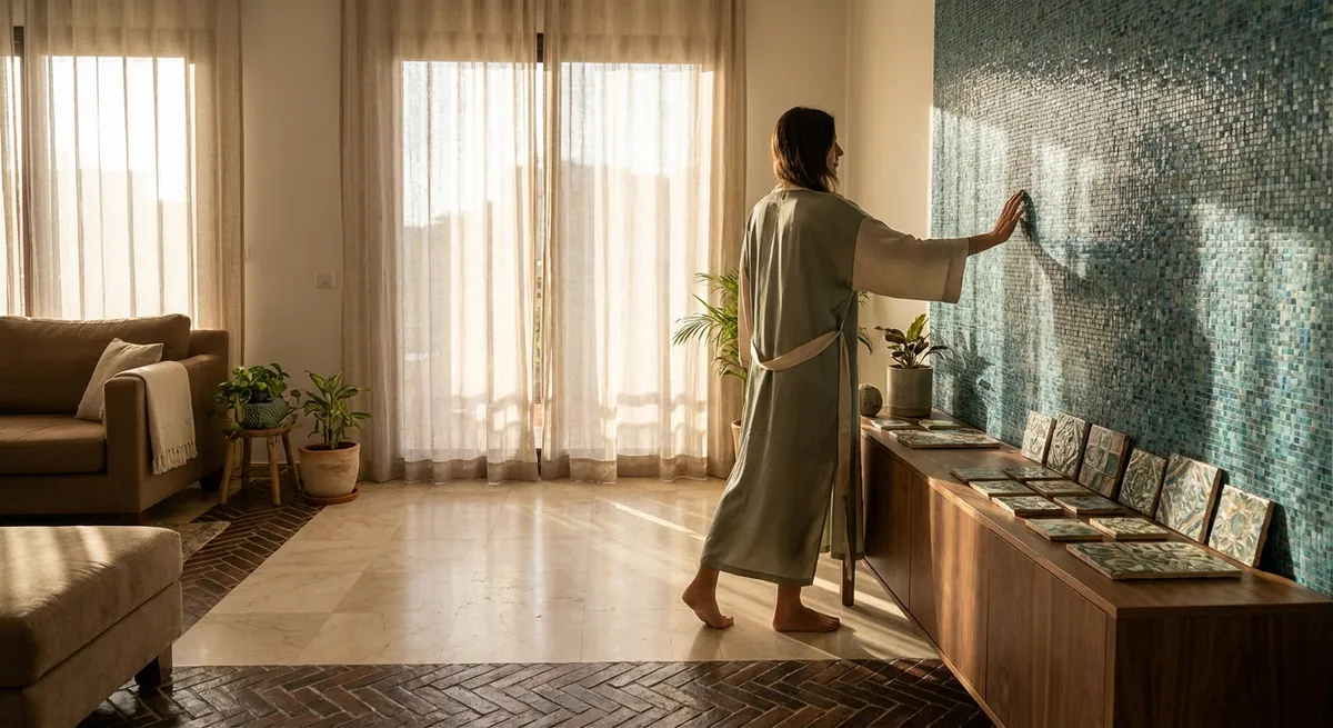
Insight 4: Curate Light Interaction Through Finish, Not Color Alone
Sophisticated interiors are as much about the quality of light as they are about materials. Tile offers a rare opportunity to shape that light with extraordinary precision—if you think in terms of finish and texture, not just color.
Consider three primary axes of light behavior:
- Reflectivity – High‑gloss tile amplifies light but also reflections, making it most suited to vertical surfaces where you want a sense of sparkle or depth (backsplashes, niche backs, or a shower feature wall). Honed or satin finishes diffuse light softly, ideal for calm bathrooms and living areas. Matte finishes absorb more light and can ground a space, especially on floors.
- Micro‑Texture – Very fine textures—linear striations, gentle fluting, or a delicately hammered surface—catch light in a way that adds depth without overt pattern. In moody spaces or darker palettes, this micro‑texture prevents flatness and reinforces a sense of quiet luxury.
- Relief and Contour – Three‑dimensional tiles, from shallow flutes to faceted pieces, create shadows that evolve throughout the day. Used sparingly—a single fireplace surround, a small backsplash zone—they can become a refined focal point that feels sculptural, not decorative.
Specify finishes according to the room’s orientation and natural light. North‑facing spaces often benefit from subtle sheen or soft honed tiles that borrow light; intensely sunlit rooms may feel calmer with matte or low‑sheen finishes that control glare. The result is an environment where tile participates in the choreography of daylight rather than simply reflecting or rejecting it.
Insight 5: Compose with Thresholds and Edges Like a Bespoke Suit
The difference between competent tile work and truly exceptional tile work is most visible at the edges: thresholds, terminations, corners, and intersections with other materials. These “quiet moments” make a space feel bespoke in the way a perfectly finished lapel or hem does on a tailored garment.
Approach edges and transitions with the same design intent as the main field:
- Doorway Thresholds – Instead of metal strips as an afterthought, consider using a stone or porcelain saddle cut from the same tile, or a contrasting but related material (such as a slim stone threshold) that aligns precisely with grout lines.
- Outside Corners – Mitred corners on stone and porcelain, where feasible, create a monolithic effect on niches, ledges, and columns. Where miters are impractical, specify slim, color‑matched trims or minimalist profiles that visually disappear rather than dominate.
- Material Intersections – Where tile meets wood, carpet, or polished concrete, plan these transitions in advance. Align changes in material with architectural lines (a column, a window mullion, an island end) so they feel structural, not arbitrary.
- Terminations at Walls and Ceilings – Decide where tile stops in a bathroom or kitchen with intention. Full‑height tile to the ceiling on key walls conveys architectural rigor; carefully measured “wainscot” heights that align with window sills, mirror tops, or cabinetry lines feel designed rather than default.
Providing your installer with detailed drawings for these edges—complete with heights, alignment points, and trim specifications—turns what is often left to the field into a deliberate design act. It’s in these edges that a home most clearly announces its level of refinement.
Conclusion
Truly elevated tile design is less about spectacle and more about orchestration: of scale, grout, edges, light, and the first glance that defines a room. When tile is treated as an architectural medium rather than a decorative afterthought, it can quietly transform a home into a sequence of composed atmospheres—each surface considered, each junction resolved, each detail calibrated for enduring calm.
For homeowners who value refinement, the opportunity is clear: collaborate with your designer and installer not only on what tile you love, but on how it will meet the room, the light, and the rest of your materials. That is where exceptional tile work moves from simply beautiful to unmistakably bespoke.
Sources
- [Tile Council of North America (TCNA) – Handbook for Ceramic, Glass, and Stone Tile Installation](https://www.tcnatile.com/products-and-services/publications/handbook.html) - Authoritative industry guidelines on technical best practices, layouts, and detailing
- [Porcelanosa – Guide to Tile Formats and Finishes](https://www.porcelanosa.com/uk/magazine/ceramic-tiles-sizes-finishes/) - Overview of how different tile sizes and finishes affect design and perception
- [ArchiDaily – The Importance of Transitions in Architecture](https://www.archdaily.com/985619/the-importance-of-transitions-in-architecture) - Discusses thresholds and junctions as key design elements, relevant to tile edges and terminations
- [The Spruce – Choosing the Right Grout Color](https://www.thespruce.com/how-to-choose-right-grout-color-1821504) - Practical exploration of grout color strategies and their visual impact
- [US Environmental Protection Agency (EPA) – Indoor Air and Flooring Materials](https://www.epa.gov/indoor-air-quality-iaq/indoor-air-pollution-introduction) - Background on materials and indoor environments, supporting thoughtful selection of tile and finishes