This exploration is devoted to those refined details—choices that feel bespoke rather than off-the-shelf. Below are five exclusive, design‑driven insights that elevate tile from background material to a sophisticated design language, all while remaining understated and timeless.
1. Designing with Shadow: The Art of Depth and Relief
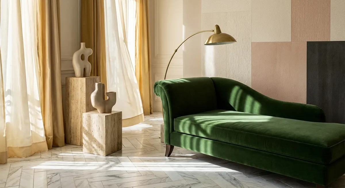
Flat, glossy tile will always have a place, but the most quietly luxurious interiors harness one additional element: shadow. Relief tiles, fluted forms, and finely beveled edges create micro‑shadows that shift throughout the day, giving even a monochromatic scheme surprising depth.
When working with relief tile, think in terms of light choreography. A softly lit vanity wall in delicately ribbed ceramic creates a vertical rhythm that feels almost textile. Shallow three-dimensional tiles behind a soaking tub can read like sculpted stone when grazed with warm, directional lighting. The key is restraint: keep the palette controlled—often one color, two at most—so the texture, not the hue, carries the narrative.
Pair sculpted surfaces with matte finishes when you want a serene, gallery-like effect, or contrast a subtle relief tile with a honed stone floor for a nuanced dialogue between man‑made and natural. The result is a room where the walls and surfaces do not shout; they whisper in contour and light.
2. Quiet Grout Strategies: When the Joints Become the Design
Refined tile work is as much about what lies between the tiles as the tiles themselves. Grout color, joint width, and layout can turn a familiar material into something custom and architectural.
One sophisticated strategy is the “barely there” joint—selecting a grout tone that aligns almost exactly with the tile. This minimizes visible grid lines and allows the overall plane to read as a continuous, tailored surface. It is especially effective with large-format porcelain or stone where expansive, calm surfaces are desired.
Alternatively, a deliberately articulated grout line can become a subtle pattern device. Imagine a vertical stack bond of slim tiles with a slightly deeper grout tone that forms a delicate pinstripe effect, elongating the space. On floors, narrow joints in a tonal grout can give small mosaics a refined, almost fabric-like appearance.
Precision matters here: consistent joint width, careful color selection, and properly finished corners and transitions are what separate a truly elegant installation from an ordinary one. Treat grout not as an afterthought, but as a design tool that can either dissolve the grid or transform it into a quiet geometry.
3. Monochrome, Layered: Working Within a Single Color Family
Some of the most elevated tile interiors are composed not of multiple bold colors, but of a single hue explored in different depths, temperatures, and textures. Monochrome does not mean flat; it means controlled.
Consider a bathroom composed entirely of warm off‑whites: a porcelain floor in a soft, honed finish; elongated subway tiles in a satin glaze on the walls; and a gently veined stone mosaic in the shower niche. Each surface stays within the same color family, but the interplay of scale, sheen, and pattern creates quiet complexity.
This layered monochrome approach also enhances the perception of space, especially in compact rooms, by eliminating harsh visual breaks. Light bounces more seamlessly, and the eye can glide across surfaces rather than stopping at sharp color contrasts. In open‑plan homes, continuing a related palette of tiles across kitchen, entry, and powder room can create a cohesive, curated feel—more boutique hotel than standard residence.
The secret is editing: choose one dominant tone, then vary only one or two qualities—such as finish and format—so the palette feels intentional, not accidental. The result is an atmosphere that reads polished and enduring, rather than trend‑driven.
4. Transitional Thresholds: Elevating the Spaces Between Rooms
Most tile decisions focus on the main areas—showers, backsplashes, entry floors—but the transitions between materials are where a home’s craftsmanship is most evident. Thoughtful thresholds, borders, and inlays can quietly signal a move from one “chapter” of the home to another.
Instead of a generic metal strip between wood and tile, consider a marble or porcelain threshold carefully aligned with the door swing, essentially framing the passage. In more formal spaces, a contrasting tile border around the perimeter of a room can evoke the sophistication of classic stone salons, without feeling ornate. Even a narrow band of smaller-format tile at the entry to a shower, contrasted with larger tiles inside, can create a subtle “entry rug” effect.
Transitions also offer an opportunity to reconcile differing levels and patterns. A carefully planned change of direction in tile layout—such as rotating a herringbone pattern at a doorway, or shifting from a stacked to a running bond at an arch—can act as a visual cue while maintaining cohesion.
These moments are rarely the focus of photographs, yet they are where a space reveals its level of intention. When transitions are handled with grace, the entire home feels more tailored, as though each space belongs to a larger, considered composition.
5. Curated Imperfection: Balancing Natural Variation with Control
High‑end tile design often embraces the character of natural variation—stone veining, zellige irregularities, handmade edges—but the difference between artful and chaotic lies in curation. A sophisticated installation presents variation as a composed tapestry, not random noise.
For stone or marble‑look surfaces, begin with a dry‑layout stage whenever possible. Arrange tiles so that prominent veining flows in a coherent direction or creates gentle movement across a wall or floor. Avoid clustering high‑drama pieces all in one area; instead, distribute them to create a balanced visual field. This technique can evoke the feel of a continuous slab, even when using smaller formats.
With handcrafted or artisanal tiles, embrace slight irregularities while maintaining visual order through consistent spacing, aligned reference lines, and a restrained grout palette. A kitchen splash in hand‑glazed tiles, each with subtle shading and imperfect edges, can look remarkably elevated when installed with disciplined joints and a thoughtfully chosen termination at the edges.
The aim is controlled authenticity: allowing the material to express its nature while guiding it with a designer’s eye. The result feels luxurious in a way that perfectly printed surfaces rarely achieve—rich, tactile, and unmistakably bespoke.
Conclusion
Exceptional tile design operates at the intersection of precision and poetry. It is felt in the way light touches a relief tile at dusk, in the quiet continuity of a tonal grout choice, in the way a threshold subtly announces that you are entering a different mood within the home.
For homeowners who appreciate refined detail, tile becomes not just a finish but a long‑term investment in atmosphere. When you design with shadow, treat grout as a compositional tool, layer monochrome intelligently, honor transitions, and curate variation, every tiled surface begins to speak the same language: calm, confident elegance.
Sources
- [Porcelain Tile Selection Guide – TCNA (Tile Council of North America)](https://www.tcnatile.com/faqs/72-porcelain-tile.html) - Technical background on tile types and performance characteristics
- [Home Improvement – Flooring and Tile Advice – Consumer Reports](https://www.consumerreports.org/home-garden/home-improvement/) - Independent guidance on durability, maintenance, and material choices
- [Natural Stone Institute – Design Resources](https://www.naturalstoneinstitute.org/consumers/design-trends/) - Insights into using natural stone thoughtfully in high-end interiors
- [Ceramic Tilework Best Practices – U.S. Department of Housing and Urban Development](https://www.huduser.gov/portal/publications/destech/ceramictile.html) - HUD technical overview on tile installation details and standards
- [School of Architecture, University of Texas at Austin – Material Research: Ceramic and Stone](https://soa.utexas.edu/research) - Academic perspectives on material behavior and architectural application