This guide explores five exclusive design insights that move beyond pattern and color charts, focusing instead on how refined tile work can choreograph light, depth, and movement throughout a home.
1. Designing with Luminance, Not Just Color
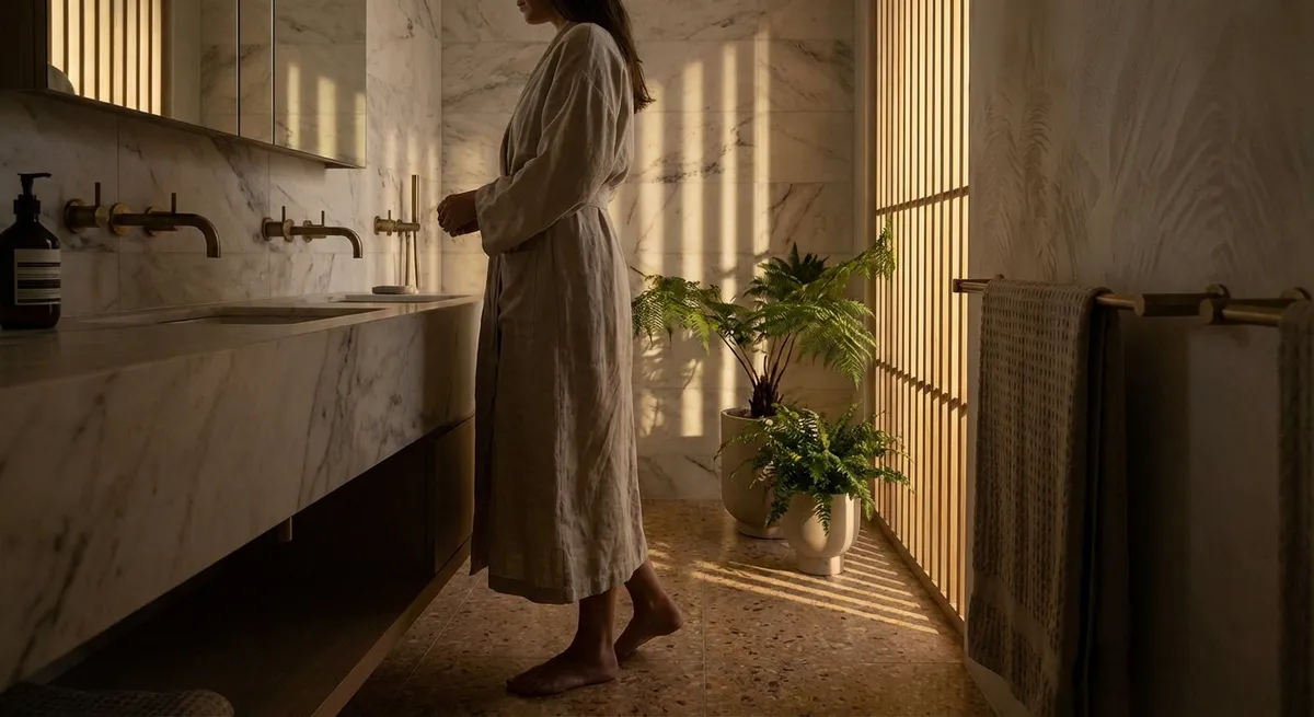
Most tile selections begin with color swatches, but sophisticated interiors are composed around luminance—how light is absorbed, reflected, and diffused across surfaces throughout the day.
High-gloss and polished tiles bounce light, visually expanding a room and amplifying natural brightness. In powder rooms or narrow entries, a glossy field tile paired with softer matte trims can create a luxurious, jewel-box effect without feeling overwhelming. Conversely, honed or matte finishes temper glare and camera-flash shine, lending a gallery-like calm to kitchens and living spaces.
Consider not only the tile’s finish but also the direction of the primary light source. Tiles with gentle surface undulation, such as hand-pressed or subtly ribbed pieces, can capture raking light from a nearby window, creating a shifting play of shadow and reflection over the course of the day. In north-facing rooms, where daylight is cooler and more diffuse, slightly warmer-toned tiles with a satin or semi-matte sheen will keep the space from feeling flat or clinical.
The most refined spaces are calibrated by testing samples in situ—propping up full-size pieces near windows and under cabinet lights, then observing them at morning, midday, and evening. Luminance, not hue alone, should be the deciding factor.
2. Elevating Grout from Background to Design Element
In elevated tile design, grout is never an afterthought. Its color, joint width, and texture are as critical as the tile itself, capable of making a surface appear monolithic, meticulously tailored, or purposefully graphic.
Tone-on-tone grout—one or two shades closer to the tile—creates a seamless, architectural feel. This works beautifully with large-format porcelain on floors and walls, giving the impression of carved stone rather than assembled pieces. Conversely, a contrasted grout line emphasizes rhythm and module, ideal for spaces where the geometry of the layout is part of the visual story, such as a herringbone corridor or a stacked-bond feature wall.
Joint width is equally influential. Narrow joints (often 1/16"–1/8" where technically possible) convey precision and luxury, especially with rectified tiles. Slightly wider joints introduce softness and tactility, particularly when paired with subtly irregular, handmade tiles where the grout becomes a gentle frame around each piece rather than a grid.
For clients who appreciate nuance, specifying grout with a very fine aggregate can result in a smoother, more tailored line, while a slightly textured grout adds a quiet, artisanal note. Sample boards with multiple grout options beside the same tile can help reveal just how dramatically grout selection shifts the overall mood.
3. Using Scale and Orientation to Guide Movement
Refined tile design does not rely on bold patterns to make a statement; instead, it manipulates scale and orientation to guide how one moves through a space.
Large-format tiles elongate sightlines and reduce visual interruption, especially in open-plan living areas. When oriented parallel to the longest wall or primary view axis, they subtly draw the eye outward, reinforcing spaciousness. In contrast, narrower planks or elongated rectangles laid in a chevron or herringbone format can compress and enrich circulation spaces, such as halls or gallery-like corridors, creating a moment of intentional intensity.
In bathrooms, consider differentiating zones through shifts in scale rather than abrupt material changes. A larger tile on the main floor with a smaller, complementary mosaic in the shower floor or niche creates a layered yet cohesive palette. Changing the orientation—running wall tiles vertically in the shower and horizontally elsewhere—can emphasize ceiling height while still feeling quietly unified.
Staggered, stacked, and offset layouts also carry distinct personalities: stacked bond reads contemporary and composed; a third-offset or running bond feels more traditional and relaxed. The most elevated schemes often blend formats within the same material family—large rectangles on the floor, slender planks on one feature wall, and mosaic underfoot where grip and tactile detail are required.
4. Curating Transitional Moments: Edges, Thresholds, and Terminations
High-end tile work is instantly recognizable at its transitions—the places where surfaces meet, end, or give way to another material. These details communicate craftsmanship, even to an untrained eye.
Rather than defaulting to exposed cut edges or standard metal trims, consider shadow reveals, stone thresholds, or custom bullnose and pencil trims that echo the architecture. A flush stone or porcelain threshold between tiled and wood-floored rooms, aligned perfectly with door frames and centered openings, can create a sense of intentional passage.
Vertical terminations are equally important. Where tile meets painted drywall, a slender, color-matched trim or a crisply cut edge aligned to architectural features (like window jambs or niche edges) prevents the surface from feeling improvised. In shower niches, lining up grout joints with the surrounding wall pattern is a subtle but powerful mark of precision; misalignment is one of the fastest ways to cheapen an otherwise beautiful installation.
For the most discerning interiors, transitions are designed at the planning stage, not improvised on site. That means verifying tile thicknesses, allowing for waterproofing and underlayment layers, and coordinating with baseboards, casings, and millwork so that everything resolves with studied clarity.
5. Layering Tiles Across a Home for a Cohesive Narrative
Luxury homes rarely rely on a single “hero” tile. Instead, they establish a coherent language of materials that can be expressed with varying intensity from room to room, maintaining continuity while avoiding repetition.
One effective strategy is to select a primary “foundation” tile—often in a neutral stone or porcelain with subtle movement—then build a supporting cast: a smaller mosaic in the same color family, a more textured or dimensional tile for focal walls, and perhaps a contrasting yet harmonizing accent for restrained moments of drama. These pieces can then be distributed across bathrooms, entries, mudrooms, and kitchen spaces in a way that feels curated rather than matched.
Consider how a guest might read your home as a sequence: the entry floor setting the tone; the powder room offering a more expressive interpretation of the same palette; the principal bath distilling it into a serene, spa-like version. Subtle echoes in tone, scale, or finish between these rooms help the home feel designed as a whole rather than as a collection of unrelated vignettes.
Equally important is restraint. Not every room requires a statement wall or a highly patterned floor. Allowing some spaces to be visually quiet gives breathing room to the more expressive ones, just as a well-composed piece of music balances crescendos with stillness.
Conclusion
Exceptional tile design is less about chasing trends and more about orchestrating light, texture, proportion, and transition with intention. By considering luminance, elevating grout to a design tool, using scale to guide movement, obsessing over edges and terminations, and layering a coherent material narrative throughout the home, tile ceases to be a mere finish and becomes an architectural signature.
In the most refined interiors, every tile is placed with purpose—and every surface, no matter how humble its function, contributes to an atmosphere of quiet, enduring luxury.
Sources
- [Porcelain Enamel Institute (Tile Council of North America) – Tile Finishes & Performance](https://www.tcnatile.com/faqs/70-pei-ratings.html) - Technical insight into surface finishes and their suitability for different applications
- [U.S. General Services Administration – Daylighting and Interior Design](https://www.gsa.gov/governmentwide-initiatives/sustainability/emerging-buildings-technologies/published-findings/building-technologies-office-projects/daylighting) - Background on how light interacts with interior surfaces
- [American Institute of Architects – Detailing Transitions and Thresholds](https://www.aia.org/resources) - Professional guidance on the importance of detailing intersections between materials
- [National Kitchen & Bath Association (NKBA) – Bathroom Planning Guidelines](https://nkba.org/resource/bathroom-planning-guidelines/) - Best practices for planning tile-based wet areas and transitions
- [Virginia Tech – Human Factors in Lighting (Department of Building Construction)](https://www.bc.vt.edu) - Research-based perspective on how light and surface characteristics impact perception of space