1. Orchestrating Transitions: From One Surface to the Next
Luxury is often revealed in the places where one material yields to another. Instead of abrupt shifts between tile and wood, or tile and carpet, consider transitions as deliberate design moments rather than necessary compromises. A slim metal schluter profile in brushed brass or stainless can frame a tiled area like a picture, elevating even understated porcelain.
For open-plan spaces, align transitions with architectural logic: sightlines, beams, or natural breaks in the floor plan. A herringbone wood floor that dovetails into large-format stone-look tile at a kitchen island, for example, can subtly delineate zones without erecting visual barriers. In bathrooms, a continuous floor tile that steps up onto the tub surround or shower bench creates a sense of unbroken volume, conveying an almost monolithic calm. When transitions are intentional, the entire home feels like a single, continuous composition rather than a patchwork of separate design decisions.
2. Mastering Scale and Proportion: Beyond “Big or Small” Tile Choices
Sophisticated design begins with proportion. The tile’s size should converse with the room’s architecture—ceiling height, window placement, and even door casings—rather than merely responding to square footage. In a tall, narrow bathroom, emphasizing verticality with slim rectangular tiles stacked in a column layout can elongate the room, while a large-format floor tile laid on the diagonal can soften rigid geometry.
In expansive spaces, consider balancing very large tiles with refined details: a sleek 24" x 48" floor tile paired with a delicate mosaic in a niche or bar backsplash. Conversely, in intimate rooms like powder baths, densely patterned or small-scale tiles can feel like a jewel box rather than a compromise. Pay close attention to how tile dimensions interact with existing elements—avoiding awkward slivers at wall edges, aligning grout lines with window frames or vanity edges, and ensuring that cuts land symmetrically. These quiet calibrations are what distinguish carefully curated work from merely competent installation.
3. Elevating Grout: The Subtle Power of Shade, Joint, and Finish
Grout is often treated as an afterthought, yet it has tremendous influence over the mood of a tiled space. For a seamless, gallery-like effect, match grout closely to the tile color, minimizing grid lines and allowing surface texture to take the lead. This works especially well with large-format tiles, stone looks, and minimalist interiors. In contrast, a deliberately contrasting grout can outline each piece like fine stitching on a couture garment—ideal for subway tiles, geometrics, or hand-made looks.
Joint width matters just as much as color. A narrower joint (within manufacturer and code recommendations) communicates precision and refinement, particularly with rectified porcelain or stone. Wider joints can lend authenticity to rustic, tumbled, or handmade tiles where slight irregularities are part of the charm. Matte versus sanded finishes also affect perception: a matte, color-consistent grout can feel modern and architectural, while a gently variegated line can soften the look in traditional settings. By testing grout boards in actual lighting conditions, you control not only the tile’s appearance, but also the rhythm and texture of the entire surface.
4. Layering Texture and Sheen: Designing for Touch as Well as Sight
Truly luxurious tile work is as much about tactility as it is about pattern. Combining different surface finishes—matte, honed, polished, fluted, or structured—within one palette can create layers of visual depth without resorting to busy color combinations. For instance, pairing a honed marble-look porcelain floor with a subtly ribbed wall tile in the same tone transforms a shower into a sanctuary of light and shadow.
Consider how natural and artificial lighting will interact with various finishes throughout the day. A high-gloss tile on a kitchen backsplash will catch and amplify under-cabinet lighting like glassware in a bar, while a satin or honed finish on flooring will better conceal footprints and everyday wear, preserving a composed appearance. In entryways, a lightly textured tile underfoot can provide both practical traction and a sensory welcome. By orchestrating sheen and relief, you create quiet drama—surfaces that invite the hand as much as they please the eye.
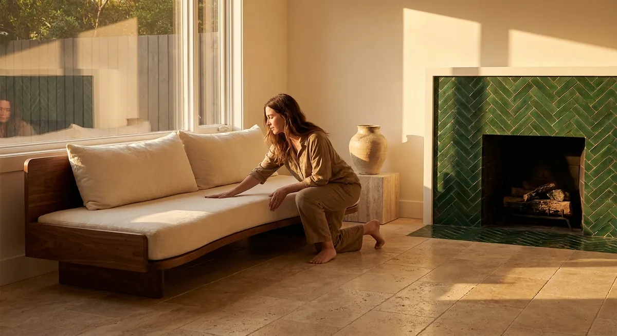
5. Designing Focal Moments: Controlled Drama, Not Visual Noise
In well-composed interiors, focal points are deliberate and restrained rather than scattered. Decide early where you want the eye to rest: a fireplace surround, a shower feature wall, a kitchen range backsplash, or a sculptural staircase. Once that hero surface is chosen, allow the surrounding areas to play a supporting role with simpler, more subdued tile choices drawn from the same tonal family.
For instance, a fireplace clad in a bookmatched porcelain slab with veining that unfolds like a piece of art requires quiet companions—perhaps matte, stone-look floor tiles that echo a secondary tone from the slab. In a bathroom, a single wall of elongated, vertically stacked tiles in a rich, desaturated color can anchor the room while the remaining walls maintain a calm, neutral field. The objective is not to eliminate personality, but to concentrate it. By editing down to one or two truly memorable tile moments per space, you achieve an atmosphere of curated confidence rather than visual competition.
Conclusion
Refined tile design is less about following trends and more about orchestrating a complete experience—how surfaces align, how light travels, how textures feel beneath bare feet. When transitions are intentional, proportions are thoughtful, grout is considered, textures are layered, and focal points are controlled, tile becomes an expression of quiet luxury that endures long after fashions shift. For homeowners who value craftsmanship and subtlety, these principles transform tile from a hard surface into a lasting signature of the home’s character.
Sources
- [Ceramic Tile Trends and Design Resources – Tile Council of North America](https://www.tcnatile.com/industry-issues/consumer-tips.html) – Industry guidance on tile selection, performance, and best practices.
- [Porcelain Tile and Design Inspiration – Ceramics of Italy](https://www.ceramica.info/en/) – European tile design case studies, trends, and technical insights.
- [Grout and Joint Design – MAPEI Technical Articles](https://www.mapei.com/us/en-us/home-page/technologies-and-solutions/architectural-and-design-solutions) – Professional resources on grout color, joint width, and installation considerations.
- [Flooring Guidance and Durability – National Association of Home Builders](https://www.nahb.org/advocacy/industry-issues/construction-codes-and-standards) – Information on standards and considerations for flooring materials in residential construction.
- [Lighting and Surface Interaction – Illuminating Engineering Society](https://www.ies.org/definitions/surface-reflectance/) – Explanation of how light interacts with different surface finishes and reflectance levels.