Below, you’ll find five exclusive, design‑driven insights that move beyond basic style advice and into the realm of curated, long‑lasting tile environments.
1. Treat Tile as Architecture, Not Decoration
Refined tile work begins with a shift in mindset: tile should be drawn into the architectural framework of the home, not simply “applied” at the end. When you start considering tile at the same moment you’re evaluating ceiling heights, door placements, and window proportions, you allow it to participate in the composition of the room.
This means aligning grout joints with key verticals—door jambs, window mullions, and even cabinetry seams—so that the space reads as one deliberate gesture rather than a series of unrelated decisions. A tall shower, for example, feels more tailored when the tile layout anticipates the shower niche, ceiling line, and glass door rather than cutting through them awkwardly. Likewise, in kitchens, a backsplash that starts and stops on meaningful lines (the edge of a window casing, the underside of a shelf) will always look more custom than one that feels arbitrarily truncated.
Think of the tile as a “quiet grid” that underpins the room. When the grid is harmonious with the architectural lines, the space feels composed, even when the pattern itself is minimal. This approach doesn’t call attention to itself; instead, the room simply looks and feels more expensive.
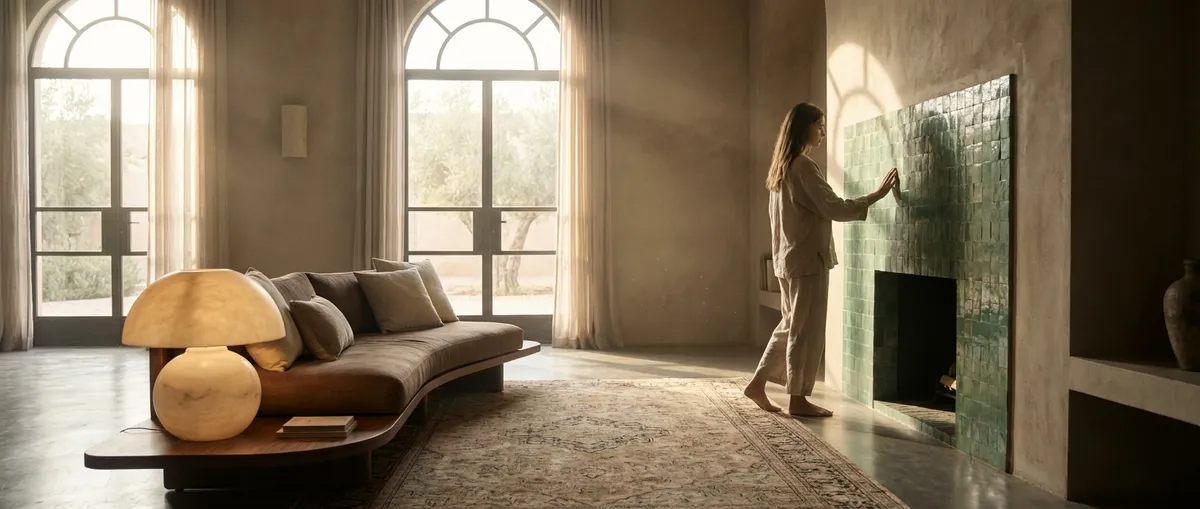
2. Curate a Palette of Textures, Not Just Colors
Most homeowners choose tile primarily by color, but the truly elevated interiors are defined more by texture and finish than hue alone. In natural and artificial light, a matte porcelain, a honed marble, and a subtly crackled ceramic all behave differently—even if they’re in the same color family. This nuanced interplay is what gives a room visual depth without relying on loud patterns.
Begin by choosing a central “lead” tile that feels timeless and grounded. From there, build supporting textures that echo or soften its character. A honed stone on the floor can be paired with a finely textured porcelain on the wall for a subtle shift under changing daylight. Or combine a soft-matte field tile with a glossy, hand‑finished trim so the perimeter catches light in a more deliberate way.
The goal is a layered, tactile experience that feels cohesive. Limiting the color range while varying the surface quality creates a quiet richness that photographs beautifully and ages gracefully. This is especially crucial in open‑plan spaces, where tile must be visually calm from multiple viewpoints, yet still interesting up close.
3. Design Intentional Thresholds Between Materials
Where tile begins and ends is as important as the tile itself. High‑end interiors rarely have abrupt, unresolved transitions; instead, they employ carefully considered thresholds that mark subtle shifts in function, mood, or hierarchy.
Between a tiled hall and a wood‑floored living area, for example, a refined stone or metal threshold can act as a small architectural punctuation mark—acknowledging the transition while keeping the language consistent. In wet rooms or ensuite baths, allowing a single tile to “turn the corner” at the doorway and step into the next space can create a sense of continuity, even if the subsequent flooring is different.
These transition details are also where you can control perception of scale. A continuous floor tile that flows from bath to shower, or from kitchen to pantry, visually enlarges the footprint and suggests a more custom build. Conversely, a carefully framed tiled zone under a freestanding tub or in front of a vanity can function almost like an inset rug, signaling a place of ritual and care.
The threshold is your opportunity to choreograph how the eye moves through the home. When materials meet thoughtfully, the interior feels serene and intentional, rather than pieced together.
4. Let Light Script the Pattern
Light—natural and artificial—is the most overlooked design partner in tile selection. The same tile can feel crisp and architectural in one room, and flat or overly busy in another, purely based on how it receives and reflects light. Sophisticated tile design treats every surface as a canvas for light behavior.
In spaces with dramatic daylight, such as a south‑facing kitchen or a bathroom with a generous window, consider how a slightly dimensional or softly glossed tile will catch sunlight across the day. Gentle variation in glaze or relief can bring a surface to life without introducing bold color or heavy pattern. In low‑light or interior rooms, a more reflective or finely speckled surface can prevent the space from feeling dull, offering subtle highlights where light is scarce.
Artificial lighting matters just as much. Tiles near under‑cabinet lighting, wall sconces, or integrated niche lighting should be chosen with the fixture’s color temperature and beam spread in mind. A warm, 2700K light source grazing a vertical tile can highlight texture in a refined way; a cooler, 4000K source may emphasize every imperfection. Testing tile samples in situ under the actual lighting plan is a hallmark of genuinely elevated design.
By allowing light to “script” the pattern, you’re designing for both day and night—ensuring the tile remains elegant in every scenario rather than only in ideal conditions.
5. Elevate the Details: Edges, Grout, and Joint Discipline
In luxury interiors, the story is told at the edges. Perfectly chosen tile can still feel ordinary if the details—edges, joints, and grout—have not been handled with precision. Conversely, even simple, modestly priced tile can look elevated when these elements are treated with rigor.
Edge profiles are a critical starting point. Bullnose pieces, mitred corners, or minimal metal trims each send a different message. A carefully executed mitred stone corner on a shower bench, for instance, looks bespoke and sculptural; a slim, color‑matched edge trim on a backsplash keeps the field tile visually uninterrupted and calm. Where possible, prioritize solutions that feel integral to the tile rather than applied afterward.
Grout is not merely functional; it’s a design tool. Matching grout to the tile creates a monolithic, architectural feel, while a slightly contrasting tone can articulate the pattern without overwhelming it. For contemporary work, disciplined, consistent joint widths convey craftsmanship and restraint. In more traditional or artisanal schemes, a slightly irregular joint can celebrate the hand‑made nature of the tile—but only when it’s clearly intentional.
The most refined installations often have one “signature” detail that sets them apart: a meticulously wrapped inside corner, a perfectly centered niche with uninterrupted joints, or a stair riser that aligns gracefully with a tiled entry. These moments of precision are subtle, but they’re where an informed homeowner—and any discerning guest—will notice the difference.
Conclusion
Exceptional tile design is not about chasing trends or dramatic statements; it’s about crafting surfaces that quietly support a sophisticated way of living. By treating tile as architecture rather than mere finish, curating texture over color, composing thoughtful thresholds, working in partnership with light, and insisting on disciplined detailing, you create rooms that feel both calm and deeply considered.
These principles do more than produce beautiful photographs; they yield interiors that remain compelling over time, aging with dignity and rewarding those who pay attention. For homeowners who view their spaces as long‑term investments in comfort and character, tile becomes not just a backdrop, but a lasting expression of taste and intent.
Sources
- [National Kitchen & Bath Association (NKBA) – Kitchen & Bath Design Trends](https://nkba.org/insights/trends/) - Industry insights on how materials, including tile, are being used in high‑end kitchens and baths
- [American Society of Interior Designers (ASID) – Research & Reports](https://www.asid.org/resources/resources-research) - Professional research on interior design best practices, including material specification and detailing
- [Ceramic Tile Education Foundation (CTEF)](https://www.ceramictilefoundation.org/blog) - Technical guidance on tile installation standards, grout, and detailing that support premium design outcomes
- [U.S. General Services Administration – Guide for Specifying Architectural Interior Stone](https://www.gsa.gov/real-estate/design-construction/design-excellence/program-information/design-excellence-policies-and-resources/pbs-pq260) - Authoritative reference on architectural stone use, relevant to high‑end stone and tile applications
- [MIT School of Architecture and Planning – Materials in Architecture](https://architecture.mit.edu/subject/4s06) - Academic perspective on the role of materials as architectural elements rather than simple finishes