Below, you’ll find five exclusive, detail-driven insights that sophisticated homeowners and their designers can use to unlock truly exceptional tile work—design thinking that rewards close inspection and long-term living.
1. Designing the Room Around the Joint, Not the Tile
Most homeowners select tile by color and size, then “fit” it to the room. The most refined spaces invert this logic: they design the room around the grid.
When you treat grout lines as an architectural framework rather than a byproduct, sightlines become your primary tool. Align joints with major visual anchors:
- The edge of a kitchen island
- The centerline of a vanity basin
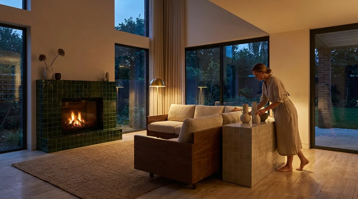
- A fireplace opening or window mullion
- Long hallway axes and door thresholds
This approach often means slightly adjusting room dimensions on paper before construction, or selecting tile sizes that divide your room dimensions cleanly. It may also mean accepting that a slightly less “on-trend” size yields a far more composed result.
Refinement shows up in the absence of awkward slivers at edges, the way a floor pattern resolves gracefully at thresholds, and the visual calm created when joints line up with architectural elements. The result is a room that feels inexplicably ordered—even to guests who can’t identify why.
2. Curating Sheen and Texture to Direct Light, Not Just Style
Most tile conversations stop at “matte vs. glossy.” In considered interiors, sheen and texture are treated as tools for light management.
Glossy finishes amplify light and reflect surroundings, but can quickly become visually noisy if used indiscriminately. Satin and honed surfaces soften reflections, allowing form and color to read with greater depth. Structured or textured tiles, when used sparingly, can add a gentle play of shadow that enriches otherwise simple planes.
Think in terms of light choreography:
- In low-light bathrooms, a subtle satin wall tile can bounce just enough light to avoid harsh glare while still feeling luminous.
- In a sunlit kitchen, a honed backsplash can prevent distracting reflections from under-cabinet lighting.
- Textured tiles belong where touch and grazing light intersect: shower niches, fireplace surrounds, a single accent wall that catches late-afternoon sun.
Advanced homeowners request samples and evaluate them in actual project lighting—day and night—before committing. The aim is not simply “beautiful tile,” but a calibrated dialogue between light, texture, and shadow throughout the day.
3. Layering Formats to Sculpt Space, Not Create “Feature Walls”
The default strategy for interest is often: “Let’s add a feature wall.” Elevated interiors do something subtler—they use format shifts to sculpt the perception of space.
Instead of relying on bold color or loud pattern, consider a single material used in multiple formats:
- Large-format floor tile grounding the space
- The same material in a smaller rectangle or planks on the walls
- A mosaic or narrow stack for niches, insets, or bench fronts
This material continuity keeps the palette serene while the scale shifts create nuanced differentiation between functional zones. In a bathroom, a change from large floor tiles to vertical planks on the shower walls can visually elongate the room. In a kitchen, transitioning from horizontal subway proportions along the main run to a vertical stack behind the cooktop can give quiet emphasis to the cooking zone without introducing another material.
The sophistication lies in restraint: aligned joints where formats meet, consistent grout color, and deliberate transition lines that feel architectural rather than decorative.
4. Treating Color as Atmosphere, Not Decoration
Color in tile is often chosen like paint: “We like blue,” or “We want something neutral.” In high-end tile design, color selection begins with atmosphere—how you want the room to feel in its quietest moments.
Instead of starting with a specific “color,” start with qualities:
- Do you want the room to feel cool and crisp, or warm and enveloping?
- Should it recede and calm, or heighten clarity and alertness?
- How will the color interact with natural light orientation (north vs. south) and evening lighting?
Warm neutrals in tile (soft greige, clay, sand) can soften modern lines without sacrificing a clean aesthetic, while cool stone tones can underscore a more gallery-like atmosphere. Desaturated colored tiles—muted celadon, slate blue, chalky green—often feel more enduring than saturated tones, especially over large surfaces.
An advanced approach is to test tile color against other permanent finishes: wood tones, stone veining, metal hardware, and even fabric swatches. The goal is a chromatic harmony where tile supports the overall palette rather than competing for attention. Color becomes the background “air” the room breathes, not an isolated statement.
5. Elevating Thresholds, Edges, and Terminations into Design Moments
Most tile installations are judged by their main surfaces—the floor, the shower wall, the backsplash. Truly exceptional work, however, is defined by how it ends.
Premium spaces turn edges into quiet moments of craftsmanship:
- Stair Noses and Steps: Mitred tile returns, integrated nosings, or precisely aligned bullnose pieces transform a functional edge into a tailored detail.
- Wall Terminations: Instead of abrupt cut edges, consider slim metal profiles, stone pencil trims, or a clean alignment to a change in paint color or paneling.
- Floor Transitions: Moving from tile to wood or carpet is an opportunity for meticulous alignment—center a doorway on a grout line, or use a metal or stone threshold sized to the existing grid.
- Niches and Recesses: Wrap edges consistently; carry the main wall tile into the niche or intentionally contrast it with the same material in a different format for depth.
Ask your installer how they intend to resolve every edge before work begins. Review drawings or mock-ups of corners, transitions, and terminations. This is often where projects that looked perfect in concept reveal either their discipline or their shortcuts. For the discerning homeowner, this is where money is best “spent”—not in adding more finishes, but in refining how each surface concludes.
Conclusion
Design-forward tile work is less about spectacle and more about orchestration—of grid, light, format, color, and detail. When joints are aligned with architecture, sheen is tuned to light, formats are layered with restraint, color is treated as atmosphere, and edges are crafted rather than merely ended, tile transcends functionality and becomes a quiet backbone of the entire interior.
For homeowners who prize longevity and subtle luxury, these five insights offer a framework for conversations with designers and installers that move beyond “what looks nice” into “what will feel resolved, every day, for years.” The most sophisticated tile work does not shout; it simply leaves nothing unresolved.
Sources
- [American Society of Interior Designers (ASID) – Design Trends](https://www.asid.org/resources/resources/view/resource-center/2024-trends-outlook-report) – Professional insight into broader interior design thinking and how surfaces support spatial experience.
- [Tile Council of North America (TCNA) – Handbook for Ceramic, Glass, and Stone Tile Installation](https://www.tcnatile.com) – Industry standards and best practices for joints, transitions, and advanced installation details.
- [Porcelanosa – Tile Collections and Technical Data](https://www.porcelanosa.com/en/tile/) – Examples of varied formats, finishes, and how manufacturers approach sheen, texture, and modular systems.
- [Ceramic Tile Education Foundation (CTEF)](https://www.ceramictilefoundation.org/blog) – Articles discussing craftsmanship, layout planning, and why details like edges and terminations matter.
- [NC State University – Daylighting and Interior Surfaces](https://projects.ncsu.edu/goinggreen/daylighting.html) – Explanation of how light interacts with interior surfaces, useful for understanding sheen and texture selection.