This guide moves past basic how‑tos and into the realm of refinement, sharing five exclusive insights that elevate tile installations from competent to truly considered.
Designing to the Room’s Rhythm, Not Just Its Dimensions
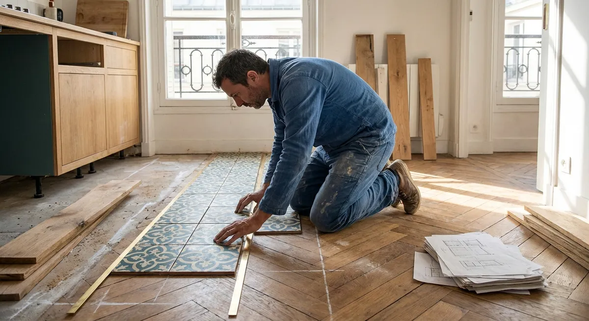
Most tile layouts are drawn to fit a measurement; the most elegant installations are composed to suit a room’s rhythm.
Before a single tile is set, stand in each primary vantage point: the entry, the seating area, the working zone in the kitchen. Notice where your eye naturally lands. That is often where your most intentional lines should resolve—centered grout joints, a full tile, or a carefully framed pattern. A room that feels “expensive” usually owes that perception to this kind of visual alignment, not to the tile’s price tag.
Think in axes rather than boundaries. Instead of simply centering a layout to the walls, consider aligning grout lines to architectural cues: the centerline of a range and hood, the axis of a dining table, or the threshold between rooms. In long corridors or open-plan spaces, a subtle shift in the tile pattern can be used to suggest zones without a single physical divider.
The result is a floor or wall that doesn’t just fit; it feels inevitable, as if the architecture and the tile were conceived together.
The Refined Power of Edges, Joints, and Transitions
The luxury of a tile installation is most apparent where it ends, not where it begins.
Refined projects give disproportionate attention to edges and transitions: door thresholds, where tile meets wood or stone, the perimeter of a shower niche, the precise line where tile stops under bespoke millwork. These are the places where shortcuts are most visible—and where thoughtful decisions yield the most elevated results.
Consider metal trims in finishes that echo your hardware but stay a half step quieter—brushed nickel instead of polished chrome, matte black instead of high gloss. For stone-look or large-format porcelain, a clean, mitered corner on an outside edge signals craftsmanship, especially in niches, benches, and exposed corners.
Equally important is vertical transition: how tile meets the ceiling, window casings, or a wainscot cap. Stopping tile at an arbitrary height can make a room feel visually chopped; terminating at logical points—window heads, door lintels, or proportionally balanced wainscot lines—creates calm and cohesion.
Where different flooring materials meet, aim for a level, flush transition with aligned seams where possible. A shared centerline or parallel joint between kitchen tile and adjacent wood flooring can subtly unify spaces that otherwise have distinct finishes.
Light as a Design Material: Reading Surfaces by Day and Night
The same tile can look understated or overly busy depending entirely on light. Sophisticated installations treat light as a design material, not an afterthought.
Glossy and polished tiles amplify light, but can reveal every inconsistency in substrate or setting. They are best in perfectly prepared environments and where you deliberately want a sense of luminosity, such as a feature backsplash with carefully positioned under-cabinet lighting. Matte and honed finishes, by contrast, absorb and soften light, often feeling more architectural and calm—particularly suitable for expansive floors and spa-like baths.
Before committing to a layout, place sample tiles in the actual space for several days and study them at dawn, midday, and night. Note reflections on glossy tiles: are you comfortable seeing the outlines of windows, pendants, or recessed lights echoed on the surface? On textured or structured tiles, check how raking light from windows accentuates the relief; in some cases, too much texture under low grazing light can become visually restless.
For large-format tiles, review how lighting interacts with minimal grout joints. Properly planned lighting can intentionally wash a feature wall, highlight a vein in stone-look porcelain, or quietly recede, allowing a seamless floor to become a serene backdrop rather than a focal point.
The Hidden Architecture: Substrate, Movement, and Longevity
Exceptional tile work feels serene on the surface because it is meticulously controlled beneath it.
Premium projects treat substrates, waterproofing, and movement joints as architectural decisions, not just technical necessities. A flat, properly reinforced subfloor or wall system reduces lippage (those minuscule but noticeable height differences between tiles) and maintains crisp lines over time. In wet areas, a continuous, tested waterproofing system—carefully detailed at corners, penetrations, and niches—protects not only the tile investment but the building envelope itself.
Movement and expansion joints, often ignored in basic installations, are quietly vital in refined ones. Strategically placed soft joints in larger expanses of tile allow the assembly to respond to temperature and structural movement without cracking. The most artful installations integrate these joints into the pattern so they are functionally present but visually discreet.
Adhesive choice, trowel technique, and back-buttering on larger tiles influence not just adhesion but sound and feel underfoot. A hollow echo when you walk across a floor subtly undermines the impression of quality; full, consistent coverage translates to a solid, reassuring step that sophisticated spaces demand.
Color, Grout, and the Subtle Language of Restraint
Color decisions in tile installations are often treated as mere aesthetics. In refined interiors, they also serve as tools of discipline and restraint.
Grout color is one of the most underestimated design levers. A close match to the tile creates an expansive, monolithic field—ideal when you want the surface to read as continuous and calm. A slightly contrasting grout articulates each tile and can add a tailored, textile-like effect in small formats such as subway or mosaic. In graphic patterns, dialing back contrast between tile and grout keeps the design elegant, not overwhelming.
Consider temperature and undertones with the same care as in paint selection. Warm stone-look tiles with cool gray grout, or cool marble-look tiles with a yellowed grout, can make even high-end materials look discordant. Request grout samples or small mockups and observe them in your actual lighting.
For homeowners who appreciate longevity and subtlety, a restrained palette—two to three tile selections thoughtfully repeated across the home—creates a sense of cohesion more commonly seen in boutique hotels and well-curated apartments. The sophistication lies not in constant variation, but in deliberate repetition and proportion.
Conclusion
The most memorable tile installations are rarely about spectacle. They are about quiet decisions made early and executed consistently: a layout aligned to the room’s natural rhythm, transitions that feel inevitable, light that flatters every surface, and technical underpinnings that protect the investment over decades.
For homeowners who see their spaces as crafted environments rather than mere square footage, tile is not just a finish—it is the considered canvas on which daily life unfolds. With these five insights, you can approach tile installation with the same discernment you bring to fine furniture, art, and architecture, ensuring every surface contributes to a home that feels intentionally, enduringly refined.
Sources
- [U.S. Department of Housing and Urban Development – Residential Rehabilitation Inspection Guide (Flooring & Subfloors)](https://www.hud.gov/program_offices/public_indian_housing/programs/ph/hcv/forms/guidebook) - Background on substrate conditions, moisture, and structural considerations that impact tile performance
- [Tile Council of North America (TCNA) – Handbook for Ceramic, Glass, and Stone Tile Installation](https://www.tcnatile.com/installation-guides/handbook.html) - Industry-recognized installation methods, substrate requirements, and movement joint guidelines
- [Schluter Systems – Shower System Waterproofing](https://www.schluter.com/schluter-us/en_US/Shower-System/c/Shower) - Technical information and details on integrated waterproofing assemblies for tiled wet areas
- [LATICRETE – Grout Color Selection and Design Considerations](https://laticrete.com/en/tile-and-stone-installation/grouts) - Guidance on grout types, color choice, and how grout impacts the visual outcome of tile installations
- [University of Florida IFAS Extension – Flooring Choices: Considerations for Selection](https://edis.ifas.ufl.edu/publication/HE633) - Context on flooring durability, maintenance, and functional performance factors relevant to tile in residential settings