Below are five exclusive, design-forward insights that move tile from expected to exceptional—ideas that invite a more curated, gallery-level approach to every tiled room in your home.
1. Treat the Floor as a “Field” and the Walls as a “Frame”
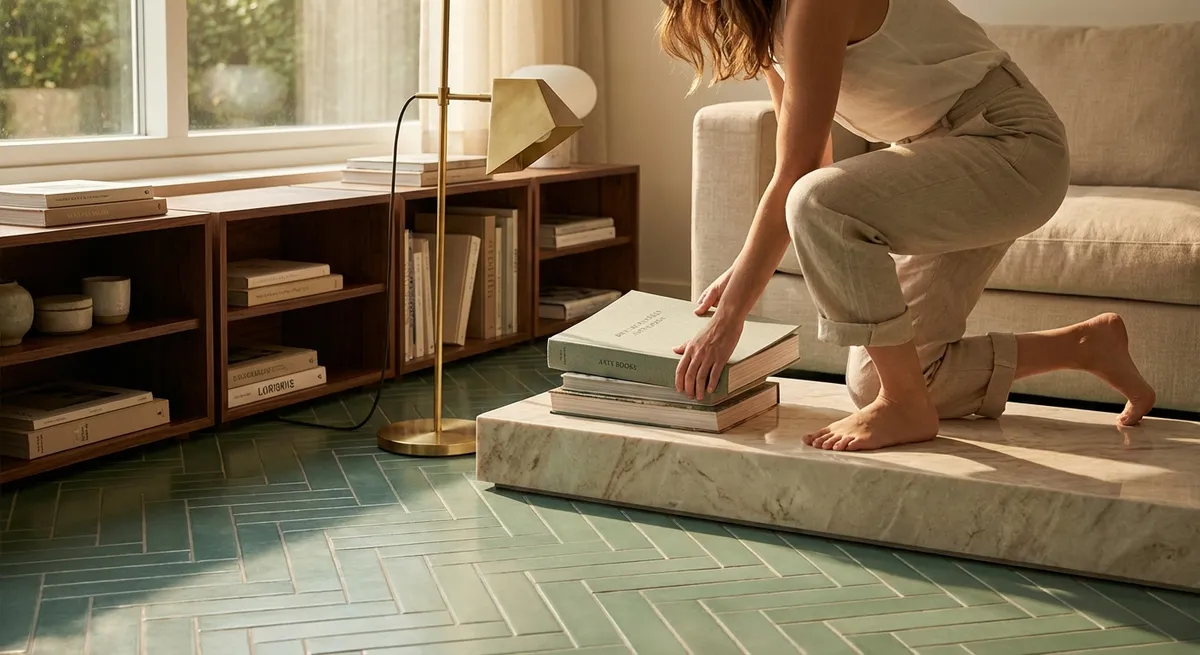
In sophisticated interiors, tile is rarely applied uniformly; instead, the room is composed as a visual hierarchy. Think of your floor as the field—the primary surface that anchors the space—and your walls as the frame that refines it.
On floors, larger-format porcelain or stone creates a calm, continuous base. Choose a restrained palette and a finish that gently interacts with light (matte or honed for softness; a silk sheen for subtle reflection). Wall tile can then introduce nuance in proportion and texture: perhaps a vertically stacked, slim rectangular tile that elongates the room, or a fine linear ribbed tile that adds shadow play without visual noise.
The sophistication comes from moderation. Allow the floor to speak in long, uninterrupted lines: minimize threshold breaks, align grout joints with architectural elements such as doorways and built-ins, and maintain consistent directionality through adjacent rooms. Walls, by contrast, can act as a tailored frame—wrapping specific features like a vanity wall, a cooking zone, or a fireplace surround rather than covering every available surface. The result is a room that feels curated rather than tiled by default.
2. Dial in Grout as a Design Material, Not a Technical Afterthought
Discerning tile work is often recognizable not by the tile alone, but by how intelligently grout is handled. In refined spaces, grout is a design material with its own color, proportion, and presence.
For a seamless, gallery-like look, choose a grout that closely matches the primary tone of the tile. This minimizes the “grid” effect and allows the space to read as continuous planes instead of a checkerboard. With textured or handmade-looking tiles, a near-match grout keeps the focus on surface variation and shadow rather than linework.
Conversely, a deliberately contrasting grout can be used sparingly to articulate specific areas, such as a niche, a shower floor mosaic, or a kitchen backsplash where pattern is desired. The critical distinction: contrast should feel intentional, not generic. Avoid default gray for every tile; instead, sample grout colors under the actual project lighting and evaluate them wet and dry. Differences that seem subtle on a fan deck can become dramatically apparent once an entire wall is installed.
Finally, grout joint width is a powerful, underused tool. Tighter joints (within manufacturer allowances) lend a tailored, custom appearance and are particularly effective with rectified porcelain and large-format tiles. Slightly wider joints can soften a highly geometric pattern or celebrate the character of natural stone. The goal is coherence: joint width, grout color, and tile finish should all support the same design story.
3. Align Tile Layouts to Architecture, Not Just to Walls
Elevated tile design begins with layout strategy, not with the first tile set in thinset. Instead of centering your layout on a single wall, consider how the tile aligns to architectural features: door openings, windows, built-ins, vanities, tubs, and even major furnishings.
In a primary bathroom, for example, let the main floor tile “center” on the vanity or the tub, not necessarily on the room’s exact dimensions. Arrange cuts so that visible edges—like the tile you see from the hallway or when first entering the room—land on full or nearly full tiles. Reserve smaller cuts and slivers for behind doors or under vanities where they visually recede.
On walls, vertical alignment can be especially impactful. Consider how grout lines intersect with:
- Mirror edges and light fixtures
- The bottom of wall cabinets or open shelving
- Window stools and sills
- The top of a shower glass panel
When these intersections are planned in advance, the result is a level of quiet precision that reads as custom millwork rather than standard tiling. Even complex patterns—herringbone, chevron, or diagonal layouts—can feel calm when their axes are derived from a central architectural line rather than simply the corner of the room.
4. Use Texture and Finish to Sculpt Light, Not Just to Add Interest
In design-forward spaces, texture and finish are less about decoration and more about sculpting light. The same color in different finishes can dramatically alter a room’s atmosphere and perceived scale.
A matte or honed finish diffuses light softly, minimizing glare and creating a restful backdrop—ideal for large surfaces such as bathroom floors or expansive kitchen backsplashes. Slightly reflective or satin finishes, used judiciously, can introduce a sense of depth and movement, especially on vertical surfaces where they catch natural daylight or under-cabinet lighting.
Subtle three-dimensional tiles—ribs, flutes, soft waves, or faceted geometry—transform ordinary walls into architectural features. In a shower niche, a lightly fluted tile can read like crafted paneling; behind a vanity, a gentle relief tile under a warm sconce can mimic the effect of finely detailed plasterwork. Keep the palette restrained so the play of light becomes the focus rather than competing colors.
In transitional spaces like entry halls or mudrooms, a combination of finishes can be particularly effective: a durable, slip-resistant floor tile paired with a more refined, softly reflective wall tile that catches afternoon light. This “light choreography” is what gives a space a sense of time and mood throughout the day.
5. Elevate Edges and Transitions as Signatures of Quality
Nothing reveals the caliber of tile work more swiftly than its edges and transitions. Where tile stops, how it meets another material, and the way corners are handled all signal whether a space was simply installed—or truly designed.
Consider these elevated approaches:
- Shadow reveals instead of harsh terminations: A slim painted reveal or a minimal metal profile set slightly back from the tile edge can create a subtle shadow line, framing the tiled area like a work of art.
- Thoughtful material pairings: Where tile meets wood, plaster, or stone, align surfaces carefully and avoid abrupt height changes. A flush transition at doorways or thresholds feels contemporary and deliberate.
- Refined corner details: When possible, mitred outside corners or dedicated bullnose/trim pieces prevent bulky edges and maintain the continuity of veining or pattern. This is particularly crucial with marble or stone-look porcelain.
- Completed “end moments”: In kitchens, rather than having backsplash tile end arbitrarily mid-wall, align its termination with a cabinet edge, window casing, or a vertical trim piece. In showers, let tile elevations relate to the height of doors, windows, or cornice lines.
These details may seem small individually, but together they create a visual logic that the eye reads as luxury. A space feels composed because nothing appears cut off, improvised, or unresolved.
Conclusion
Exceptional tile work is less about spectacle and more about restraint, alignment, and intentional detail. When the floor is treated as a calm field and the walls as a considered frame; when grout is selected as carefully as the tile; when layouts follow architecture, not just room dimensions; when light is sculpted through finish and texture; and when edges are resolved with precision—tile transcends utility and becomes an integral part of the home’s architecture.
For homeowners investing in truly distinguished spaces, these nuances are not indulgences—they are the quiet markers of craftsmanship that make a room feel permanently relevant, deeply considered, and quietly luxurious.
Sources
- [Ceramic Tile Institute of America – Tile Installation Guidelines](https://ctioa.org/) – Technical references on tile layout, grout joints, and detailing best practices
- [Tile Council of North America (TCNA) – Handbook for Ceramic, Glass, and Stone Tile Installation](https://www.tcnatile.com/) – Industry standards and methods that underpin high-quality tile work
- [Porcelanosa – Large Format Tiles Design Inspiration](https://www.porcelanosa.com/uk/large-format-tiles/) – Examples of refined, large-format applications and seamless surfaces
- [American Institute of Architects – Light and Material in Architecture](https://www.aia.org/resources/6077662-lighting-in-architecture) – Discussion of how finishes and surfaces interact with light in interior spaces
- [Massachusetts Institute of Technology – Architecture & Light Studies](https://architecture.mit.edu/subject/4s17) – Academic perspective on light, materiality, and perception in architectural design