Below are five exclusive, often-overlooked insights that quietly separate standard tile work from the kind of installation that feels purpose-built and effortlessly luxurious.
1. Designing the “First Glance Line”: Where the Eye Naturally Lands
In any room, there is a dominant sightline: the point your eye meets first when you enter. Exceptional tile installations are composed around this moment.
Rather than starting layout from the most convenient wall, a premium approach begins by standing at each main entry and observing where the eye falls—often a tub face, the far kitchen wall, a fireplace surround, or a shower back wall. That visual focal plane should receive the most intentional tile alignment: centered patterns, full tiles instead of slivers, and carefully aligned grout joints with adjacent architectural elements like windows, door casings, or range hoods.
This can mean shifting the entire layout so the “unseen” edges—behind a vanity, under cabinetry, inside a closet—accept the less-than-ideal cuts. The most refined installations are mercilessly generous with their best work in the places you feel first, and quietly pragmatic in the places you rarely notice.
2. Treating Transitions as Jewelry, Not Afterthoughts
Many tile projects fall short not in the field of tile, but at the edges—door thresholds, stair noses, fireplace terminations, and transitions between materials. These are the “jewelry points” of a space, where precision is most visible and touch is most frequent.
Instead of defaulting to a generic metal trim or a standard reducer, a more sophisticated approach considers:
- Flush transitions between tile and hardwood, achieved with carefully planned heights, appropriate underlayment, and tile thickness selection.
- Stone or porcelain thresholds that echo the main tile but introduce a subtle frame or directional shift.
- Shadow reveals or minimalist trims that disappear visually, allowing the tile to feel monolithic and uninterrupted.
This level of intention begins early—during substrate preparation and product selection—so the final finish looks deliberate, not improvised. When transitions are handled with jewel-like care, the entire installation reads as custom-crafted rather than simply “installed.”
3. Curating Grout as a Design Material, Not a Filler
Grout is frequently treated as a technical necessity instead of a powerful design tool. In high-caliber work, grout selection is as considered as the tile itself.
Color should be chosen not only to “match” but to control visual rhythm. A near-tonal match creates a seamless, almost stone-like field, ideal for calm, expansive spaces. A softly contrasting grout can articulate pattern and craftsmanship—particularly with mosaics or elongated formats—without feeling busy. Strong contrast works best when it intentionally highlights geometry, such as stacked joints or intricate patterns, and when the substrate and installation are flawlessly flat.
Equally critical is grout type and joint size. For large-format porcelain, a premium, stain-resistant grout with tighter joints can underscore the tile’s scale and produce a more continental, gallery-like feel. In wet areas and high-use floors, high-performance or epoxy grouts provide additional protection, color stability, and long-term clarity—an understated luxury that reveals itself in how well the joint lines age over years, not months.
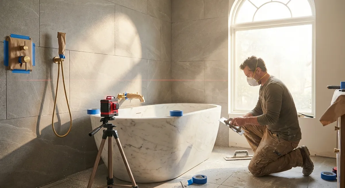
4. Pursuing Flatness, Not Just Level: The Hidden Foundation of Luxury
Most homeowners know that substrate should be “level,” but the more important—and more demanding—quality is flatness. Tiles do not care if a room is perfectly level to the earth; they care whether the surface underneath is consistently even.
A refined installation will often involve:
- Self-leveling compounds or patching materials to correct dips and crowns before a single tile is placed.
- Careful evaluation of large-format tiles (and especially gauged porcelain panels) against the substrate, with lippage tolerances kept far tighter than typical minimum standards.
- Strategic use of leveling systems, not as a rescue tool, but as a precision aid on an already-prepared substrate.
Why it matters: true flatness allows light to wash across floors and walls without catching on edges or telegraphing imperfections. In spaces with strong natural light, large windows, or accent lighting that grazes walls, this is the difference between “nicely tiled” and “architectural-grade finish.”
5. Orchestrating Light, Texture, and Joint Direction as a Single Composition
High-end tile work is never just “installed along the longest wall.” It is composed in relation to light, use, and architectural flow.
Refined planning considers:
- Directionality and pattern: Long planks or rectangles may run with the natural traffic paths or toward the primary view, but sometimes the more sophisticated choice is to run them perpendicular to expected direction to visually widen a room or draw focus to a specific feature.
- Texture and reflectivity: Matte, honed, and lightly textured tiles can temper glare in sunlit rooms and provide softly tactile underfoot experiences. More reflective finishes might be selectively introduced in niches, backsplashes, or vertical details to enliven evening light.
- Alignment with architecture: Grout joints that align with window mullions, cabinet edges, and key verticals allow the space to feel orchestrated rather than coincidental.
In exceptional projects, these decisions are not made in isolation. Tile layout is reviewed against lighting plans, cabinetry drawings, and even furniture placement. The result is an installation that feels innately “right,” even if the observer can’t quite articulate why.
Conclusion
Luxury in tile installation is not defined by brand, rarity, or price per square foot. It resides in invisible planning, disciplined restraint, and impeccable alignment between technical execution and aesthetic intent. When sightlines, transitions, grout, flatness, and composition are all considered with equal seriousness, tile ceases to be a mere finish and becomes the quiet structure of an elevated interior.
For homeowners, understanding these deeper layers of decision-making offers something invaluable: the ability to recognize, request, and ultimately enjoy tile work that feels not just correct, but exquisitely resolved.
Sources
- [TCNA Handbook for Ceramic, Glass, and Stone Tile Installation](https://www.tcnatile.com/publications-and-guides/handbook-download.html) - Industry-recognized standards and best practices for tile installation in North America
- [ANSI A108/A118/A136 Installation Standards (Tile Council of North America)](https://www.tcnatile.com/faqs/71-ansi-standards.html) - Technical guidelines on setting materials, installation methods, and performance criteria
- [Schluter Systems – Movement Joints and Transitions](https://www.schluter.com/schluter-us/en_US/Profiles/c/P) - Detailed information on transition profiles, edge trims, and movement accommodation in tile assemblies
- [LATICRETE – Guide to Substrate Preparation](https://laticrete.com/en/support-and-downloads/technical-design-manuals) - Technical manuals explaining substrate requirements, flatness, and preparation techniques for high-performance tile installations
- [National Institute of Standards and Technology – Building and Fire Research](https://www.nist.gov/el/fire-research-division-73300) - Research and publications relevant to building materials, durability, and performance in constructed environments