This guide looks beyond the basics and into five exclusive, often-overlooked insights that discerning homeowners and design-forward renovators should understand before a single tile is set.
Designing From the Threshold, Not the Center of the Room
Most tile layouts are planned from the geometric center of a room. It’s a technically correct approach—but not always an aesthetically intelligent one. In a cultivated space, the human eye rarely reads a room from the center; it reads from transitions and thresholds: the main doorway, a view line from the hall, or the point where stone meets hardwood.
Begin your layout where the experience begins. Stand at the primary entrance and consider what your gaze lands on first: is it a continuous grout line running directly to the far wall, a centered pattern that visually anchors the space, or a perfectly framed focal tile? Adjust your layout so that cut tiles—inevitable in most rooms—are subtly tucked away at secondary walls, under vanities, or behind freestanding tubs rather than at highly visible transitions.
This threshold-first design mindset affects more than aesthetics. It can reduce awkward slivers of tile, help align grout joints with cabinetry and architectural elements, and create a visual calm that you feel even if you can’t immediately identify why the room looks “right.” When you review your installer’s layout plan, always ask: “What do I see from the doorway, and where will the cuts fall?”
Respecting Tile Tone Variation as a Feature, Not a Flaw
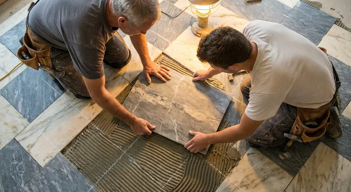
High-end tile—especially natural stone and premium porcelains designed to mimic it—rarely arrives as a perfectly uniform batch. Instead, there are subtle differences in tone, veining, and texture. In rushed installations, boxes are opened as needed and installed in sequence, which can unintentionally cluster similar tones and create visible “patches” across the floor or wall.
A more considered approach involves a deliberate “dry lay” and blend. Before adhesive touches the substrate, your installer should unbox multiple cartons, stand tiles upright, and visually sort them into a balanced mix of light, medium, and dark tones (or varied veining directions). This curated blend is then distributed strategically across the space so that no single area feels visually heavy or overly busy.
For homeowners, this is an opportunity for editorial control. Request a blending session and review the variation under the actual lighting conditions of your space—daytime and evening. Decide whether you prefer a more restrained, tonal progression or a dynamic interplay of contrast. In sophisticated interiors, tone variation becomes a quiet rhythm across the surface rather than an accidental patchwork.
Building Flatness, Not Just Level: The Underlayment Intelligence
Luxury tile work does not merely sit on top of the structure; it relies on the invisible preparation beneath it. The distinction between “level” and “flat” is subtle but critical, especially for large-format tiles and rectified porcelain with razor-thin grout joints.
A floor may technically be within level tolerance and still have shallow waves, humps, or dips that cause tiles to rock, lippage at edges, and pooling water in showers. High-caliber installers aim for exceptional flatness, often exceeding the minimum industry standards when working in premium homes. They may use self-leveling underlayments, patch compounds, or strategic grinding to achieve a substrate that allows large tiles to lie in the same plane with minimal adjustment.
Homeowners should not hesitate to ask for a flatness check before tile is installed. Request that your installer place a long straightedge or level across the floor in multiple directions, and have them explain how they will address any visible gaps or high spots. This is also the moment to confirm that underfloor heating, movement joints at perimeters, and any decoupling membranes (such as uncoupling mats) are integrated in a way that preserves both performance and the height transitions into adjoining rooms.
In a refined project, the most luxurious aspect of the tile work may be something you never see: the absolute absence of visual disruption across the plane.
Grout as a Design Element, Not a Last-Minute Decision
In many projects, grout is the afterthought chosen in a few rushed minutes at the end—the “closest gray” or “matching white” from a small plastic sample board. Yet grout is the connective tissue of your surface, and its color, width, and type profoundly influence how the installation reads: monolithic and calm, or patterned and graphic.
Sophisticated tile work treats grout as a design material. Near-matching grout can create a seamless, stone-like effect, while a deliberately contrasting grout will emphasize pattern, size, and layout. In modern bathrooms, a soft tonal grout that is one or two shades darker than the tile can preserve a serene look while quietly disguising everyday dust, soap, and micro-staining.
Type matters as much as color. Epoxy and high-performance grout formulations often provide superior stain resistance and color consistency, which is essential in kitchens, showers, and entryways. The joint width should also be discussed in the context of the tile’s edges (rectified vs. pressed), the tile size, and the desired visual mood. Slender joints feel more architectural and tailored; slightly wider joints can lend warmth and a handcrafted character.
Approach grout selection as you would fabric for a custom piece of furniture: under real lighting, in context with cabinets, paint, and stone, and with an understanding that this “secondary” element may ultimately define the visual harmony of the entire room.
Orchestrating Light, Shadow, and Texture on Vertical Surfaces
On vertical surfaces—showers, fireplaces, feature walls—the relationship between tile and light is as critical as color. Subtle textures, beveled edges, and varying gloss levels can transform a simple wall into a sophisticated architectural backdrop when paired thoughtfully with lighting.
Softly ribbed or fluted tiles, for instance, appear understated in a showroom but become sculptural when washed with light from a ceiling cove or an offset sconce. A matte tile adjacent to a slightly more reflective piece can introduce depth without resorting to bold contrast. Even a simple subway tile can feel elevated when lit from above or below so that the micro-bevel catches the light and casts delicate shadows.
During planning, consider where natural light falls at different times of day, and how artificial light sources—recessed downlights, wall washers, sconces, or concealed LED strips—will interact with the tile surface. Ask your installer about tile orientation (vertical vs. horizontal, stacked vs. staggered) and edge treatments (mitered corners, bullnose, or metal trims) so that these decisions enhance the visual logic of how light travels across the space.
The most refined tile installations are not just assembled; they are lit. The combination of tile selection, setting pattern, and thoughtful illumination creates a quiet sense of luxury that feels more like architecture than mere decoration.
Conclusion
Exceptional tile installation is never only about adhesion and alignment; it is about intention. When you design from the threshold, curate tone variation, insist on true flatness, treat grout as a deliberate material, and choreograph light with texture, your surfaces transcend utility. They become extensions of the architecture—calm, durable, and quietly expressive.
For homeowners who care about the subtleties of a refined environment, these five insights offer a language to collaborate more effectively with installers, designers, and architects. The result is tile work that not only looks impeccable on completion day, but continues to feel considered and enduring years later.
Sources
- [Tile Council of North America (TCNA) Handbook](https://tileusa.com/tcna-handbook/) - Industry reference for tile installation standards, tolerances, and best practices
- [Schluter Systems – Uncoupling Membrane Technology](https://www.schluter.com/schluter-us/en_US/Uncoupling%28DITRA%29/c/CU) - Technical explanation of substrate preparation, movement accommodation, and underlayment solutions
- [Mapei – Guide to Grouts](https://www.mapei.com/us/en-us/products-and-solutions/solutions/detail/grouts) - Overview of grout types, performance characteristics, and color selection considerations
- [U.S. Department of Energy – LED Lighting Basics](https://www.energy.gov/energysaver/led-lighting) - Foundational guidance on LED lighting that informs how light interacts with surfaces like tile
- [Ceramic Tile Distributors Association (CTDA)](https://www.ctdahome.org/) - Trade association resources on tile materials, design trends, and technical education