This is not a how-to manual for DIY; it’s a curated lens into the refined side of tile installation. Below are five exclusive insights that top-tier installers quietly rely on—details that rarely make it into generic guides, yet define the difference between ordinary tile work and enduring, gallery-worthy surfaces.
Insight 1: Substrate Flatness Is the First Luxury
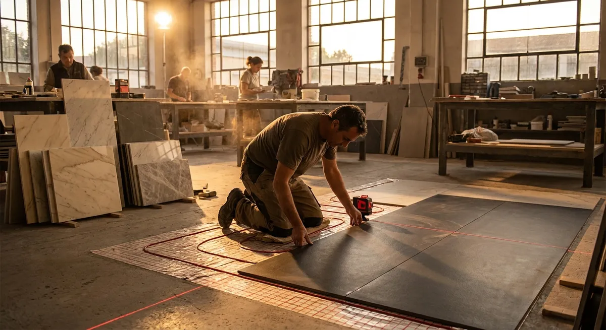
A premium tile installation does not begin with the tile—it begins beneath it. The substrate (the surface your tile adheres to) dictates whether your finished floor or wall reads as calm and seamless, or subtly distorted and uneasy.
High-end installers don’t simply check that a floor is “level”; they obsess over flatness. Large-format tiles, especially, demand a substrate that meets strict tolerances—commonly within 1/8 inch over 10 feet, as referenced in industry standards. When the surface is even minutely out of plane, you’ll notice:
- Shadow lines at tile edges when light grazes across the floor
- Lippage (one tile edge sitting slightly higher than its neighbor)
- Reflections that appear “wavy” on polished tiles
Achieving this level of flatness often involves self-leveling underlayment, precision grinding of high spots, and careful prep on walls (cement board, mud work, or properly primed drywall in appropriate areas). Homeowners who prioritize this phase and allow time and budget for substrate correction will see their tile read as monolithic and calm—a hallmark of truly luxurious installations.
Insight 2: Layout Should Follow the Light, Not Just the Room
Basic tile layouts start from the center of a room or the middle of a wall. Elevated installations start from the light. Refined tile work acknowledges that your primary viewpoint is not a blueprint; it’s how surfaces behave under natural and artificial light as you move through the space.
Discerning installers will:
- Align grout joints along the main sight lines from key entry points
- Consider how tiles terminate against thresholds, door casings, and cabinetry
- Ensure that cut tiles land in discreet, less-visible areas—never as a visual focal point
- Arrange patterns so that feature lines or joints echo architectural symmetry (centered on a vanity, fireplace, or art piece)
In spaces with strong directional light—floor-to-ceiling windows, skylights, or long corridors—your layout should be discussed with light in mind. Tiles laid parallel to light sources produce a softer, more continuous look, while perpendicular layouts can emphasize each individual joint. A premium installation uses this effect intentionally, not accidentally.
Insight 3: Movement Joints Are the Most Elegant Detail You Never Notice
One of the quiet secrets of enduring tile work is movement accommodation. Tile, substrate, and structure all respond differently to temperature, humidity, and building movement. Without planned flexibility, even the most beautifully installed tile can crack, tent, or debond over time.
Top installers factor in movement joints at:
- Perimeters of rooms (where floor tile meets walls or fixed elements)
- Transitions between different materials (tile to wood, tile to concrete)
- Large expanses of tile where industry standards call for field joints
These joints do not have to compromise the aesthetic. Color-matched silicone, carefully aligned transitions, and discrete profiles allow the installation to move subtly while appearing visually seamless. Homeowners who understand and ask about movement joints send a clear signal: long-term performance matters as much as first impressions.
Insight 4: Grout and Joint Design Are a Discipline of Their Own
In refined interiors, grout is never an afterthought—it is a designed element. The choice of grout type, color, joint width, and finish can either elevate your tile or dilute its impact.
Considerations that sophisticated installers and designers weigh carefully:
- Joint width as a proportion: Large-format or rectified tiles typically look most elegant with narrower joints, provided the tile and substrate allow it. The joint should feel intentional, not merely “as small as possible.”
- Color nuance: A grout that is one to two shades softer or deeper than the tile can create a tailored look. Exact matches can appear flat; high contrast can feel busy unless deliberately styled.
- Grout type for performance: Epoxy, high-performance cementitious, or premixed grouts each offer different resistances to staining, color inconsistency, and cracking. Premium spaces—showers, kitchens, outdoor areas—benefit from grouts specified for the environment, not just based on color.
- Finish and texture: Smooth, dense grout joints read as more refined and are easier to maintain. Rough, sandy grout in a polished bathroom or sleek kitchen can feel visually discordant.
Homeowners who view grout as part of the design language, not just a functional filler, end up with installations that feel holistically composed rather than merely assembled.
Insight 5: Tile Edge Treatments Define the Installation’s “Signature”
No matter how beautiful the tile, its edges will reveal the installer’s rigor. Luxury tile work is recognized by how cleanly and thoughtfully it terminates—at outside corners, niches, window reveals, steps, and transitions.
Edge refinement can include:
- Mitered corners for a continuous, wrapped-stone effect (when technically appropriate and executed with precision)
- High-quality profiles in brushed metal or color-matched finishes that echo the room’s hardware and fixtures
- Factory bullnose or finished trim pieces deployed selectively, not as a default, so edges feel integrated rather than decorative add-ons
- Flawless alignment where wall tile meets floor tile, or where patterns change direction
Discussing edge treatments before installation allows your tile contractor to plan cuts, order the correct trims, and coordinate the details with your designer or builder. Homeowners who insist on clarity at these junctions invariably end up with installations that look resolved rather than improvised.
Conclusion
Truly distinguished tile work lives in the details few people talk about: the discipline below the surface, the way layouts respond to light and architecture, the invisible joints that preserve integrity, the grout that supports—not competes with—the tile, and the edges that quietly frame everything.
When you bring these five insights into your conversations with tile professionals, you elevate the entire project. You move from choosing only style and color to curating performance, proportion, and longevity. The result is tile work that doesn’t just look refined on day one—it continues to feel composed, stable, and sophisticated for years to come.
Sources
- [Tile Council of North America (TCNA) Handbook](https://www.tcnatile.com/handbook.html) - Industry-recognized standards and recommendations for substrate prep, movement joints, and installation best practices
- [American National Standards Institute (ANSI) A108/A118/A136 Specifications](https://webstore.ansi.org/standards/tca/tcaa108a118a1361-2022) - Technical criteria for ceramic tile installation materials and methods
- [Schluter Systems – Movement Joint Guidelines](https://www.schluter.com/schluter-us/en_US/Movement-Joints/c/MJ) - Practical explanations and diagrams showing the role and placement of movement joints in tile assemblies
- [LATICRETE – Large Format Tile Installation Tips](https://laticrete.com/en/tile-and-stone-installation/industry-solutions/large-format-tile) - Technical guidance on substrate flatness, lippage control, and mortar selection for large-format tiles
- [Mapei – Guide to Choosing the Right Grout](https://www.mapei.com/us/en-us/home-page/products-and-solutions/lines/grouts-and-sealants) - Detailed overview of grout types, performance characteristics, and selection for different environments