This guide explores five elevated, often-overlooked design insights that transform tile from background material into architectural couture—without tipping into spectacle. Each idea is crafted for those who appreciate discretion, rigor, and enduring elegance.
1. Curated Transitions: Treat Thresholds as Design Moments
Most tile projects lavish attention on main surfaces while treating transitions as an afterthought. In truly considered interiors, thresholds—the meeting of tile with wood, stone, or carpet—are treated as small architectural events.
Instead of generic metal strips or abrupt material changes, consider recessed profiles that sit flush with both finishes, creating an invisible yet perfectly controlled seam. In hallways, align plank flooring boards or stone slab joints with tile modules so that lines continue without interruption, despite the change in material. For a bathroom leading from a bedroom, echo the bathroom tile layout with a subtle border detail in the bedroom’s wood flooring, visually “preparing” the eye for the tiled space beyond. When materials must meet at awkward angles or non-orthogonal walls, choose a tile layout that resolves against the transition, not against the room’s perimeter. These refinements rarely announce themselves, but they are instantly felt as calm, coherence, and intent.
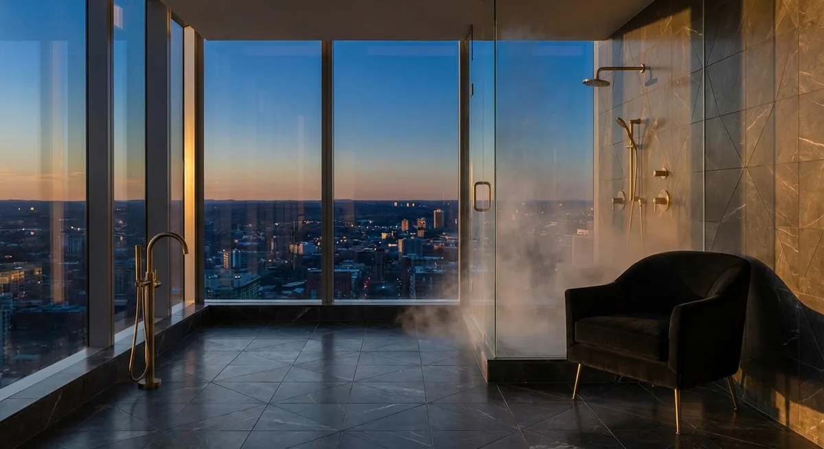
2. Light as a Material: Sculpting Surfaces with Reflection and Relief
The most sophisticated tile designs begin not with color, but with light. The same tile behaves entirely differently in north light, warm artificial light, or spaces with strong direct sun, and a premium result acknowledges this from the outset.
Matte tiles absorb and soften light, ideal for spaces meant to feel quiet and restorative, while satined or honed finishes offer a gentle, diffused glow that flatters both architecture and skin. Highly polished surfaces can feel opulent but require discipline: use them strategically as an accent—such as a niche back panel or a band in a shower wall—rather than flooding entire rooms. Textured and three-dimensional tiles, when aligned carefully with light sources, can create shifting patterns of shadow over the course of the day, adding depth without resorting to bold color or busy pattern. Before committing, ask your installer or designer to mock up tiles on a vertical board and move them near windows and under the actual light fixtures you’ll use. The question is not only “How does this tile look?” but “How does this tile hold and shape the light in this room?”
3. Intelligent Pattern Discipline: Quiet Complexity Beneath the Surface
Premium spaces often feel simple, but a closer look reveals controlled complexity. Tile layouts can employ this same discipline—patterns that are intellectually rich yet visually composed.
Consider mixing tile formats within a single material family to create subtle hierarchy: large-format tiles for field areas, smaller formats or mosaics as “textural punctuation” in select zones. A herringbone floor in a shower, when framed by larger planks in the bathroom, can read as a finely tailored inset rug. Similarly, continuous-vein porcelain or stone on a feature wall becomes more powerful when surrounded by tiles laid in an ultra-regular, almost monastic grid. Avoid competing geometries: if one surface introduces a dynamic pattern (chevron, arabesque, heavily veined marble), keep adjacent surfaces calm and rigorously aligned. The aim is to achieve rooms where your eye moves in a deliberate rhythm, rather than being pulled into a visual argument.
4. Grout as a Design Instrument, Not a Necessity
Grout is often treated as a purely technical necessity, yet its color, joint width, and finish are among the most powerful tools in tile design. In refined spaces, grout is never accidental.
Tone-on-tone grout (matched as closely as possible to the tile) softens joints so surfaces read as monolithic, ideal for large-format porcelain or stone that’s meant to feel architectural. In contrast, slightly darker or lighter grout can emphasize geometry, perfect for smaller tiles where the pattern is part of the narrative—think a bevelled metro tile with a hairline, crisply contrasting joint. Ultra-narrow joints create an almost seamless effect but require exceptionally flat substrates and precise installation; they should be a deliberate choice made early, not a last-minute request. Grout finish also matters: a smoother, denser grout can look more tailored and stay visually calm, while a rougher finish may suit rustic or tactile schemes. When evaluating tile samples, always place them with proposed grout sticks or color cards—it is the ensemble, not the tile alone, that ultimately appears in your home.
5. Purposeful Zoning: Using Tile to Choreograph How a Room Is Lived
Beyond aesthetics, tile can subtly choreograph how people move, pause, and use a space. In elevated interiors, this zoning is felt as “natural” rather than obvious.
In open-plan kitchens, a different tile format or slightly shifted color tone beneath the island can define a working zone without resorting to borders or inlays. In bathrooms, changing tile module or texture between vanity, shower, and WC areas can create a sense of distinct “rooms” within one space, supporting rituals and privacy. Entries and mudrooms can use a denser, more textured floor tile that blends quietly into smoother tile in adjacent spaces, signaling a threshold from exterior to interior living. Even in smaller apartments, a raised tiled platform, a full-height tiled niche, or a band of tile extending beyond the wet zone can give the impression of bespoke architecture, not mere practical cladding. When thoughtfully deployed, tile stops being a background and becomes a subtle director of daily life.
Conclusion
Exceptional tile work is rarely about spectacle. It is about decisions that respect geometry, light, touch, and the choreography of everyday life. The tile that feels truly luxurious is not always the most expensive, but the most considered—chosen with an awareness of how it will meet other materials, how it will respond to the sun at 4 p.m., how it will age beneath bare feet over years.
For homeowners who see their surroundings as an extension of their standards, these five insights offer more than design tricks; they provide a framework for creating tiled spaces that whisper quality in every joint and junction. When tile is treated as silent geometry, your home gains not just a finish—but a point of view.
Sources
- [Ceramic Tile Installation Guide – TCNA Handbook](https://www.tcnatile.com/handbook.html) - Industry-recognized guidelines and best practices for tile installations, including substrate preparation and layout considerations.
- [Porcelain Tile Selection & Design – Porcelanosa](https://www.porcelanosa.com/uk/tiles/) - Product and design insights from a leading premium tile manufacturer, showcasing finishes, formats, and applications.
- [Natural Stone Institute – Design Resources](https://www.naturalstoneinstitute.org/consumers/resources/) - Guidance on natural stone selection, finishes, and detailing for high-end interiors.
- [American Society of Interior Designers (ASID) – Design Trends](https://www.asid.org/resources/resources) - Professional perspectives on interior design trends, material use, and spatial planning relevant to tile-based design.
- [Harvard Graduate School of Design – Light and Space Research](https://www.gsd.harvard.edu/research/) - Academic research and projects exploring light, surfaces, and spatial perception, informing nuanced use of reflective and textured materials.