The Blueprint Beneath the Beauty: Substrate as Design Foundation
Sophisticated tile work begins long before the first tile is set. The substrate—the underlying surface—quietly dictates whether a space will read as seamless or subtly “off.” Even the most exquisite marble or rectified porcelain will appear compromised if installed over a floor that is out of level, structurally flexible, or unevenly prepared.
A premium installation starts with rigorous assessment: checking for deflection in wood subfloors, confirming flatness to within tight tolerances, and specifying appropriate underlayments. Cement backer boards, uncoupling membranes, or self‑leveling compounds are selected not as generic “prep,” but as tailored responses to the structure, tile format, and anticipated use of the space. In wet areas—showers, steam rooms, and spa-like baths—this foundation also includes a carefully integrated waterproofing system, not just a moisture-resistant board. When the substrate is engineered with the same intentionality as the visible finish, grout lines run straight, large-format tiles lie perfectly plane, and the entire surface visually “relaxes” instead of fighting the eye.
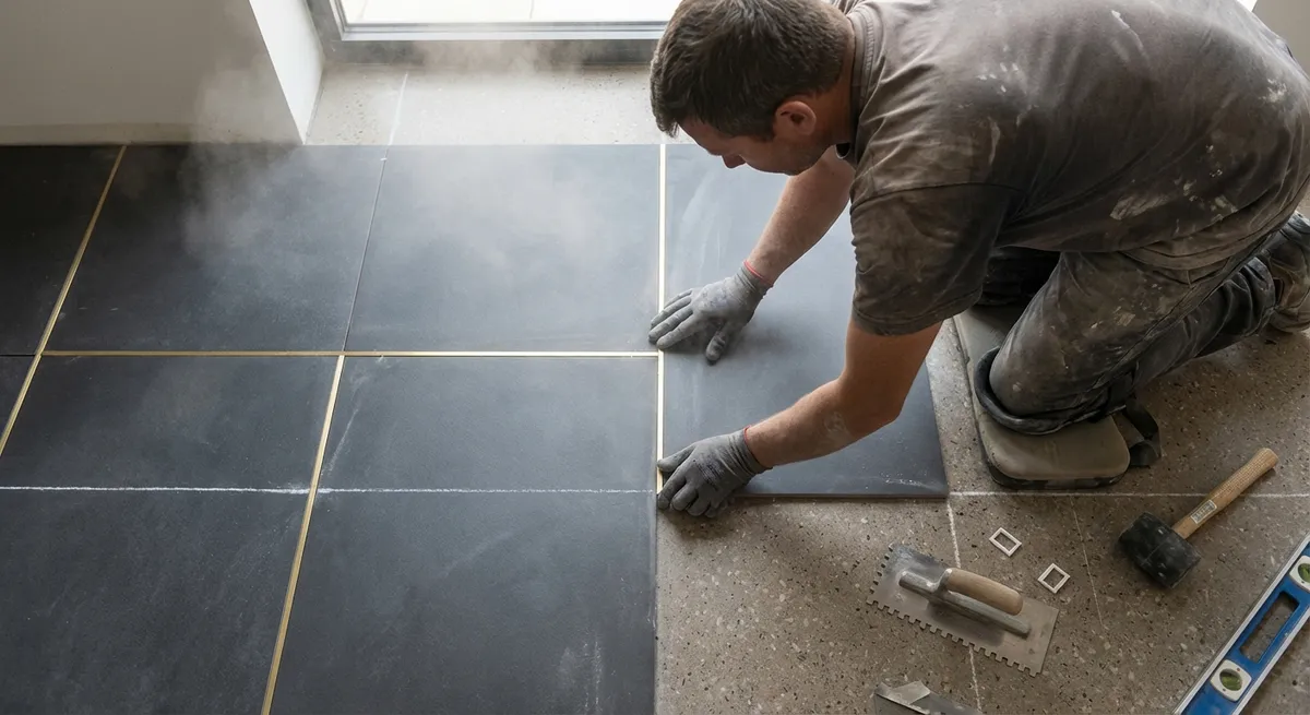
Joint as Jewelry: Grout Width, Color, and Composition
For the discerning eye, grout is not filler; it is framing. It defines the rhythm of the installation, influences scale perception, and either amplifies or quiets the inherent character of the tile. This is where taste, practicality, and technical performance must intersect.
Selecting grout width is both an aesthetic and technical decision. Narrow joints emphasize expansiveness and precision, especially with rectified porcelain or stone. Slightly wider joints may be essential when working with handmade or irregular tiles, allowing for micro-adjustments that preserve the overall geometry. Grout color, meanwhile, can either blend to create an almost monolithic surface or contrast to articulate each tile like a finely set gemstone. Darker grout may better resist visible staining in high-traffic areas, while softer tones lend an understated, gallery-like calm.
Material choice is equally critical. Cementitious grout may be appropriate for traditional installations, but high-performance formulas—such as epoxy or advanced polymer-modified grouts—offer superior stain resistance, color consistency, and durability. A considered grout strategy ensures that, as years pass and lighting changes, the joints still feel intentional, dignified, and quietly refined.
Light as the Final Inspector: Designing for Reflection and Shadow
The most exquisite tile installation can be visually undermined by poorly considered lighting; conversely, a thoughtful lighting plan can make well-installed tile feel transcendent. Because tile surfaces—especially polished stone, glossy ceramic, or large-format porcelain—catch and shape light, they will also reveal every plane change, lippage, and misalignment.
During planning, it is wise to consider how natural light enters and moves through a room: How do morning shadows traverse the floor? Will sunset light rake across a shower wall, turning the slightest unevenness into a visible defect? Overhead fixtures, sconces, and under-cabinet lighting should be positioned so they complement, rather than expose, the installation. Wall washing fixtures can be beautiful with textured tile, but ruthless on poorly flattened surfaces.
Homeowners who demand excellence should insist that lighting is not an afterthought. Discuss fixture locations, lumen levels, and color temperature before tile layout is finalized. This is especially relevant in long corridors, feature walls, and shower niches, where even a few millimeters of inconsistency become dramatically apparent when grazed by angled light. The ideal outcome is a surface that looks just as composed in low, moody evening light as it does in bright midday clarity.
Transitions with Intention: Thresholds, Edges, and Material Conversations
Truly elevated tile work is often identified not by the expanses of field tile, but by the eloquence of its edges—where tile meets wood, carpet, metal, stone, or simply air. Transitions are where design discipline is tested, and where a space reveals whether it was executed as a cohesive composition or a series of disconnected decisions.
Thoughtful homeowners and their installers treat thresholds and terminations as integral design elements. This may mean selecting a slim-profile metal trim with a finish that precisely echoes the room’s hardware, or commissioning stone thresholds that bridge level changes gracefully. In showers, perfectly aligned miters, carefully chosen corner trims, or bullnose details can determine whether the eye glides smoothly around the space or stutters at every edge.
Height transitions between flooring types also matter. Elegant spaces avoid abrupt step-ups or awkward reducers whenever possible. Instead, they resolve level differences through meticulous planning of underlayments and tile thicknesses, ensuring a nearly flush meeting between materials. These refined transitions communicate quiet luxury—the sense that every meeting of surfaces was foreseen and resolved with care, rather than improvised on installation day.
Layout as Language: Alignments, Symmetry, and the Discipline of Restraint
While patterns and shapes are often celebrated, the deeper sophistication of tile lies in the discipline of its layout. A premium installation does not leave cut locations, pattern centers, or alignment points to chance. Instead, the layout is drawn, measured, and rehearsed before a single tile is set.
This begins with understanding “sight lines”—what you see first when you enter a room, look down a hallway, or stand at a vanity. Joints can be aligned to architectural features: centered under windows, lined up with door mullions, or carried from floor to wall so the geometry feels continuous. Cuts are hidden in less visible areas whenever possible, while highly visible edges are reserved for full or near-full tiles that read as intentional.
In complex spaces, restraint can be a virtue. Not every wall needs a dramatic pattern; sometimes the most elevated choice is to allow a subtle, beautifully aligned grid to speak quietly in the background. Even in patterned or herringbone layouts, precision—consistent angles, clean terminations, and symmetrical focal points—distinguishes sophisticated design from visual noise. A carefully resolved layout makes the room feel intuitively “right,” even if the viewer cannot immediately explain why.
Conclusion
Impeccable tile installation is a composition of hidden rigor and visible calm. Beneath every elegantly aligned joint lies careful substrate preparation; behind every harmonious surface is a considered conversation between grout, light, edge, and layout. For homeowners who value longevity, refinement, and the quiet assurance of work well done, these five insights form a language for collaborating with designers and installers at a higher level.
When you understand the subtleties—the foundation beneath the finish, the geometry behind the pattern, the discipline within each decision—you can demand more than a serviceable surface. You can curate a tile installation that feels cohesive, enduring, and genuinely bespoke: a silent geometry that elevates your home every single day.
Sources
- [Tile Council of North America (TCNA) Handbook](https://www.tcnatile.com/handbook.html) - Industry reference for substrate preparation, installation methods, and performance standards
- [Custom Building Products: Surface Preparation Guide](https://www.custombuildingproducts.com/how-to-surface-prep.aspx) - Technical guidance on underlayments, self-leveling, and substrate requirements
- [Schluter Systems: Movement Joints and Transitions](https://www.schluter.com/schluter-us/en_US/Movement-Joints/c/P-MovementJoints) - Details on elegant edge profiles, transitions, and joint design
- [LATICRETE Grout Solutions](https://laticrete.com/en/tile-and-stone-installation/grouts) - Overview of grout types, performance characteristics, and color considerations
- [Illuminating Engineering Society (IES) Lighting Fundamentals](https://www.ies.org/standards/lighting-fundamentals/) - Explains how light, shadow, and fixture placement affect visual perception of surfaces